
You open Google Analytics to answer one question and end up moving through several reports, copying figures into a document, and trying to remember whether everyone used the same comparison period. The data may be available, but the route to a decision is unnecessarily long.
Google Analytics Dashboards can shorten that route by putting selected KPIs and visualizations on a customizable, grid-based canvas. The useful part isn’t the canvas itself. It is the discipline of deciding which questions deserve permanent space, which chart can answer each question, and what someone should do after seeing the result.
Decide what the dashboard must make obvious
A dashboard should reduce decision time. It shouldn’t reproduce every report your team might occasionally need. Before you add a card, write a short dashboard brief that answers:
- Who will use it? An SEO lead investigating landing pages needs different detail from an executive checking overall acquisition and conversion performance.
- What recurring decision will it support? Examples include deciding where to investigate a traffic decline, which content group needs attention, or where users leave a conversion journey.
- How often will someone review it? The review rhythm determines whether short-term movement or longer trends deserve more space.
- What is the primary outcome? Name the result the dashboard is supposed to monitor before choosing supporting metrics.
- Who owns the response? A metric without an owner becomes decoration. Decide who investigates, who explains, and who acts.
Turn each proposed card into a complete question. “Organic traffic” is only a label. “Is traffic from organic discovery moving in the expected direction, and which landing content explains the change?” is a question. It tells you that you need a headline value, a trend, and enough detail to locate the affected content.
Give every KPI an explicit scope as well. The team should know which property, audience, outcome, time period, and comparison the number represents. Two people can read the same number differently when one assumes all traffic and the other assumes a particular channel. The dashboard won’t fix an unsettled definition; it will simply make the ambiguity more visible.
This distinction matters for SEO, AEO, and GEO reporting. Google Analytics can show activity captured in the property, including measurable visits and subsequent behavior. It cannot turn external rank tracking, AI citation visibility, crawl findings, CRM revenue, or platform delivery data into Analytics measurements merely by arranging cards on a page. Keep those claims in their appropriate systems, then use the dashboard for the questions its data can actually answer.
Build from outcomes to diagnosis
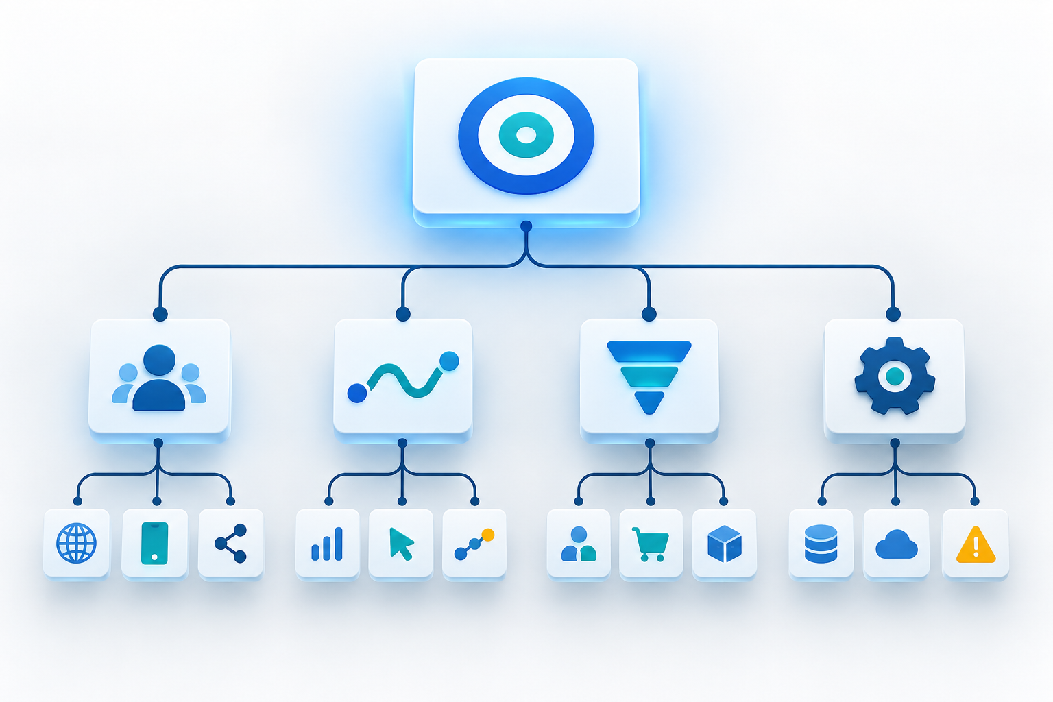
The builder lets you drag dimensions and metrics onto the canvas, then position, resize, and align the resulting visualizations. That makes experimentation easy, but it also makes it easy to fill the page before establishing a hierarchy.
Build in the order a reader will think:
- Start with the outcome. Place the KPI that best represents the dashboard’s primary business result where the eye lands first.
- Add its context. Show the input or volume metric needed to interpret that result. An outcome without scale can make a small fluctuation look more important than it is.
- Show direction. Add a time-series view so the reader can distinguish a sustained movement from an isolated value.
- Expose the main comparison. Break performance down by the category most likely to explain a change, such as an acquisition grouping or content grouping that your measurement plan defines consistently.
- Provide a diagnostic route. Use a detailed table for the pages, campaigns, or other entities someone will inspect next.
- Add the journey where it matters. If the decision concerns an ordered conversion process, use a funnel to reveal the step where progress changes.
- Remove repetition. If two cards lead to the same observation and action, keep the clearer one.
This sequence creates a practical reading path: outcome, context, trend, explanation, detail, action. It also leaves room beneath the documented cap of 15 cards for standard properties. Premium properties can contain up to 30, but a larger allowance isn’t a reason to use every available position.
Review the completed canvas at the size your intended audience will normally use. Visual priority comes from position and size as well as chart type. If the primary outcome is smaller than a supporting breakdown, the layout is telling the reader that the breakdown matters more.
Match each business question to the right visualization

Six visualization types are available: scorecards, tables, line charts, bar charts, donut charts, and funnel charts. Choose among them by the question being asked, not by the visual variety they add to the page.
| Visualization | Question it should answer | Best use | Common mistake |
|---|---|---|---|
| Scorecard | What is the current headline value? | A primary KPI or an essential context metric | Displaying several isolated values without showing why any change matters |
| Line chart | When did the movement begin, and did it persist? | Performance over time | Using a trend line when the real question is a comparison between categories |
| Bar chart | Which categories are larger, smaller, ahead, or behind? | Direct category comparisons | Adding so many categories that meaningful differences become hard to see |
| Donut chart | How is a whole divided among a limited set of parts? | A simple composition or share breakdown | Using similar-sized or numerous slices that are difficult to compare |
| Table | Which exact item requires investigation? | Detailed rows that support diagnosis | Turning the dashboard into an exhaustive data export |
| Funnel chart | At which ordered step does progression change? | Conversion steps and drop-offs | Treating unrelated actions as if they formed a single sequential journey |
Use date context deliberately. Scorecards can display percentage change when a date comparison is applied, while line charts support daily, weekly, and monthly views. Pick the line-chart interval that matches the decision rhythm. A view that is too granular can distract the reader with ordinary variation; one that is too broad can conceal when a meaningful shift began.
A percentage movement also needs its underlying value. A large percentage attached to a small base may deserve less attention than a modest movement in the metric most closely tied to the business outcome. Keep the scorecard for quick detection, then place a trend or detailed breakdown nearby so the reader can test whether the movement is broad, persistent, and actionable.
Publish with property-wide governance in mind
Creating a useful layout is only half the job. A user needs an Editor or Administrator role to create and publish a dashboard. Once published, the dashboard can be viewed by anyone who has access to the property, and it can be placed directly in the Reports navigation without routing it through the Analytics library.
That convenience changes the governance standard. Published dashboards are shared across the property rather than privately with selected individuals, so don’t treat the published area as a personal scratchpad. Settle experimental metric definitions and layouts before exposing them to every property user.
- Name the audience and purpose clearly. A title such as “Content performance” is weaker than one that identifies the intended decision or review context.
- Assign an owner outside the dashboard. Someone should be responsible for definitions, layout changes, and questions from viewers.
- Record the KPI definitions. Preserve the scope, outcome meaning, and expected response in team documentation so the dashboard doesn’t become its own undocumented vocabulary.
- Check the published view with ordinary access. Confirm that the navigation placement and reading order work for viewers, not only for the person who built it.
- Review cards when strategy changes. Remove KPIs that no longer inform a live decision instead of leaving them in place for historical familiarity.
Plan around the launch limitations before promising the dashboard as a complete reporting system. API support, segments, and card-level comparisons were not supported at launch. That means you shouldn’t design a workflow that depends on programmatic dashboard management, segment-based dashboard cards, or a different comparison basis for each card unless those capabilities are verified in your property.
The absence of card-level comparisons is especially important. Agree on a coherent comparison before presenting the page, and explain any analysis that requires a different baseline somewhere else. Otherwise, adjacent cards can appear comparable while answering different questions.
Key takeaways
- Start with a recurring decision and its owner, then choose the metrics needed to make that decision.
- Arrange cards as a reading path from outcome to context, trend, explanation, and diagnostic detail.
- Use scorecards for headline values, line charts for timing, bar charts for comparison, donut charts for simple composition, tables for diagnosis, and funnels for ordered journeys.
- Keep metric definitions and scope explicit; a clean layout cannot repair an ambiguous KPI.
- Design within the 15-card standard or 30-card premium limit, but treat those figures as ceilings rather than targets.
- Publish only after accounting for property-wide visibility, role requirements, and the feature limitations that applied at launch.
Your first dashboard should feel focused rather than comprehensive. Open the builder with your decision brief beside you, place the primary outcome first, and add a card only when it helps the reader detect a change, explain it, or choose the next action. If a card does none of those jobs, leave the space empty.
References

Leave a Reply