Tag: Audience Behavior

  • Product-Led SEO Measurement: From Rankings to User Value

    Product-Led SEO Measurement: From Rankings to User Value

    You shipped a template change, internal-link module, or new landing-page experience. Impressions and clicks moved, but the product team asks the question the SEO dashboard cannot answer: did the release help anyone accomplish something valuable?

    Product-led SEO measurement closes that gap. It connects search exposure to the on-page experience, the user’s next meaningful action, and the business decision that follows. The result is not a larger dashboard. It is a measurement system that tells you whether to keep, change, expand, or roll back what you built.

    Start with the decision your dashboard must support

    Before choosing metrics, write down the decision you expect the data to inform. A useful decision statement looks like this: “If eligible organic visitors use the new experience and complete the intended next step without harming search visibility or page performance, expand it to the remaining eligible pages.”

    That sentence establishes the audience, behavior, desired outcome, guardrails, and next decision. Without it, teams tend to collect every available number and debate the meaning after launch.

    Treat the SEO change as a product capability. Define the problem, why it matters, the intended outcome, and the requirements that must survive implementation. Leave room for developers to choose an approach that fits the codebase, but be exact about observable SEO requirements. If links must appear in rendered HTML, state that. If every eligible page needs a canonical URL or a particular content element, make it testable.

    For a related-content module, the measurement brief might contain:

    • User problem: A visitor reaches a useful page from search but encounters a dead end before the next relevant question.
    • Hypothesis: Contextual links will help eligible visitors continue to a relevant page.
    • SEO requirement: The links must be present in rendered HTML and point to indexable destination URLs.
    • User outcome: A visitor selects a relevant recommendation and continues the journey.
    • Business outcome: More eligible organic journeys reach the qualified action that matters for this experience.
    • Guardrails: The release must not introduce broken links, rendering failures, inappropriate destinations, or a material deterioration in the page experience.

    Notice what is missing: “increase traffic” is not the whole objective. Traffic is one stage in the mechanism. The visitor’s ability to use the page is another.

    Build a metric tree from search exposure to product value

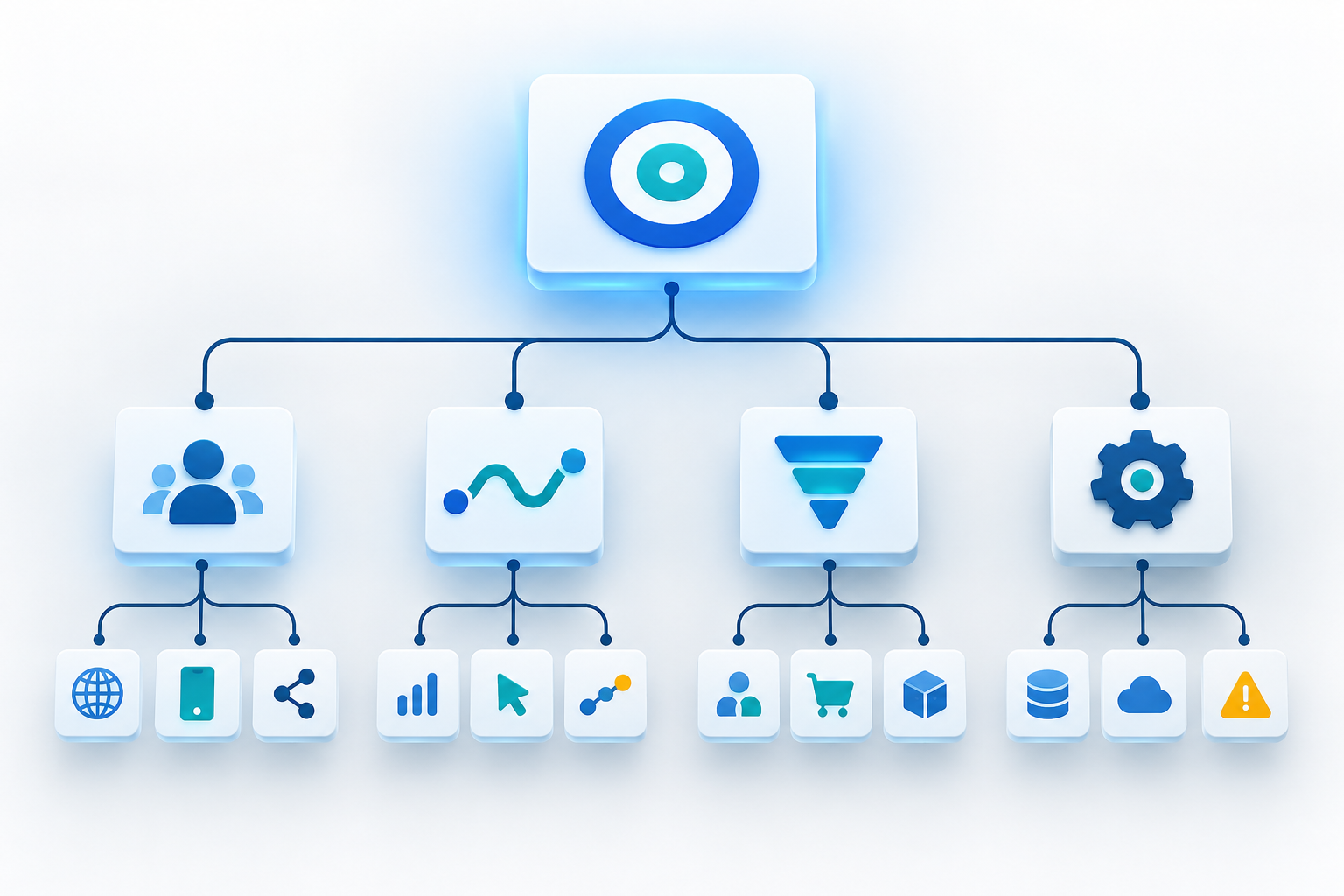
    Abstract branching pathway connecting search exposure lights to interactions, product actions, and a glowing value core.

    A product-led scorecard needs several layers because no single metric can explain the full journey. Rankings can diagnose discoverability, but they cannot tell you whether a visitor found the page useful. Conversions represent value, but they can hide a failed rollout when only a small share of eligible pages received the feature.

    Measurement layerQuestionUseful signalsWhat the layer helps diagnose
    AvailabilityDid the intended experience actually ship?Eligible pages, deployed pages, valid rendered components, crawlable links, error statesRelease and implementation failures
    Search exposureCould searchers discover the eligible pages?Indexed-page coverage, impressions, query coverage, average position, clicksDiscovery, indexing, and search-demand changes
    User behaviorDid organic visitors use the experience as intended?Feature views, interactions, path continuation, return to results where measurable, completion of the intended next stepRelevance, comprehension, placement, and usability
    Product or business valueDid the journey produce a qualified outcome?Sign-ups, purchases, qualified enquiries, subscriptions, or another explicitly defined value eventWhether improved discovery and behavior matter to the business
    GuardrailsWhat might the release have damaged?Rendering errors, broken destinations, unwanted indexation, page-performance deterioration, accessibility failuresCosts hidden by an attractive headline metric

    Connect these layers as a metric tree rather than presenting them as an unrelated set of charts. The business outcome sits at the top. The user behavior that should produce it sits beneath it. Search exposure explains how people reach the experience. Availability and guardrails tell you whether the product operated as designed.

    You can then define a rate whose numerator and denominator match the decision. For example:

    Organic activation rate = eligible organic landing sessions that complete the qualified action / eligible organic landing sessions

    “Eligible” matters. If the feature appears only on one template, including every organic session in the denominator dilutes the effect and can make a successful release look irrelevant. Conversely, reporting only people who interacted with the feature excludes visitors who saw it and ignored it. That turns adoption into a precondition and overstates performance.

    Keep raw counts beside rates. A rising conversion rate with sharply lower eligible traffic may still produce fewer total outcomes. A growing outcome count with a flat rate may simply reflect stronger search demand. You need both views to distinguish efficiency from scale.

    Instrument the feature, not just the pageview

    A pageview confirms that a URL loaded. It does not confirm that the feature was present, visible, relevant, or usable. Product-led measurement therefore needs an explicit event and validation plan for the capability you changed.

    For every important event, document:

    • Name: Use one stable name that describes the action rather than a campaign slogan or temporary design.
    • Trigger: Specify exactly what must happen. A component rendered, entered the viewport, received a click, and led to a successful destination are different events.
    • Properties: Include the page template, component type, destination class, release identifier, and eligibility state needed for analysis.
    • Deduplication: Decide whether repeated actions in one journey count once or multiple times.
    • Failure behavior: Record what happens when the component has no recommendation, returns an error, or points to an invalid destination.
    • Privacy boundary: Do not place personal or sensitive information in event names, URLs, or free-text properties.

    Then separate three states that dashboards often collapse:

    • Available: The feature was deployed to an eligible page and met its technical requirements.
    • Exposed: A visitor had a genuine opportunity to encounter it.
    • Adopted: The visitor used it and completed the intended behavior.

    This distinction makes diagnosis much faster. Low interaction is not a relevance problem if the component failed to render. High interaction is not necessarily valuable if visitors repeatedly hit broken destinations. Strong downstream outcomes among users do not prove the rollout worked if most eligible pages never received the feature.

    Validate instrumentation before evaluating impact. Check that an eligible page is classified correctly, the component appears in rendered HTML where required, events fire only on their defined triggers, properties contain expected values, destination URLs resolve correctly, and analytics can isolate the release cohort. Record the deployment in your reporting timeline so later changes are not mistaken for unexplained movement.

    Search data and product analytics describe different parts of the journey. Search Console impressions and clicks should not be forced to reconcile exactly with analytics sessions or users. Keep the systems connected through common dimensions such as landing page, country, device, query class, template, and release cohort, while preserving the meaning of each metric.

    Evaluate releases with cohorts, segments, and guardrails

    Two parallel release-testing lanes carry grouped user figures toward task outcomes within illuminated safety rails and a final decision platform.

    Comparing the whole site’s performance before and after a release is rarely enough. Search demand, rankings, site changes, promotions, seasonality, and unrelated product work can move during the same period. Build the evaluation around the pages and visitors that could actually be affected.

    Define the analysis cohort before opening the results:

    • List the eligible URLs or the rule that identifies them.
    • Record which URLs received the release and when.
    • Create a credible comparison group when one exists, using pages with similar purpose, template, demand pattern, and prior performance.
    • Preserve a pre-release baseline for the same metrics and segments.
    • Exclude known migrations, outages, redirects, or other changes that make the groups incomparable.
    • Choose the primary outcome and guardrails in advance so the interpretation does not change to fit the result.

    If you run a controlled test, keep the experimental unit clear. A page-level test should be analyzed by its assigned page cohort, not retroactively by whichever visitors converted. Check that search engines and users receive stable, coherent experiences, and do not use URL, canonical, redirect, or indexing changes casually as testing machinery. Those changes can alter discoverability and contaminate the result you are trying to measure.

    Segmentation should answer a plausible mechanism, not create an endless hunt for a favorable slice. Useful cuts commonly include branded versus non-branded demand, country, device, query intent, new versus established pages, and page template. Google Search Console can now combine selected countries in its performance reporting, which makes regional groupings easier to inspect without first exporting and grouping them elsewhere.

    Predefine the segments that could change the decision. If mobile layout determines whether the feature is visible, device is necessary. If a release serves a defined group of markets, combined-country reporting is relevant. If neither condition applies, adding those cuts may only fragment the data.

    Read the layers together when results arrive:

    • Availability fails: Stop interpreting user or business outcomes. Fix the rollout or instrumentation first.
    • Exposure rises but qualified actions stay flat: Inspect intent match, page promise, usability, and the relevance of the next step.
    • Traffic stays flat but activation improves: The release may have improved the experience without changing discoverability. Decide whether that product value justifies expansion.
    • Interaction rises but value does not: The feature may attract attention without advancing the journey. Review destination quality and event definitions.
    • Outcomes rise while a guardrail deteriorates: Do not declare an uncomplicated win. Quantify the downside and determine whether the experience needs revision before expansion.
    • Only one segment improves: Confirm that the segment was expected, large enough to matter to the decision, and not selected after inspecting many alternatives.

    Use language that matches the evidence. An uncontrolled before-and-after movement is an observation, not proof that the release caused it. A well-matched comparison strengthens the case. A properly designed experiment can support a stronger causal conclusion. The dashboard should make those evidence levels visible instead of presenting every green arrow with equal confidence.

    Finally, design the measurement so the next version remains possible. Stable eligibility rules, release identifiers, reusable events, and template-level dimensions let another team extend the capability without rebuilding the reporting model. That is the practical difference between a launch report and a product measurement system.

    Key takeaways

    • Begin with the decision the data must support: keep, revise, expand, or roll back the release.
    • Measure availability, search exposure, user behavior, product value, and guardrails as connected layers.
    • Use the eligible audience as the denominator; neither all site traffic nor feature clickers alone represent the true opportunity.
    • Instrument whether the capability was available, exposed, and adopted instead of relying on pageviews.
    • Analyze affected page cohorts and predefined segments, while treating uncontrolled before-and-after changes as observations rather than causal proof.
    • Keep raw totals beside rates and read gains against technical, accessibility, and experience guardrails.

    For your next SEO release, write the decision statement and metric tree before the implementation ticket is finalized. If the team cannot say what result would change its next action, another dashboard widget will not solve the problem. A clear decision, an eligible cohort, and a verified path from search exposure to user value will.

    References


  • Google Search Ranking Factors in 2026: What to Prioritize

    Google Search Ranking Factors in 2026: What to Prioritize

    If your rankings have stalled, the answer probably is not another hundred-item SEO checklist. The useful question is narrower: which improvements can still separate your page from competent competitors, and which ones merely keep you eligible to compete?

    In 2026, the strongest plan starts with satisfying content, deep subject coverage, and evidence that real searchers find the page useful. Titles, links, trust, brand recognition, freshness, and technical health still matter, but they play different roles. You need to know whether each signal creates an advantage, confirms relevance, supplies proof, or clears a minimum threshold.

    The 2026 priority map: advantage signals versus thresholds

    Use the percentages below as a directional resource-allocation model, not as Google’s official formula. These estimated 2026 weights come from a single long-running agency dataset. They can help you decide where to invest, but they cannot predict the ranking of every page for every query.

    Ranking factorEstimated 2026 weightChange from 2025Practical role
    Consistent publication of satisfying content24%Up 1 pointPrimary competitive advantage
    Niche expertise14%Up 1 pointTopical depth and retrieval coverage
    Searcher engagement13%Up 1 pointEvidence that the page resolves the visit
    Keyword in the meta title12%Down 2 pointsRelevance and click expectation
    Backlinks12%Down 1 pointExternal authority and corroboration
    Freshness6%UnchangedContinued accuracy and usefulness
    Trustworthiness5%Up 1 pointAuthorship, evidence, and accountability
    Mobile-friendly, mobile-first site4%Down 1 pointTechnical threshold
    Link distribution diversity3%UnchangedBreadth of external validation
    Page speed2%Down 1 pointTechnical threshold and usability
    Brand mentions2%New as a standalone factorEntity recognition and reputation
    Site security and SSL1%Down 1 pointTechnical threshold
    Internal links1%UnchangedDiscovery, hierarchy, and context
    Meta descriptions and 22 other factors1% combinedNot specifiedSupporting signals

    Do not turn this table into a page score. A technically perfect page does not earn a fixed number of ranking points, and publishing more often does not compensate for failing the searcher’s task. The weights are most useful at the portfolio level: they show where marginal investment is likely to produce differentiation and where compliance has become commonplace.

    Key takeaways

    • The three leading content and audience factors account for 51% of the estimated weighting: satisfying publication at 24%, niche expertise at 14%, and searcher engagement at 13%.
    • Titles and backlinks still account for 24% combined. Their declining weights mean they are no longer adequate substitutes for a weak page, not that you can ignore them.
    • Mobile friendliness, page speed, and security total 7% in the model. They behave more like eligibility thresholds because competent sites commonly meet them.
    • Schema markup, header keywords, URL keywords, meta-description keywords, and numerous smaller signals share a 1% residual group. Treat them as supporting implementation, not the center of your ranking strategy.

    Build content around complete search tasks, not publishing quotas

    A researcher at a desk brings connected source materials and visual information fragments together into one complete solution.

    Consistent publication leads the model only when the content satisfies the search. Across one agency’s client sites during the March and May 2026 core updates, sites publishing weekly gained an average of 3.8 positions on their hub keywords, while sites publishing less than monthly lost an average of 2.7 positions. That is useful directional evidence, but it does not make weekly publishing a universal rule. The meaningful variable is a sustainable flow of pages that finish a real search task.

    Volume without satisfaction can become a liability. If your team can produce one defensible page that answers the question, shows its reasoning, and helps the reader decide what to do, that page is more valuable than a cluster of near-duplicates written to occupy keyword variations.

    Design a hub for query fan-out

    Google’s AI Mode can use query fan-out to break a question into related sub-searches and retrieve different pages for the resulting needs. That favors sites with coherent depth across a subject. It does not justify making a page for every minor wording change.

    1. Name the hub’s core problem. Write it as a task the reader needs to complete, not as a broad category your company wants to own.
    2. Map meaningful dimensions. Look for genuinely different industries, use cases, customer types, specialties, constraints, and decision stages. A dimension deserves its own page only when the answer materially changes.
    3. Assign one best page to each intent. If several URLs would give essentially the same answer, consolidate them instead of forcing artificial distinctions.
    4. Give every supporting page a job. It should answer its own question, connect back to the hub, and direct the reader to the next relevant decision.
    5. Identify the missing evidence. Add the comparison, process, example, definition, limitation, original data, or decision rule that competing pages leave unresolved.

    This approach builds niche expertise through coverage and coherence. A site becomes easier to retrieve across related sub-searches because each page has a distinct purpose inside a recognizable body of work.

    Use engagement to diagnose the page, not manipulate a metric

    Searcher engagement rose to 13% for the fourth consecutive annual increase. AI Overviews and AI Mode can resolve simple informational needs before a website visit, leaving a smaller pool of people who click because they need detail, evaluation, or action. Those visitors notice generic content quickly.

    Do not reduce this to a campaign to increase time on page. Google has not handed you a public formula that converts an analytics metric into ranking points. Use behavior as diagnostic evidence instead:

    • Does the opening answer the query immediately, or make the reader cross an essay-length preamble?
    • Can a visitor find the relevant comparison, instruction, definition, or limitation without hunting through unrelated sections?
    • Does the page support the likely next action, such as checking a requirement, choosing an option, or moving to a more specific page?
    • Are visitors encountering a mismatch between the title’s promise and the page’s actual depth?

    Fix the underlying experience. Removing padded introductions, making distinctions explicit, and placing the decisive information where it is needed are more durable choices than adding interaction for its own sake.

    Make relevance, authority, trust, and brand reinforce one another

    Titles, backlinks, trust signals, and brand mentions answer different versions of the same question: why should Google select this page from this site for this search? Treating them as one coordinated proof system produces a stronger result than optimizing each in isolation.

    Write titles for clear meaning rather than exact-match repetition

    The keyword in the meta title fell from 14% to 12%, the largest decline in the 2026 weighting. Google’s May 2026 search-box redesign encouraged longer, conversational queries, making the page’s overall meaning more important than an exact string match. The title still functions as a prerequisite-level relevance signal and sets the searcher’s expectation.

    • State the main subject in language your intended reader will recognize.
    • Add the qualifier that changes the answer, such as the year, platform, audience, use case, or decision type.
    • Describe the value of the page without promising a result the content cannot deliver.
    • Remove repeated keyword variants that make the title less readable without clarifying its scope.

    A good title is not a bag of terms. It is a compact contract: this is the subject, this is the version of the problem being addressed, and this is what the reader can expect to resolve.

    Earn links with something worth citing

    Backlinks declined to 12%, continuing an eight-year downward trend, while link distribution diversity remained at 3%. Links are still meaningful evidence, but the useful links are increasingly editorial: another publisher chooses to reference your original data, resource, or explanation because it improves their own work.

    Before running outreach, ask what the recipient would actually cite. A well-defined dataset, transparent benchmark, reusable template, calculator, primary-source collection, or unusually clear decision framework gives outreach a reason to exist. A routine article with no distinctive evidence leaves you negotiating for a link rather than earning one.

    Avoid manufactured link patterns. Recent spam enforcement has focused on attempts to borrow or fabricate authority, so the downside is not limited to wasting budget. The safer strategy is to create a reference-worthy asset, identify publications whose readers genuinely need it, and explain the precise section where it contributes evidence.

    Make trust visible at the claim level

    Trustworthiness rose from 4% to 5% as low-cost AI-generated content increased the supply of plausible-looking pages. Clear authorship and credible support now help distinguish accountable information from text that merely sounds confident.

    • Identify who wrote or reviewed the page and why that person is qualified to address the subject.
    • Link factual claims to the evidence that supports them, placing the citation beside the relevant claim.
    • Separate documented facts from your interpretation, recommendation, or forecast.
    • Disclose material limitations instead of hiding the conditions under which the advice stops working.
    • Show a meaningful update date when the page has actually been reviewed or changed.
    • Make the site’s ownership, editorial responsibility, and contact path easy to verify.

    Do not assume a trusted domain can safely publish unrelated third-party material. Google’s enforcement of its site-reputation-abuse policy specifically challenges the idea that content can inherit authority merely by being hosted on a strong domain. Topical fit and editorial accountability still have to be real.

    Treat brand mentions as external corroboration

    Brand mentions entered the standalone list at an estimated 2% in 2026. Relevant mentions in authoritative publications can help establish that a company is a recognized entity with a reputation, even when every mention does not carry a link. The same public evidence can also influence whether generative systems encounter and understand the brand.

    This is not permission to flood low-quality sites with a company name. Pursue coverage where the brand contributes something verifiable: data, expert analysis, a useful tool, a documented initiative, or a defensible point of view. Track linked and unlinked coverage separately, correct naming inconsistencies, and make sure the facts on your own site agree with the facts publishers can verify elsewhere.

    Keep technical SEO above the floor and use freshness for gains

    Mobile friendliness declined to 4%, page speed to 2%, and site security to 1%. Those drops do not mean the requirements stopped mattering. Compliance is now common enough to differentiate fewer competent sites, while falling below the expected standard can still hurt disproportionately.

    Think of technical health as the floor beneath the content strategy. Before polishing a title or commissioning outreach, verify that:

    • The important page can be crawled, rendered, indexed, and assigned the intended canonical URL.
    • The mobile version contains the primary content and actions rather than a reduced or obstructed experience.
    • Core templates load without unnecessary delay or disruptive layout movement.
    • HTTPS works consistently, with no broken redirects or insecure resources undermining the page.
    • Navigation and internal links expose the hub structure to users and crawlers.

    Once those conditions are stable, another marginal technical tweak may have less value than improving the answer or adding missing topical coverage. Fix genuine failures; do not keep rebuilding an already competent foundation because technical work is easier to measure than content quality.

    Refresh substance, not timestamps

    Freshness held at 6%, and pages updated within the preceding year continued to outrank comparable untouched pages in the tracked client data. The useful interpretation is not that every page needs an annual date change. A refresh should remove decay and restore usefulness.

    • Recheck claims, dates, product behavior, screenshots, citations, and outbound links.
    • Compare the page’s scope with the current search task and add newly important distinctions.
    • Replace obsolete examples rather than placing a new paragraph above them.
    • Review internal links in both directions so newer supporting pages strengthen the hub.
    • Update the visible date only when the review produced a meaningful change.

    Keep schema in its proper role

    Schema markup, header keywords, URL keywords, meta-description keywords, and 19 other signals sit inside a combined 1% group. The tracked results did not show measurable ranking movement from structured data itself, despite broad claims that schema is the key to inclusion in AI-generated answers.

    That does not make schema useless. Keep accurate structured data that describes the visible page and its entities, but do not mistake machine-readable labels for substantive authority. Schema cannot supply missing evidence, topical depth, trustworthy authorship, editorial links, or a satisfying answer. The correct sequence is to create the real information first and mark it up faithfully second.

    Use a page-level decision order instead of a flat checklist

    An isometric web page follows an ascending path through technical, relevance, evidence, and user-engagement stages.

    A flat audit encourages teams to fix whichever issue is easiest to count. A decision order forces you to address dependencies first. Run each important page through these gates:

    1. Can the page compete at all? Resolve crawling, indexing, canonical, mobile, security, and serious performance failures before making editorial refinements.
    2. Does it resolve one identifiable search task? If the purpose is vague, choose the intended query and reader decision before rewriting individual sections.
    3. Is it the strongest page on your site for that task? Merge overlapping URLs, redirect obsolete versions where appropriate, and stop internal competition.
    4. Does it belong to a coherent hub? Connect the page to broader and narrower resources, then identify genuinely missing industry, use-case, customer-type, or specialty coverage.
    5. Does the title set the right expectation? Make the subject and decisive qualifier clear without repeating keyword variants.
    6. Can the reader verify the important claims? Add accountable authorship, direct citations, transparent reasoning, limitations, and a meaningful update record.
    7. Is there a reason for outside recognition? Develop evidence or a reusable asset that can earn editorial links, diverse references, and credible brand mentions.
    8. Does visitor behavior expose an unresolved need? Look for title-content mismatch, buried answers, missing comparisons, weak next steps, and sections that do not help the intended decision.

    The order matters. Schema refinements will not rescue an inaccessible page. A faster template will not make a generic answer distinctive. Outreach will not create durable authority when the target page offers nothing worth citing.

    Start with your most commercially important hub. Map the search tasks it must cover, choose the page that most clearly fails its reader, and repair that page from the technical floor upward. Then fill one meaningful coverage gap and create one asset that deserves external recognition. That sequence turns ranking-factor theory into work your team can assign, review, and improve.

    References


  • Google Discover’s “Dive Deeper” Test: A Publisher Playbook

    Google Discover’s “Dive Deeper” Test: A Publisher Playbook

    If Google Discover sends you meaningful traffic, the new “Dive deeper” experiment deserves a measurement plan, not a panic rewrite. The AI-powered card can occupy a feed position that might otherwise show publisher content, then answer part of the user’s need before offering links to the web.

    Your immediate job is to separate a plausible traffic risk from an observed traffic loss. Establish a Discover baseline, isolate the content most exposed to the test, and make the value of clicking unmistakable. You can do all of that without guessing at an undisclosed ranking factor or inventing a new schema strategy.

    What the test changes in the Discover journey

    A normal publisher card offers a relatively direct choice: open the content or continue scrolling. “Dive deeper” introduces another route. A person can enter an AI-generated topic overview and then decide whether one of its linked stories, community reactions, or pieces of original reporting deserves another click.

    Google describes those destination links as prominent, but prominence doesn’t remove the added decision point. The overview itself may satisfy a casual reader. A publisher also has to win selection among several related resources rather than win the initial feed interaction alone.

    That creates three distinct risks for publishers:

    • Displacement: the topic card may use feed space that could have carried a publisher’s individual item.
    • Intermediation: the user reaches an overview before reaching a publisher, adding another choice between discovery and the site visit.
    • Substitution: the generated overview may provide enough context that some people no longer need the underlying coverage.

    Those are mechanisms, not measured outcomes. Google is starting the experiment with videos and trying multiple designs. That makes it premature to treat the interface as a completed rollout, assume every Discover user can see it, or attribute every traffic decline to it.

    Measure the test without mistaking correlation for cause

    Two streams of content tiles pass through separate test pathways while a magnifying lens and measuring vessels represent controlled analysis.

    A total traffic chart won’t tell you whether “Dive deeper” affected your site. Publishing volume, subject mix, headline quality, seasonality, and changing audience interest can all alter the same line. You need a Discover-specific view and enough page-level detail to identify the shape of the change.

    1. Preserve your baseline. Export Discover clicks, impressions, click-through rate, and landing-page performance from Google Search Console. Use a period long enough to show your site’s normal range rather than selecting only a convenient high point.
    2. Record editorial context. Annotate major changes in publishing frequency, topic selection, video output, headlines, and distribution. Otherwise, a newsroom decision can look like a platform effect.
    3. Separate video-led content. Because the experiment begins with videos, compare pages built around video with the rest of your Discover inventory. Keep the classification consistent; don’t move a page between groups merely because its performance changed.
    4. Inspect pages before aggregates. Identify which landing pages lost impressions, which retained exposure but lost clicks, and which continued to convert after the visit. A sitewide average can conceal all three patterns.
    5. Connect visits to outcomes. Pair Discover traffic with the action that matters on your site, such as engaged reading, registration, subscription, or revenue. Fewer visits would still be harmful at scale, but a publisher should know whether the remaining visits became more or less valuable.

    Use the pattern below as a diagnostic guide, not as proof of exposure to the experiment.

    Pattern in your dataWhat it may indicateWhat to check next
    Impressions fall while CTR stays near its normal rangeReduced feed exposure or weaker topic relevanceCompare publishing volume, subject mix, and video-led versus non-video pages
    Impressions hold while CTR fallsA more competitive or more satisfying interface, or weaker packagingReview the affected headlines, media, and the distinctive value promised by each page
    Clicks fall while value per visit holdsA volume problem rather than a visitor-quality problemModel the total subscription or revenue impact and reduce channel concentration
    Only a small group of pages declinesA page, format, or topic issue rather than a sitewide platform effectCompare those pages with stable content before changing the whole editorial plan

    If you cannot identify which users encountered “Dive deeper,” describe any relationship as an association. A decline that begins during a platform experiment is worth investigating, but timing alone doesn’t establish causation.

    Give readers a reason to continue beyond the overview

    A reader moves from a small translucent summary card into a series of deeper chambers filled with visual research and practical resources.

    The wrong response is to make content longer or more mysterious. An overview competes most easily with generic coverage that repeats known facts. Your stronger position is content whose useful part cannot be reproduced by a short topic summary.

    Google says the expanded experience can link to related stories, community reactions, and original reporting. Treat those labels as clues about the types of destination that can complete a reader’s journey, not as confirmed ranking factors.

    • Make the unique asset visible in the headline. Name the interview, analysis, data, demonstration, timeline, local detail, or expert interpretation the reader will receive. A broad topic label gives the overview little reason to send the user onward.
    • Put original evidence near the top. If the page contains reporting, show what was learned and how. Don’t bury the differentiating material beneath a generic explanation that an overview can already provide.
    • Define the unanswered question. A useful headline and opening should reveal what the short overview cannot settle: why an event happened, what changed, who is affected, how competing claims differ, or what the viewer can verify in the full video.
    • Match the promise to the page. A headline that implies original reporting must lead to original reporting. Artificial curiosity may win an occasional click, but it creates a poor destination and weakens the value of being selected.
    • Build a useful next step on your own site. Connect the landing page to genuinely related analysis, primary material, or an update path. If Discover supplies a more fragmented entry point, your internal journey has to restore context quickly.

    For video-led pages, audit the complete package: title, thumbnail, opening text, video, transcript or summary, and supporting evidence. The page should make clear what the video contributes beyond the surrounding topic overview. Don’t assume that embedding a video makes otherwise generic coverage distinctive.

    Do not invent a schema fix for a user-interface test

    This is where technical teams can lose time. Google’s disclosed description of “Dive deeper” does not specify a new structured-data type, an opt-in setting, or a publisher control for the feature. There is therefore no responsible basis for promising that a markup change will secure placement or prevent summarization.

    Keep existing Article or VideoObject markup accurate when those types properly describe the page. Make sure visible titles, dates, authorship, media, and structured properties agree. That is sound technical hygiene, but it shouldn’t be presented internally as a “Dive deeper optimization.”

    Use this decision rule before approving Discover-related technical work:

    • If the change repairs inaccurate or inconsistent markup, make it.
    • If the change improves how people understand and navigate the page, evaluate it on that merit.
    • If the change depends on an undocumented “Dive deeper” signal, hold it until Google provides supporting guidance or your own controlled evidence justifies the work.

    Also keep the product distinction clear in reports. “Dive deeper” is an experiment inside Discover; it is not evidence that every Discover card is being replaced, and it should not be casually relabeled as the search results feature commonly called AI Overviews. Blurring those surfaces makes your measurements and recommendations less reliable.

    Reduce the business risk before the interface settles

    You don’t need to predict the final design to manage the exposure. Start with channel concentration. Calculate how much traffic, engagement, subscription activity, and revenue comes from Discover, then identify the pages and formats responsible for most of that contribution.

    Build scenarios from your own historical range rather than borrowing an arbitrary industry percentage. Your baseline scenario can reflect normal variation. A lower-range scenario can show what happens when Discover underperforms without disappearing. A stress scenario can show which editorial products become uneconomic if referral volume contracts materially.

    Assign an action to each scenario before traffic moves. That action might be protecting distinctive reporting, changing the volume of generic video coverage, improving conversion on the visits you retain, or accelerating channels you control more directly. Email subscriptions, direct visits, feeds, memberships, and durable search demand won’t reproduce Discover’s feed distribution exactly, but they can reduce the damage caused by dependence on any single interface.

    Avoid across-the-board cuts based on one weak reporting period. A narrow decline in commodity coverage calls for a different response from a broad loss of impressions across original work. The first may be a content-positioning problem; the second may justify a larger distribution and revenue review.

    Key takeaways

    • “Dive deeper” inserts an AI-generated topic overview between parts of the Discover experience and publisher destinations, creating a credible risk of click compression.
    • The experiment begins with videos and may use multiple designs, so its current form should not be treated as a settled, universal rollout.
    • Track Discover impressions, clicks, CTR, landing pages, content format, and downstream value separately; aggregate traffic alone cannot diagnose the cause.
    • Make original evidence and the reason to continue beyond a summary explicit in the headline, opening, and page experience.
    • Do not promise a structured-data solution when Google has not identified special markup or a publisher control for the test.
    • Model Discover dependency now so your response is based on business impact rather than fear generated by an unfamiliar interface.

    Start with a clean export of your current Discover performance. Classify the leading pages as video-led or non-video, note the distinctive value each one offers, and record the editorial conditions behind the baseline. If the interface begins affecting your audience, you will have evidence for a targeted decision instead of a reason to overhaul everything at once.

    References


  • SEO for Task Completion: Turn Rankings Into Outcomes

    SEO for Task Completion: Turn Rankings Into Outcomes

    You can rank first for a valuable query and still have an underperforming page. If visitors cannot find the price, confirm that your offer fits, or take the next step without hunting for it, visibility has delivered traffic but not the outcome they came to achieve.

    SEO for task completion closes that gap. It treats the searcher’s finished job as the target, then aligns the content, user experience, conversion path, and measurement around that job. The result is a page that does more than attract a click: it helps the right person reach a useful conclusion or complete a meaningful action.

    Treat the searcher’s finished job as the SEO target

    A keyword tells you how somebody expressed a need. It does not fully describe what they must accomplish after clicking.

    Consider a search for enterprise marketing automation pricing. The literal request is for a price, but the practical job may be to establish whether the product fits an approved budget and gather a defensible number for finance. A page that replaces pricing with a feature tour has covered the topic without completing the task.

    This distinction applies beyond commercial queries. Someone searching for an integration wants to know whether two systems work together and what limitations apply. Someone searching for a comparison needs enough evidence to eliminate unsuitable options. Someone following a technical how-to needs to reach a working end state, not merely read an explanation.

    The primary task is also not automatically your preferred conversion. A reader may need an honest compatibility answer before a trial makes sense. If you hide that answer behind a form, you have optimized the page for lead capture at the expense of the reason the visitor arrived.

    Key takeaways

    • Define what the visitor must decide, obtain, or complete before you revise the copy.
    • Put the decisive answer before background information and brand messaging.
    • Map the entire route from the search result to the confirmation state, including forms and other pages.
    • Measure completed tasks and intermediate drop-offs alongside rankings and organic traffic.
    • Use structured content and schema to clarify a useful page, not to compensate for missing answers or a broken journey.

    Write a task statement before changing the page

    Start each important landing page with one plain sentence that defines success. A useful template is: For this specific searcher, help them make this decision or complete this action by providing this information or proof, then give them a clear finish line.

    That produces statements such as:

    • Help a marketing leader determine whether the platform fits a 50-person sales team, collect evidence for an internal recommendation, and book a relevant demonstration.
    • Help a buyer establish the realistic price range and cost drivers, then request an exact quote if the range fits the budget.
    • Help an administrator confirm that the integration supports the required system and understand the setup path before starting configuration.
    • Help a prospective franchise owner confirm territory availability and investment requirements before requesting a call.

    If your statement says only that the visitor wants to learn about a subject, it is probably too broad. Replace learn with an observable verb: choose, compare, calculate, verify, configure, book, buy, apply, or call. The verb forces you to identify what done looks like.

    A strong task statement contains four parts:

    • The person and context: Who is searching, and what constraint shapes the decision?
    • The immediate job: What must the person decide or do during this visit?
    • The required evidence: Which price, limitation, comparison, proof point, instruction, or eligibility condition makes that decision possible?
    • The finish line: What visible event shows that the task was completed?

    Use the statement to control scope. Every major section should either answer a necessary question, reduce uncertainty, or move the visitor toward the finish line. Content that does none of those things is competing with the task.

    Choose one primary task per landing page. You can support secondary actions, such as downloading specifications or contacting support, but they should not compete visually with the main path. If two audiences need substantially different answers and finish lines, separate pages will usually produce a clearer experience than one page trying to serve everyone.

    Map every step between the search result and completion

    Overhead illustration of a person following a connected route from search results through information, decision, and action stages to a completion point.

    The journey begins before the landing page. The title and search snippet make a promise; the first screen must confirm it. If the result promises pricing but the visitor lands on a general product overview, the path is already broken.

    Write the shortest credible route as a sequence. A commercial path might look like this:

    1. Recognize that the page answers the query.
    2. Confirm essential fit, such as price range, compatibility, availability, or eligibility.
    3. Review enough evidence to make the decision defensible.
    4. Take the next action, such as booking, purchasing, applying, or calling.
    5. Reach a confirmation state that explains what happens next.

    Do not stop the map at the call-to-action button. Include the form, calendar, cart, account requirement, payment step, confirmation screen, and any page transition between them. A landing page can perform well while an unavailable appointment calendar or confusing form destroys the overall completion rate.

    For each step, record four things: the question in the visitor’s mind, the page element that answers it, the action that advances the task, and the failure mode that can stop progress. This makes vague concerns such as weak UX diagnosable.

    Typical blockers include:

    • A decisive fact is absent, qualified beyond usefulness, or placed far below promotional copy.
    • Supporting information lives on another page with no obvious link from the decision point.
    • The CTA uses a vague label such as Learn more even though the next step is specific.
    • A form asks for information that is not needed to deliver the requested response.
    • The mobile layout hides the action, rearranges the evidence, or makes input difficult.
    • The confirmation screen fails to say whether the submission worked or what the visitor should expect next.

    Pay attention to searches that occur in the middle of a larger task. A calculator, compatibility checker, territory finder, or structured comparison can be more useful than another broad landing page because it meets the visitor at the precise point where progress has stopped. Connect that tool directly to the next logical action instead of leaving it as an isolated traffic asset.

    Walk the path yourself on a mobile device while signed out. Start from the search-result promise, use only the information a new visitor would have, submit the form, and inspect the confirmation. Mark blockers before cosmetic imperfections. A missing price range matters more than a button color; a failed form matters more than either.

    Build the page in answer, decision, and action layers

    A task-focused page needs three layers in a deliberate order. The answer layer confirms relevance. The decision layer supplies evidence and constraints. The action layer makes completion obvious. This structure serves human readers while also making the page easier for search and answer systems to interpret.

    Lead with the decisive answer

    The first screen should resolve the visitor’s largest uncertainty. For pricing intent, show a real price, a useful range, or a clear explanation of the variables required to calculate one. For integration intent, state whether the connection exists and name important limitations. For local availability, let the visitor check the relevant market without reading the company history first.

    Supporting detail can follow. The order should mirror the decision: direct answer, qualification, evidence, action. A hero video or broad claim about innovation should not push the requested information several screens down.

    Use descriptive headings, short definitions, lists for criteria, and tables only where readers genuinely need row-by-row comparison. These elements improve scanning and create self-contained passages that answer engines can understand without stripping away essential context.

    Remove technical and interaction friction

    Performance is part of task completion. If the largest page element takes longer than about 2.5 seconds to render, it has missed Google’s benchmark for a good Largest Contentful Paint score. A visitor cannot act on an answer that has not appeared. Layout movement is similarly disruptive when it shifts a button or form just as someone tries to use it.

    Audit forms field by field. Keep a field only if it is required to complete the request, route it correctly, or support an agreed follow-up. If the immediate response only requires a name, email address, and contact method, extra qualification fields create work before the visitor has received value. Put deeper qualification into the later conversation when possible.

    Error messages should identify the exact problem without clearing valid entries. Buttons should describe the action they initiate: Book a demo, Check availability, Calculate cost, or Start the application is clearer than Submit or Continue. Place the primary CTA close to the decisive answer and repeat it after substantial evidence when the page is long.

    Connect SEO, AEO, GEO, and conversion without confusing them

    An extractable answer and a usable next step serve different parts of the same journey. Concise answers, clear entities, descriptive headings, and accurate structured data can help search and AI systems understand the page. They cannot make an unavailable product purchasable or turn a confusing form into a completed application.

    If you add JSON-LD, make it describe content and offers that visitors can actually see and use. Schema is a machine-readable representation of the experience, not a substitute for the experience. The price, availability, eligibility rule, or answer must exist on the page before its markup can clarify anything.

    The need for a strong action layer grows as AI results absorb informational demand. In Seer Interactive’s tracking, organic CTR on queries with AI Overviews reached 1.3% in December 2025 and recovered to 2.4% by February 2026, compared with roughly 3.8% on searches without an AI Overview. Those figures describe that tracked dataset rather than a universal forecast for every site, but the operational lesson is useful: the clicks that remain deserve a page capable of completing work an AI summary cannot perform, such as booking, buying, applying, or calling.

    Measure the completed task and locate the failed step

    Analyst examining an abstract multistage user pathway on a monitor where several user markers drop off before completion.

    Rankings, impressions, click-through rate, and organic sessions tell you whether people can discover and enter the page. They do not tell you whether the page helped them finish. Add an outcome metric and a small set of diagnostic events to every priority landing page.

    Use a measurement hierarchy:

    • Primary completion: The event that represents the finished task, such as a confirmed booking, completed purchase, submitted application, successful quote request, or completed configuration step.
    • Next-step progression: The proportion of eligible organic visitors who move from the landing page into the required next stage.
    • Form completion: Completed forms divided by form starts. This separates weak intent from a form that loses people after they begin.
    • Diagnostic events: Interactions that expose where progress stopped, such as opening pricing details, starting an eligibility check, clicking the CTA, encountering an error, or abandoning a required field.

    Define the denominator before reporting a rate. Task completion rate should usually be completed primary tasks divided by eligible organic landing sessions, not all site sessions. Exclude traffic that could not reasonably perform the action, such as visitors landing on support content when you are evaluating a sales journey.

    Read search and completion metrics together. The combination narrows the diagnosis:

    Observed patternMore likely problemInspect next
    Rankings and impressions declineDiscovery, relevance, or technical visibilityIndexing, query fit, internal links, and whether the page still satisfies the search
    Rankings remain stable but organic visits declineSearch-result click-through or a changing results pageTitle and snippet promise, competing result formats, and AI Overview presence
    Organic visits remain stable but completions declineLanding-page or journey frictionAnswer placement, device performance, CTA visibility, and changes to the offer
    CTA clicks remain stable but completed actions declineDownstream failureForm errors, unnecessary fields, calendar availability, cart steps, and confirmation behavior

    A quick return to the results page deserves attention because Google’s ranking systems, including Navboost, distinguish click patterns associated with satisfied and unsatisfied searches. That does not make every short visit a penalty or every single-page session a failure. Someone may find a phone number, copy a configuration value, or get a complete answer without triggering another pageview. Treat repeated return-to-search behavior as a risk signal, then confirm the likely cause with the funnel data you can observe.

    When you test a change, start at the largest observed drop rather than the easiest element to redesign. Set one primary success event, record the current path, make one coherent change, and watch downstream guardrails such as lead quality or purchase completion. If traffic is too limited for a reliable controlled test, use the form errors, device breakdowns, progression rates, and support questions you already have to choose the clearest blocker, then document the change and compare the same metrics after release.

    Keep a task record for each priority page: query group, task statement, primary completion event, path stages, largest observed drop, current owner, and next change. Revisit it during the normal SEO reporting cycle and whenever pricing, availability, forms, page templates, or search-result features change. That turns task completion from a one-time conversion project into a durable part of SEO operations.

    Start with the high-traffic landing page whose business outcome is weakest. Write its task statement, walk the full path on mobile, and remove the first blocker that prevents a qualified visitor from finishing. Keep the ranking report, but judge the next release by whether more people reach the end of the job.

    References


  • Meta-TikTok Child Safety Dispute: What Marketers Should Do

    Meta-TikTok Child Safety Dispute: What Marketers Should Do

    If you manage paid social, publish platform news, or forecast teen audience reach, the tempting conclusion is that TikTok rejected Meta’s child safety settlement. That is not what the documented event establishes. TikTok rejected Meta’s ads after classifying them as political content; it did not announce a formal rejection of the settlement terms.

    That distinction should shape your next move. The settlement, Meta’s pressure campaign, TikTok’s advertising decision, and the possible effects on teen media use are related, but they are not interchangeable. Separate them before you change a campaign, brief leadership, or publish an answer that search engines and AI systems may repeat.

    Four events are being compressed into one headline

    Four separate evidence stations on a newsroom desk depict an agreement, a pressure campaign, a blocked advertisement, and youth media use connected by colored threads.

    Meta agreed to pay up to $16.7 billion to settle allegations from U.S. states that Facebook and Instagram were designed in ways that harmed children. The word allegations matters: a settlement resolves claims, but the reported figure should not be rewritten as a judicial finding that every allegation was proved.

    The financial structure gives Meta a direct reason to seek participation from its competitors. About $5 billion of Meta’s settlement is conditional on TikTok and YouTube reaching agreements with similar restrictions and payments of roughly $5 billion from each company. Meta therefore has financial, operational, and competitive interests in turning its agreement into a broader platform standard.

    Meta then launched a public campaign urging TikTok and YouTube to accept comparable terms. It argues that restrictions limited to Facebook and Instagram would be less effective because teens could move to other apps. Meta also says operating alone would put it at a competitive disadvantage. Those are Meta’s positions. They are not established evidence that teen migration will occur at a particular scale or that identical rules across platforms would produce identical safety outcomes.

    TikTok’s action occurred at a different layer. Meta attempted to buy TikTok placements calling on TikTok and YouTube to join the settlement. TikTok blocked the campaign because it contained political content, a category the platform prohibits in advertising. A policy decision about whether an ad may run does not, by itself, reveal whether TikTok accepts or rejects the policy proposal promoted inside that ad.

    • Confirmed settlement fact: Meta agreed to the reported financial and product terms with U.S. states.
    • Confirmed advertising fact: TikTok rejected Meta’s campaign under its political advertising policy.
    • Attributed position: Meta says industry-wide restrictions are necessary for safety and competitive fairness.
    • Unresolved question: TikTok and YouTube had not publicly committed to comparable agreements when Meta applied pressure.

    Use those four labels in internal briefs and published coverage. They prevent the most consequential error in this story: changing TikTok rejected Meta’s ads into TikTok rejected child safety rules.

    The reported restrictions create planning scenarios, not forecasts

    Meta’s agreement includes limits on daily use and overnight access, notification restrictions during school hours, chronological-feed options, and limits on showing likes and other reactions to young users. These terms identify where audience behavior and campaign performance could change. They do not establish how large any change will be.

    Reported termWhat your team should examineDecision to make now
    Daily usage restrictionsReach, repeat exposure, frequency, and sequences that depend on several visitsBuild a sensitivity case with less repeat exposure, then replace assumptions with platform data when relevant terms take effect.
    Overnight access restrictionsDelivery and engagement concentrated in overnight periodsSeparate overnight performance from the rest of the day so dependence on that window is visible.
    Limits on notifications during school hoursCampaigns or publishing patterns that rely on prompts bringing young users backMeasure direct sessions and notification-assisted returns separately wherever your tools permit it.
    Chronological-feed optionsThe relationship among publishing time, recency, organic distribution, and paid amplificationTrack posting time and distribution source rather than treating all feed impressions as equivalent.
    Restrictions on displaying likes and reactionsCreative that relies on visible engagement as social proofTest whether the message remains persuasive when reaction counts are not part of the presentation.

    These are testing priorities, not promised outcomes. The reported material does not provide precise age boundaries, implementation dates, enforcement mechanics, or campaign-performance estimates. Do not invent those details to complete a forecast. Use the age definitions and effective dates that appear in final platform documentation when they become applicable to your account.

    Your planning model should distinguish three scenarios. If comparable restrictions remain limited to Facebook and Instagram, use platform-specific assumptions rather than reducing teen reach across every channel. If TikTok and YouTube sign similar agreements, reassess reach, frequency, dayparting, notification dependence, and social-proof creative across the affected platforms. If negotiations remain unsettled, preserve your operating plan but attach sensitivity ranges and explicit triggers for revising it.

    Do not assume similar settlements would produce identical interfaces or delivery systems. A common restriction can be implemented differently by each platform. Your measurement plan should therefore follow the actual product changes, not merely the legal label attached to them.

    TikTok’s rejection is an advertising-governance warning

    The immediate lesson for advertisers is broader than this corporate fight. A campaign can be about reputation, safety, regulation, or competitor conduct and still be classified as political advertising. A large advertiser and a socially framed message are not automatic exceptions to a platform’s eligibility rules.

    If your campaign asks a regulator, platform, trade group, or competitor to adopt a public-policy position, treat policy review as an early production dependency. Do not wait until the media booking is complete and the creative is final.

    • Write down the campaign’s real objective: selling a product, changing corporate reputation, influencing a policy debate, or pressuring another organization. The label your team prefers does not control how the platform will classify it.
    • Ask for an eligibility assessment before committing the full production and distribution budget. Preserve the platform’s response and the policy language supplied with it.
    • Prepare an owned-channel and earned-media route for the same message. A campaign directed at another platform should not depend entirely on that platform selling you access to its audience.
    • Create channel-specific plans instead of assuming an approval on one network transfers to another. Political-content definitions and enforcement decisions can differ.
    • Do not disguise the campaign’s purpose to evade review. That creates a separate policy and reputational risk without resolving the original classification issue.

    A rejection also needs precise external language. Say that the platform rejected the ad and state the reason provided. Do not escalate that into a claim that the platform opposes child safety, refuses negotiations, or rejected the underlying settlement unless you have separate evidence for that statement.

    A response plan for marketing, communications, and SEO teams

    Three professionals review an abstract social media advertisement at a layered governance checkpoint with a shield, balance scale, and branching paths.

    You do not need to predict which company will concede. You need a process that remains useful under each outcome.

    1. Create a claim ledger with three fields: confirmed event, attributed company position, and unresolved question. Put every sentence in a leadership brief, campaign memo, or news page into one of those fields.
    2. Audit your exposure to the reported restrictions. Identify campaigns that depend heavily on teen repeat visits, overnight delivery, school-hour re-engagement, algorithmic-feed distribution, or visible reaction counts.
    3. Define evidence that will trigger a plan change. Useful triggers include a signed rival agreement, published platform rules, an effective date, product documentation, or a measurable change in your account data. A corporate pressure ad is not an implementation notice.
    4. Maintain separate platform forecasts. Do not copy an assumed Facebook or Instagram effect into TikTok or YouTube merely because Meta wants equivalent terms.
    5. Prepare creative that can work with less visible social proof and fewer repeat exposures. This is a resilient test even if the broader settlement never materializes.
    6. Assign ownership for monitoring. Legal or policy teams should validate obligations, media teams should track delivery changes, analytics teams should preserve baselines, and editorial teams should update public claims when the status changes.

    If you publish about the dispute, answer the narrow question before adding analysis: TikTok rejected Meta’s ads as political content, while TikTok and YouTube had not publicly joined the settlement campaign. That sentence preserves the actors, action, reason, and unresolved status. Avoid the shorter but unsupported formulation that TikTok rejected the settlement.

    That precision also matters for AEO and GEO. Machine-generated answers can collapse adjacent events when a page uses settlement rejection, ad rejection, and policy disagreement as synonyms. Keep each claim in a self-contained sentence, place attribution next to contested positions, and connect every figure to the agreement it describes.

    Use Article or NewsArticle JSON-LD that matches the visible page. Include the real headline, author, publisher, publication date, and modification date. Treat Meta, TikTok, YouTube, and the U.S. states as distinct entities in the copy rather than referring vaguely to the platforms or the parties. Update both the visible wording and structured data when the status materially changes. Schema can clarify a well-written page, but it cannot repair an inaccurate claim.

    Do not use the reported settlement as your organization’s legal compliance checklist. If you serve minors or have separate legal duties, ask qualified counsel to evaluate the rules that apply to your organization. Relying on a competitor’s reported agreement could cause you to miss obligations, age definitions, jurisdictions, or effective dates that are specific to your situation.

    Key takeaways

    • TikTok rejected Meta’s advertisements under its political-content policy; the documented rejection was not a formal rejection of the settlement terms.
    • Meta agreed to pay up to $16.7 billion, with about $5 billion of its settlement contingent on comparable agreements involving TikTok and YouTube.
    • Meta’s claim that teens will migrate to less restricted rivals is a strategic argument, not a measured outcome supplied with the settlement.
    • The reported restrictions give you specific variables to audit: repeat exposure, overnight activity, school-hour notifications, feed order, and visible reactions.
    • Change forecasts when concrete platform terms, dates, product updates, or account data justify it, not merely because one company is publicly pressuring another.
    • For search and AI visibility, distinguish confirmed actions, attributed positions, and unresolved questions in both visible copy and structured data.

    Your best next step is to document the distinction now, while the outcome is still open. Audit where your strategy depends on the affected engagement mechanics, define the evidence that would trigger a change, and keep every public claim narrower than the proof behind it. That leaves you ready to adapt if the restrictions spread without making costly decisions based on a pressure campaign alone.

    References


  • How to Build a Google Analytics Dashboard for Decisions

    How to Build a Google Analytics Dashboard for Decisions

    You open Google Analytics to answer one question and end up moving through several reports, copying figures into a document, and trying to remember whether everyone used the same comparison period. The data may be available, but the route to a decision is unnecessarily long.

    Google Analytics Dashboards can shorten that route by putting selected KPIs and visualizations on a customizable, grid-based canvas. The useful part isn’t the canvas itself. It is the discipline of deciding which questions deserve permanent space, which chart can answer each question, and what someone should do after seeing the result.

    Decide what the dashboard must make obvious

    A dashboard should reduce decision time. It shouldn’t reproduce every report your team might occasionally need. Before you add a card, write a short dashboard brief that answers:

    • Who will use it? An SEO lead investigating landing pages needs different detail from an executive checking overall acquisition and conversion performance.
    • What recurring decision will it support? Examples include deciding where to investigate a traffic decline, which content group needs attention, or where users leave a conversion journey.
    • How often will someone review it? The review rhythm determines whether short-term movement or longer trends deserve more space.
    • What is the primary outcome? Name the result the dashboard is supposed to monitor before choosing supporting metrics.
    • Who owns the response? A metric without an owner becomes decoration. Decide who investigates, who explains, and who acts.

    Turn each proposed card into a complete question. “Organic traffic” is only a label. “Is traffic from organic discovery moving in the expected direction, and which landing content explains the change?” is a question. It tells you that you need a headline value, a trend, and enough detail to locate the affected content.

    Give every KPI an explicit scope as well. The team should know which property, audience, outcome, time period, and comparison the number represents. Two people can read the same number differently when one assumes all traffic and the other assumes a particular channel. The dashboard won’t fix an unsettled definition; it will simply make the ambiguity more visible.

    This distinction matters for SEO, AEO, and GEO reporting. Google Analytics can show activity captured in the property, including measurable visits and subsequent behavior. It cannot turn external rank tracking, AI citation visibility, crawl findings, CRM revenue, or platform delivery data into Analytics measurements merely by arranging cards on a page. Keep those claims in their appropriate systems, then use the dashboard for the questions its data can actually answer.

    Build from outcomes to diagnosis

    A large outcome tile branches into several smaller diagnostic dashboard modules in a layered hierarchy.

    The builder lets you drag dimensions and metrics onto the canvas, then position, resize, and align the resulting visualizations. That makes experimentation easy, but it also makes it easy to fill the page before establishing a hierarchy.

    Build in the order a reader will think:

    1. Start with the outcome. Place the KPI that best represents the dashboard’s primary business result where the eye lands first.
    2. Add its context. Show the input or volume metric needed to interpret that result. An outcome without scale can make a small fluctuation look more important than it is.
    3. Show direction. Add a time-series view so the reader can distinguish a sustained movement from an isolated value.
    4. Expose the main comparison. Break performance down by the category most likely to explain a change, such as an acquisition grouping or content grouping that your measurement plan defines consistently.
    5. Provide a diagnostic route. Use a detailed table for the pages, campaigns, or other entities someone will inspect next.
    6. Add the journey where it matters. If the decision concerns an ordered conversion process, use a funnel to reveal the step where progress changes.
    7. Remove repetition. If two cards lead to the same observation and action, keep the clearer one.

    This sequence creates a practical reading path: outcome, context, trend, explanation, detail, action. It also leaves room beneath the documented cap of 15 cards for standard properties. Premium properties can contain up to 30, but a larger allowance isn’t a reason to use every available position.

    Review the completed canvas at the size your intended audience will normally use. Visual priority comes from position and size as well as chart type. If the primary outcome is smaller than a supporting breakdown, the layout is telling the reader that the breakdown matters more.

    Match each business question to the right visualization

    Six dashboard cards display abstract line, bar, ring, funnel, dot, and gauge visualization forms.

    Six visualization types are available: scorecards, tables, line charts, bar charts, donut charts, and funnel charts. Choose among them by the question being asked, not by the visual variety they add to the page.

    VisualizationQuestion it should answerBest useCommon mistake
    ScorecardWhat is the current headline value?A primary KPI or an essential context metricDisplaying several isolated values without showing why any change matters
    Line chartWhen did the movement begin, and did it persist?Performance over timeUsing a trend line when the real question is a comparison between categories
    Bar chartWhich categories are larger, smaller, ahead, or behind?Direct category comparisonsAdding so many categories that meaningful differences become hard to see
    Donut chartHow is a whole divided among a limited set of parts?A simple composition or share breakdownUsing similar-sized or numerous slices that are difficult to compare
    TableWhich exact item requires investigation?Detailed rows that support diagnosisTurning the dashboard into an exhaustive data export
    Funnel chartAt which ordered step does progression change?Conversion steps and drop-offsTreating unrelated actions as if they formed a single sequential journey

    Use date context deliberately. Scorecards can display percentage change when a date comparison is applied, while line charts support daily, weekly, and monthly views. Pick the line-chart interval that matches the decision rhythm. A view that is too granular can distract the reader with ordinary variation; one that is too broad can conceal when a meaningful shift began.

    A percentage movement also needs its underlying value. A large percentage attached to a small base may deserve less attention than a modest movement in the metric most closely tied to the business outcome. Keep the scorecard for quick detection, then place a trend or detailed breakdown nearby so the reader can test whether the movement is broad, persistent, and actionable.

    Publish with property-wide governance in mind

    Creating a useful layout is only half the job. A user needs an Editor or Administrator role to create and publish a dashboard. Once published, the dashboard can be viewed by anyone who has access to the property, and it can be placed directly in the Reports navigation without routing it through the Analytics library.

    That convenience changes the governance standard. Published dashboards are shared across the property rather than privately with selected individuals, so don’t treat the published area as a personal scratchpad. Settle experimental metric definitions and layouts before exposing them to every property user.

    • Name the audience and purpose clearly. A title such as “Content performance” is weaker than one that identifies the intended decision or review context.
    • Assign an owner outside the dashboard. Someone should be responsible for definitions, layout changes, and questions from viewers.
    • Record the KPI definitions. Preserve the scope, outcome meaning, and expected response in team documentation so the dashboard doesn’t become its own undocumented vocabulary.
    • Check the published view with ordinary access. Confirm that the navigation placement and reading order work for viewers, not only for the person who built it.
    • Review cards when strategy changes. Remove KPIs that no longer inform a live decision instead of leaving them in place for historical familiarity.

    Plan around the launch limitations before promising the dashboard as a complete reporting system. API support, segments, and card-level comparisons were not supported at launch. That means you shouldn’t design a workflow that depends on programmatic dashboard management, segment-based dashboard cards, or a different comparison basis for each card unless those capabilities are verified in your property.

    The absence of card-level comparisons is especially important. Agree on a coherent comparison before presenting the page, and explain any analysis that requires a different baseline somewhere else. Otherwise, adjacent cards can appear comparable while answering different questions.

    Key takeaways

    • Start with a recurring decision and its owner, then choose the metrics needed to make that decision.
    • Arrange cards as a reading path from outcome to context, trend, explanation, and diagnostic detail.
    • Use scorecards for headline values, line charts for timing, bar charts for comparison, donut charts for simple composition, tables for diagnosis, and funnels for ordered journeys.
    • Keep metric definitions and scope explicit; a clean layout cannot repair an ambiguous KPI.
    • Design within the 15-card standard or 30-card premium limit, but treat those figures as ceilings rather than targets.
    • Publish only after accounting for property-wide visibility, role requirements, and the feature limitations that applied at launch.

    Your first dashboard should feel focused rather than comprehensive. Open the builder with your decision brief beside you, place the primary outcome first, and add a card only when it helps the reader detect a change, explain it, or choose the next action. If a card does none of those jobs, leave the space empty.

    References


  • How to Run a Claude-Assisted CRO Audit You Can Trust

    How to Run a Claude-Assisted CRO Audit You Can Trust

    If Claude has given you a polished CRO audit in minutes, the dangerous part isn’t obvious nonsense. It’s a plausible explanation built around the wrong conversion, a mismatched reporting period, blended audiences, or a tracking change that looks like user behavior.

    You can prevent that. Use Claude to organize evidence, expose inconsistencies, and draft testable findings. Keep measurement validation, causal judgment, and prioritization under human control. The result will be slower than asking for instant recommendations, but far more useful to the team deciding what to change.

    Key takeaways

    • Define the primary conversion and a downstream quality measure before Claude sees your analytics.
    • Give Claude a one-page audit brief covering scope, dates, measurement sources, recent changes, constraints, and known data problems.
    • Build a compact evidence pack from analytics, search, page, business, and change-history data instead of uploading files without context.
    • Require every finding to separate observation from explanation and include evidence, scope, confidence, alternatives, validation, and a next step.
    • Treat correlations, screenshots, and aggregate reports as inputs to a hypothesis, not proof that a page element caused a conversion change.

    Start with the business outcome, not the GA4 key event

    A CRO audit can be analytically tidy and commercially wrong. That happens when the metric Claude is asked to improve isn’t the outcome the business actually values.

    Marking an event as a GA4 key event makes it more prominent in reporting. It does not establish that the event fires correctly, represents a qualified outcome, or deserves to be the decision metric for your audit. Validate those points separately.

    For ecommerce, a completed purchase is often a sensible primary conversion, but purchase rate alone can hide a bad trade. Review it beside revenue per session, average order value, discount use, cancellations, refunds, and margin. A variation that produces more discounted orders may lift purchase rate while weakening the result the business keeps.

    For lead generation, a form submission is usually an early milestone. A shorter form may generate more submissions while sending sales a lower-quality pipeline. When matching data is available, connect the on-site action to the next meaningful stage: meeting booked, meeting attended, sales-accepted lead, opportunity created, or closed-won revenue.

    Write a conversion contract

    Before opening a new Claude conversation, write down the following:

    • Primary conversion: The exact on-site action you want to improve.
    • Quality measure: The downstream CRM, revenue, retention, or margin outcome that stops you from optimizing for low-value conversions.
    • Measurement source: The GA4 event, CRM field, transaction field, or reporting view used for each outcome.
    • Relationship between measures: How an on-site event is matched to its downstream result, including any gaps in that match.
    • Decision boundary: What must remain healthy even if the primary conversion increases.

    For a B2B SaaS audit, that contract might name the completed demo-request form as the primary conversion and the share of submissions becoming sales-accepted leads within 30 days as the quality measure. Claude can then distinguish a form-volume improvement from a business-quality improvement.

    If downstream matching is unavailable, say so. Do not quietly substitute form volume for qualified demand. Label form completion as a proxy, record the missing quality evidence, and limit the strength of any recommendation that depends on it.

    Build a one-page brief and a compact evidence pack

    A blank one-page brief is surrounded by anonymized interface cards, audience tokens, a calendar strip, funnel pieces, and a magnifying glass.

    Your brief is the operating contract for the audit. Keep it short enough to review before each analysis session, but precise enough that a different analyst would select the same metrics, periods, and page scope.

    Claude Projects can keep chat history, uploaded reference material, and project-level instructions in one workspace. If you use a Project, place the approved brief beside the audit files and tell Claude to treat it as authoritative whenever a file label, event name, or date is ambiguous.

    Put these fields in the brief

    • Primary conversion and quality measure: Use the definitions from your conversion contract.
    • Date range and comparison period: State both explicitly. Do not make Claude infer them from filenames.
    • Scope: List the pages, templates, devices, markets, audiences, and acquisition channels included. State what is excluded.
    • Recent changes: Record releases, tracking edits, campaign shifts, pricing changes, consent-banner updates, promotions, and inventory problems that overlap the analysis period.
    • Known limitations: Include duplicate events, incomplete cross-domain tracking, consent-related gaps, bot traffic, small samples, and missing CRM matches.
    • Business constraints: Note qualification rules, service locations, inventory, legal requirements, brand rules, and realistic implementation capacity.
    • Metric ownership: Identify who can verify analytics, CRM, commerce, and implementation questions when the evidence conflicts.

    A consent-banner release in the middle of the reporting period is not background trivia. A recorded drop after that release could reflect a measurement change, a real behavioral change, or both. Claude can identify the timing overlap, but someone must inspect the implementation before the audit calls it a UX problem.

    Assemble evidence by the question it can answer

    A larger upload is not automatically a stronger evidence pack. Include each file because it helps answer a defined question:

    • GA4 export: Where does recorded conversion performance differ by landing page, template, channel, device, market, or audience? Preserve raw counts and denominators alongside calculated rates.
    • Search Console export: Did the organic search demand or landing-page mix change while conversion performance moved? This helps separate an acquisition shift from a page-performance hypothesis.
    • CRM or commerce data: Do the conversions retain quality and economic value after the on-site event?
    • Page captures: What messages, offers, forms, navigation choices, proof elements, and calls to action were visible in the reviewed page state?
    • Change log: What releases, campaigns, promotions, inventory conditions, tracking edits, or consent changes coincide with the pattern?
    • Business notes: Which apparently simple changes would violate qualification, service, inventory, legal, brand, or implementation constraints?

    Give each export an inventory entry containing its date range, filters, time zone, metric definitions, row grain, and known exclusions. If two files cannot be joined reliably, say that before analysis. A model should not be invited to invent a relationship between rows that only happen to share a similar label.

    Common audit material can be supplied as CSV, PDF, DOCX, JSON, HTML, or image files. XLSX can also be usable where code execution and file creation are enabled. Choose the format that preserves the fields and context you need; a visually polished PDF is a poor substitute for row-level data when the task requires filtering or segmentation.

    You can also connect approved systems through Model Context Protocol, an open standard for connecting AI applications to external systems through defined tools. Curated exports create a stable snapshot that is easier to reproduce. A governed connection can reduce manual export work, but it must still enforce the intended scope, date filters, permissions, and metric definitions. Prefer the least access the audit needs, and exclude personal CRM fields that do not contribute to the analysis.

    Make Claude analyze in passes instead of writing the report immediately

    Three connected inspection stages sort abstract evidence, flag inconsistencies, and place validated findings on ranked platforms under human control.

    “Audit these pages and improve conversions” is an invitation to generic advice. It asks for recommendations before Claude has established whether the measurement is usable, which audience is affected, or whether the page evidence matches the analytics period.

    Use separate passes with a review checkpoint between them. Each pass should narrow uncertainty rather than add another layer of polished prose.

    Check measurement integrity first

    Ask Claude to produce a measurement-issues register before it produces CRO findings. The register should identify:

    • Which event and field represent each conversion and quality measure.
    • Whether every file uses the brief’s audit period and comparison period.
    • Whether rates retain their counts and denominators.
    • Whether event definitions, tracking implementations, consent behavior, or reporting views changed during either period.
    • Which results rely on small or incomplete samples.
    • Which checks require analytics, tag-management, CRM, or implementation access that Claude does not have.

    A clean spreadsheet cannot prove that an event fires once, fires at the intended moment, or survives a cross-domain journey. When that verification is missing, the correct output is an open measurement question, not a confident page recommendation.

    Separate segment performance from traffic mix

    Blended conversion rate can move because the composition of traffic changed. A page can receive more visitors from a lower-intent channel, query group, device category, or market even when the experience within each group is stable.

    Ask Claude to compare like with like across the dimensions named in the brief. For an organic landing page, check Search Console demand and landing-page patterns beside GA4 outcomes. If the acquisition mix changed, preserve that as an alternative explanation. Do not let an overall decline become “the page got worse” by default.

    Keep segments with weak volume visible but clearly limited. Removing them hides uncertainty; treating them as conclusive exaggerates it. The useful question is whether the pattern is strong enough to justify more validation, not whether Claude can write a convincing reason for it.

    Review page evidence without pretending it shows behavior

    A screenshot or HTML capture can support observations about the reviewed page state. It may show where a call to action appears, what the form asks for, how an offer is described, or whether proof is present in the captured content.

    It cannot establish that users noticed an element, understood it, hesitated because of it, encountered a validation error, or abandoned because of it. Those are behavioral explanations. They require additional evidence or a test.

    Be precise about the difference:

    • Observation: “The mobile capture places the primary call to action after the product explanation.”
    • Hypothesis: “Some mobile visitors may not reach the call to action.”
    • Unsupported causal claim: “The call-to-action position caused the lower mobile conversion rate.”

    The first statement can be checked against the capture. The second defines something to validate. The third overstates what page imagery and aggregate analytics can establish.

    Force every finding into an evidence record

    Place a standing instruction in the Project rather than repeating a loose request in every chat. A practical version is:

    Project instruction: Use the approved audit brief and supplied files as evidence. Do not assume a GA4 key event is qualified unless the brief defines it that way. Label observed facts, interpretations, and hypotheses separately. Do not infer causation from correlation, screenshots, or aggregate analytics. If evidence is missing or contradictory, state that directly.

    Then require the same fields for every proposed finding:

    • Finding name: A neutral description, not a verdict.
    • Observation: What the supplied evidence directly shows.
    • Evidence reference: The file, table, page, capture, field, and relevant filter supporting the observation.
    • Affected scope: The page, template, audience, channel, device, or market to which the finding applies.
    • Business relevance: Its relationship to the primary conversion and quality measure.
    • Confidence: High, medium, or low, with a reason.
    • Alternative explanations: Traffic mix, seasonality, campaign changes, tracking changes, consent effects, promotions, inventory, or other plausible confounders present in the evidence.
    • Validation needed: The analytics check, implementation inspection, additional segmentation, user evidence, or quality-data match required before action.
    • Next step: A measurement repair, deeper analysis, page investigation, or experiment.

    This format makes weak reasoning visible. If Claude cannot point to the evidence behind an observation, the finding is not ready for the roadmap.

    Rank findings by evidence and business impact, not confident wording

    Claude’s tone is not a prioritization signal. A fluent explanation can rest on a thin sample, an unverified event, or a screenshot with no behavioral evidence. Use an explicit confidence rubric and treat it as a routing tool rather than statistical certainty.

    • High confidence: The observation is supported by validated measurement and relevant page or business evidence, while the major alternatives in the brief have been checked. Move it into test or implementation design.
    • Medium confidence: The pattern appears in relevant evidence, but an important confounder, data gap, or implementation question remains. Resolve that issue before committing development time.
    • Low confidence: The idea comes mainly from a heuristic review, a screenshot, a weak sample, or blended analytics. Keep it in the investigation backlog rather than presenting it as an optimization decision.

    Confidence alone still isn’t enough. A strong observation may affect a narrow, low-value audience. A modest-looking issue may touch the main conversion path or damage lead quality. For each finding, ask:

    • Does it concern the primary conversion or only an intermediate interaction?
    • Could the proposed change weaken the downstream quality measure?
    • Which users, pages, devices, markets, and channels are actually affected?
    • Has the underlying measurement been verified?
    • What plausible explanation could reverse the interpretation?
    • Can the idea be tested or validated without creating unnecessary implementation or business risk?

    Write a test brief that can fail

    A useful experiment is designed to challenge a hypothesis, not decorate a recommendation. Convert the surviving finding into this structure:

    • Affected segment: Name the users and page state covered by the evidence.
    • Proposed change: State exactly what will differ from the current experience.
    • Evidence-backed mechanism: Explain why the change might help while preserving uncertainty.
    • Primary measure: Use the conversion contract’s on-site outcome.
    • Quality guardrail: Use the downstream CRM, revenue, retention, or margin measure.
    • Diagnostic measures: Include only the intermediate behaviors needed to interpret the result.
    • Validity checks: Confirm tracking, eligibility, allocation, page state, campaign overlap, and relevant release history before reading the outcome.
    • Decision rule: Agree in advance how the team will handle an improvement, a neutral result, conflicting primary and quality outcomes, or an invalid test.

    Do not ask Claude to invent expected lift, sample requirements, or a decision threshold from the audit files. Set those with the people responsible for experimentation and measurement, using the site’s traffic, baseline performance, business risk, and chosen method.

    Not every finding needs an A/B test. A broken event calls for measurement repair. A suspected form error calls for implementation inspection. A traffic-mix question calls for segmentation. A low-confidence usability explanation calls for behavioral validation. Choosing the correct next method is part of the audit; “test everything” is not a substitute for diagnosis.

    Associations found in spreadsheets, screenshots, and aggregate analytics do not prove causation. Claude has done its job when it makes the evidence easier to inspect and the remaining uncertainty harder to ignore.

    Before your next audit, write the conversion contract and the one-page brief before uploading anything. Then ask Claude for a measurement-issues register, not recommendations. That first output will tell you whether you are ready to optimize the experience or still need to repair the evidence.

    References


  • How Publishers Can Adapt as AI Redistributes Web Traffic

    How Publishers Can Adapt as AI Redistributes Web Traffic

    You may be looking at an organic traffic report that says your audience is shrinking while Google, YouTube, ChatGPT, and other platforms appear busier than ever. The tempting explanation is that AI took the clicks. That may be part of the problem, but it is not a diagnosis.

    Your decline could come from weaker search visibility, more answers being completed without a click, changing audience habits, or a measurement break. Each cause requires a different response. The practical goal is to build a publishing system that can earn conventional visits, appear inside AI-generated answers, and turn temporary platform exposure into a direct audience relationship.

    Key takeaways

    • Separate ranking loss from click loss before changing your editorial strategy.
    • Treat search, AI answers, social platforms, and owned channels as different environments with different success measures.
    • Make important passages easy for machines to understand, but give people a substantial reason to open the full page.
    • Do not confuse off-platform reach with audience acquisition. Acquisition begins when a person chooses an ongoing relationship with you.
    • Combine search data, AI visibility checks, platform analytics, first-party behavior, and business outcomes. No single dashboard captures the full journey.

    First, separate lost visibility from lost clicks

    Split conceptual illustration showing visible content cards on one pathway, visitors reaching a publisher on another, and a broken measurement gauge nearby.

    AI is changing discovery, but it should not become a catch-all explanation for every falling line in an analytics dashboard. USA TODAY tied an audience reorganization to pressure on search traffic and platforms retaining more of the user experience. The same situation can still contain an ordinary SEO visibility problem. If rankings and impressions have fallen, optimizing for AI citations alone will not repair the underlying loss.

    Start with the search funnel rather than total sessions. In Google Search Console, inspect impressions, clicks, click-through rate, and average position by query, landing page, device, country, and search appearance. Aggregate sitewide traffic can hide a severe decline in one coverage pillar behind growth in another.

    What you seeWhat it may meanWhat to inspect nextWhat to change first
    Impressions and average positions decline togetherYour pages have lost search visibilityAffected queries, directories, templates, indexing, competitors, and update timingTechnical SEO, content quality, internal linking, consolidation, and authority signals
    Impressions remain steady while clicks and click-through rate declineSearchers are clicking less, the result presentation changed, or your snippet became less competitiveQuery mix, visible search features, titles, descriptions, freshness, and the value promised by the resultImprove the result proposition and add a stronger reason to visit the page
    Organic discovery falls while direct or branded demand holdsThe route to your brand may be changing more than audience demandLanding pages, branded queries, returning users, AI referrers, and platform audiencesProtect brand demand and make repeat access easier
    Several channels shift around an analytics migration or tagging changePart of the movement may be measurement driftProperty definitions, consent effects, channel rules, redirects, tags, and historical annotationsRepair the measurement boundary before making editorial cuts

    Measurement history deserves special attention. Standard Universal Analytics properties stopped processing new data on July 1, 2023, and Google began rolling out AI Overviews to US users on May 14, 2024. That sequence removed a clean, like-for-like baseline shortly before search behavior began shifting. Do not splice Universal Analytics and GA4 totals into one continuous trend and treat the result as precise. Annotate the change, compare consistent definitions, and keep third-party traffic estimates separate from first-party measurements.

    You should finish this diagnosis with a written cause statement for each affected content area. For example: visibility declined on previously ranking pages; impressions remained stable but click yield weakened; or reported sessions changed after instrumentation work. If you cannot yet distinguish those cases, you are not ready to reorganize the newsroom or scale content production.

    Traffic is concentrating, not simply disappearing

    The largest US websites show why a channel-level view can mislead you. In third-party estimates current to July 2026, total visits among the top 150 sites increased 6.1% year over year. The top 10 still captured 68.6% of that traffic, compared with 68.8% one year earlier. Attention remained highly concentrated even as its internal distribution changed.

    The largest gains favored environments that can satisfy demand without sending a visitor elsewhere. Google visits increased 10.72%, YouTube increased 36.6%, and ChatGPT.com increased 48.38% to 1.09 billion monthly visits. On that site-visit ranking, ChatGPT reached ninth place and moved ahead of Bing and DuckDuckGo. Google, YouTube, and Reddit generated 54.3% of the traffic among the top 10 sites.

    Those platform gains do not imply a matching increase in referral opportunities for publishers. A visit to Google, YouTube, or ChatGPT is platform traffic. It becomes publisher traffic only when the user opens your property. AI answers, video consumption, and native feeds can create awareness while keeping the measurable session inside the platform.

    Traffic declines are also uneven and do not share one cause. Bing fell 50.43% in the same estimates despite Microsoft’s AI investment, while NBCNews.com declined 20.2% and moved down 35 positions in the ranking. Other large sites changed for reasons involving commerce, policy, product demand, or competitive visibility. A falling traffic total is an observation, not proof that AI caused the loss.

    Give every distribution environment a clear job:

    • Search: capture qualified demand and earn a visit when your page provides depth, utility, or evidence beyond the result.
    • AI answers: build accurate brand association, earn mentions or citations, and create click opportunities when the user needs verification or more detail.
    • Video and social platforms: deliver a useful native experience, earn follows, and introduce recurring coverage people may choose to seek out.
    • Owned channels: create repeat access through newsletters, accounts, alerts, apps, memberships, or direct navigation.
    • The publisher site: provide the canonical, durable version with the reporting, context, tools, and conversion paths you control.

    This prevents a common planning error: demanding that every channel produce last-click sessions at the same rate. It also prevents the opposite error of calling impressions an audience relationship. Reach, referral, retention, and revenue are separate outcomes.

    Make content understandable before the click and valuable after it

    Producing more URLs is no longer a sufficient growth strategy. USA TODAY’s leadership concluded that adding more content was less effective than it had been. For you, the useful response is not to make every page longer. It is to decide which questions deserve a direct answer, which topics deserve an enduring asset, and what value cannot be compressed into a generated summary.

    Write passages that can be interpreted accurately

    An AI system should not have to infer who, what, where, or when you mean. Important passages work better when the entity, claim, qualifier, and supporting context are close together. A clear answer can still lead into nuanced analysis; clarity does not require oversimplification.

    • Answer the page’s main question in the first genuinely useful paragraph, then explain the evidence, limitations, and consequences.
    • Use descriptive headings that reflect the reader’s subquestions rather than clever labels that lose meaning outside the page.
    • Name the organization, product, location, version, date, or jurisdiction when the distinction affects the answer.
    • Keep factual claims connected to visible evidence and direct links. Do not make a reader or machine hunt through the page to discover what supports a statement.
    • Show meaningful publication and update dates, and explain material corrections when accuracy changes.
    • Use Article or NewsArticle, Person, and Organization structured data only where the type fits. Properties such as headline, author, publisher, datePublished, dateModified, and mainEntityOfPage must agree with the visible page.
    • Preserve an indexable canonical page with accessible HTML, stable URLs, descriptive internal links, and consistent entity naming.

    JSON-LD helps machines interpret information that already exists. It does not manufacture authority, make unsupported claims trustworthy, or guarantee a citation. If your markup describes facts that users cannot verify on the page, you have created inconsistency rather than optimization.

    Build a reason to open the full page

    A concise factual answer is highly compressible. If the entire value of a page fits into a short generated response, fewer users may need to visit. The answer is not to hide the basic fact behind filler. Give the fact clearly, then provide something useful that the interface cannot reproduce completely.

    • Original reporting, documents, interviews, or observations that establish where the claim came from
    • A transparent methodology, underlying dataset, or downloadable resource that lets the reader verify or reuse the work
    • A calculator, filter, interactive comparison, map, timeline, or other tool that responds to the reader’s situation
    • Continuously maintained local, regulatory, pricing, availability, or event information where freshness is central to the task
    • A decision framework that connects evidence to tradeoffs rather than merely listing facts
    • Alerts, newsletters, or saved preferences that make ongoing coverage more convenient than repeating the same discovery process

    Connect that deeper value to an appropriate next action. A breaking-news page might offer a topic alert. An evergreen explainer might lead to a maintained reference hub. A data project might offer the methodology and future updates. A generic pop-up shown before the reader sees any value is not an audience strategy.

    Rebuild audience operations around distinct functions

    Cutaway illustration of teams at connected workstations managing content, distribution, community, audience relationships, experiments, and measurement around a central editorial hub.

    The old operating model often treated editorial production, search optimization, social distribution, and analytics as a loose sequence: publish, optimize, share, report. That breaks down when a single reporting package must become a canonical page, searchable explanation, AI-readable evidence unit, video segment, native platform package, newsletter item, and reusable entity in an archive.

    USA TODAY’s planned audience organization separates central production, coverage-pillar audience growth, and strategic platform work. You do not need to copy that organization chart. The useful principle is to assign those functions explicitly so they do not disappear between editorial teams.

    • Production integrity owns publishing workflows, indexability, canonicalization, metadata, structured data, accessibility, corrections, and reliable page rendering.
    • Coverage-pillar growth owns audience needs within a subject area. It decides when to create, update, consolidate, redirect, or retire content and maintains the internal paths connecting related coverage.
    • Platform distribution adapts work for each environment, tracks platform changes, protects brand presentation, and defines an appropriate path from native consumption to a direct relationship.
    • Measurement maintains common definitions across search, AI visibility, platform reach, onsite behavior, conversion, and revenue. It should challenge unsupported causal stories rather than merely produce dashboards.

    Use one shared workflow for each important publishing package:

    1. Define the reader’s decision or question, the entities involved, the evidence available, and the value your property can uniquely provide.
    2. Publish the durable canonical version with clear authorship, visible dates, supporting links, structured data, and relevant internal connections.
    3. Create platform-native versions that preserve the meaning and brand attribution instead of pasting the same headline everywhere.
    4. Choose the next relationship you want to earn: another useful page, a follow, an alert, a newsletter subscription, an account, or a paid action.
    5. Review visibility, consumption, referrals, retention, and business outcomes separately before deciding whether to maintain, expand, merge, reposition, or stop the work.

    The handoff matters. If editorial teams are rewarded only for output, distribution teams only for reach, and commercial teams only for immediate conversions, each group can hit its metric while the overall audience weakens. Assign one owner to the complete journey for every major coverage pillar.

    Measure the outcomes that session analytics cannot see

    GA4 can record a session after a click. It cannot record every time your brand informed an AI answer, appeared in a platform summary, or influenced a later visit without a trackable referral. That does not make those exposures worthless, but it does mean you cannot value them as though they were measured clicks.

    Build a scorecard with several layers:

    • Search discovery: impressions, clicks, click-through rate, average position, query coverage, landing-page visibility, indexing, and crawl health.
    • AI visibility: whether your brand or URL appears for a fixed set of representative questions, which claims it is associated with, whether the reference is accurate, and which page is cited. Record the date and interface because generated responses can vary.
    • Platform performance: native reach, meaningful consumption, follows, saves, outbound visits, and the coverage pillars that earn repeat attention.
    • Onsite behavior: landing-page engagement, onward journeys, returning users, newsletter or alert signups, registrations, and other consent-based relationships.
    • Business outcomes: subscriptions, leads, commerce actions, advertising value, or other outcomes appropriate to your model.

    Keep raw referrers available alongside your channel groupings so visits from AI services do not vanish inside a generic referral bucket. Add campaign parameters to links you control. Maintain annotations for analytics migrations, consent changes, redesigns, domain moves, major algorithm changes, and platform launches. Compare like with like, and label modeled third-party estimates as modeled rather than mixing them with server logs or first-party analytics.

    A fixed AI question set is useful for directional monitoring, not an absolute market-share calculation. Select questions that represent your coverage and audience intent, rerun them consistently, and store the response context. Brand mentions, citations, and linked visits are different events, so report them separately. An unlinked mention may support awareness; it is not referral traffic.

    Turn the scorecard into decisions:

    • If impressions and positions fall, prioritize search visibility and page quality before blaming zero-click behavior.
    • If impressions hold but clicks weaken, inspect the result experience, query mix, answer compressibility, brand preference, and the page’s post-click value.
    • If platform reach grows but returning users and signups do not, you have distribution without acquisition. Change the return path or redefine the channel’s job.
    • If AI mentions increase without measurable visits, record the visibility but do not assign it the value of a session or conversion.
    • If sessions decline while retention or business outcomes hold, investigate audience quality before attempting to restore low-value volume.
    • If publishing volume rises while visibility and outcomes stagnate, move resources toward updates, consolidation, original evidence, and differentiated utilities.

    At your next planning cycle, choose one coverage pillar instead of attempting a sitewide transformation. Diagnose where its traffic changed, define the job of each distribution channel, strengthen its canonical pages, add a genuine reason to visit, and connect exposure to an owned relationship. Expand the model only after the scorecard can show which part is working.

    References


  • Google Discover Mechanics: How Content Gets Chosen and Amplified

    Google Discover Mechanics: How Content Gets Chosen and Amplified

    If one story surges in Google Discover while the next one disappears, it is tempting to blame timing, the headline, or luck. That diagnosis is usually too blunt. A page can miss the candidate pool, win attention but lose engagement, or satisfy readers yet reach too few people because the system has weak evidence that this audience and your publication belong together.

    The useful shift is to treat Discover as a recommendation funnel with distinct jobs. Once you separate candidate retrieval, user-content prediction, final ranking, and learned affinity, you can identify the weak transition and work on the right problem.

    Discover is a four-part recommendation system

    A four-stage abstract machine selects, matches, ranks, and distributes content cards to groups of readers.

    Google groups Discover ranking work around retrieval, prediction, ranking, and embedding. These are not four optimization factors or a checklist for publishers. They are four technical jobs within a recommendation system:

    1. Retrieval assembles a set of articles, videos, and other items that might suit the user.
    2. Embeddings represent users and content in a form that allows the system to estimate similarity or relevance.
    3. Prediction estimates what may happen if a particular card is shown to a particular user.
    4. Ranking resolves the competing candidates into the feed the user actually receives.

    The jobs interact rather than forming one simple, publicly documented sequence. Embeddings can support retrieval as well as prediction, and ranking can use information that publishers cannot observe. The model is still valuable because it stops you from treating every distribution problem as a headline problem.

    Retrieval is especially easy to overlook. You cannot rank well inside a candidate set you never entered. Across 42 million monitored cards, about 20 candidate pipelines have been mapped, including candidate sampling, cluster-profile retrieval, trend-embedding retrieval, item-to-item collaborative filtering, and a post-retrieval pipeline heavily populated by YouTube and X content. The labels expose multiple routes into Discover, although they do not disclose the precise rule set behind each route.

    A channel labeled as generative retrieval also appeared in September 2025 in roughly 0.03% of the French Discover feed. That tiny footprint is consistent with a limited test of model-driven candidate selection, not evidence that generative retrieval has replaced the broader system.

    Observed user representations add another clue. Their names cover durable Discover interests, a short-term interest variant, trends, real-time behavior, and shopping-related behavior. This is consistent with a two-tower design in which user and content representations are compared in a shared vector space. The visible labels are real observations; the exact architecture and purpose of each representation remain interpretations rather than confirmed Google documentation.

    Your practical response is to add an audience-state map to your keyword and topic planning. Before approving a Discover-oriented pitch, record:

    • The intended reader: Name the person and existing interest the story serves. A broad demographic is less useful than a recognizable need or content habit.
    • The time horizon: Decide whether the story serves an enduring interest, a developing trend, or an immediate event. Do not judge all three by the same distribution pattern.
    • The relationship to previous coverage: Identify whether the story begins a subject, extends a cluster, or follows an item readers already encountered.
    • The next useful item: Plan what a satisfied reader would reasonably want from your publication after finishing this page.

    None of those fields forces retrieval. They make your publishing intent coherent enough to evaluate. If your team cannot explain who a story is for, why it matters at that moment, or how it relates to your established coverage, changing a few keywords is unlikely to solve the underlying recommendation mismatch.

    Attention and deep engagement are separate predictions

    Discover does not appear to reduce content quality to one universal score. About nine observed prediction values collapse into two nearly independent dimensions: whether a person is likely to stop on a card, and whether that particular person is likely to click and read deeply.

    The correlation between those dimensions is close to zero. A card can be highly effective at interrupting the scroll while being a poor match for sustained reading. That is the mechanical form of clickbait: the promise wins attention, but the experience does not hold it.

    The predictions also correspond with observed behavior. Interaction roughly doubled from the bottom to the top of the deep-engagement score range and declined as the predicted likelihood of scrolling past increased. These measurements do not reveal every ranking input, but they are strong enough to justify separating your own attention and engagement diagnostics.

    Diagnostic layerQuestion to answerPublisher evidence to inspectWhat to change if it is weak
    AttentionDid the card make the right person stop and click?Impression-to-click response, segmented by topic and audience where possibleTest the headline, visual, and topic framing while preserving an accurate promise
    Deep engagementDid the landing experience hold the reader?Engaged time, meaningful scroll, completion, related-content actions, and return behaviorImprove audience fit, opening clarity, structure, depth, and promise fulfillment
    UsefulnessDid the content deliver a result worth the reader’s time?Task completion, use of relevant tools or links, saves, qualified follow-on actions, and direct feedbackAnswer the real question sooner, remove padding, support decisions, and make the next step explicit

    Those publisher metrics are diagnostic proxies, not a list of disclosed Google ranking inputs. An increase in engaged time, for example, does not prove that one metric directly caused more Discover distribution. The purpose of the table is to locate the leak in your own experience before you prescribe a fix.

    If impressions are meaningful but card response is weak, examine attention and candidate-to-reader fit. If clicks are healthy but readers leave quickly, the problem is downstream: the audience may be wrong, the opening may delay the payoff, or the content may not fulfill the card’s promise. If both look healthy but amplification remains limited, a more aggressive title is not the obvious next move. Retrieval, reader-source affinity, and usefulness still need investigation.

    This distinction should change how you run headline tests. Evaluate the card response and the post-click session together. A variation that increases clicks while reducing reading depth may have widened the promise-content gap rather than improving the story’s overall Discover potential.

    Reader-source affinity can outweigh topic potential

    A reader has a strong glowing connection to one familiar content source while weaker paths lead to other topic cards.

    Topic relevance gets a page into the conversation, but personalization can determine how loudly it is heard. Reader-source affinity is the learned relationship between a specific person and a specific publisher. It is not identical to general popularity, topical relevance, or the number of people who pressed Follow.

    A small comparison involving two French sports publishers with nearly equal topic potential illustrates the possible size of that effect. The publisher with deep-engagement predictions about twice as high received amplification on the order of eight times as strong. It also had fewer explicit follows among the test accounts, making raw Follow counts an inadequate explanation for the difference.

    A separate test within one technology publisher found deep-engagement predictions nearly twice as high for accounts that followed the publisher. A United States comparison between ESPN and NFL.com produced a smaller amplification gap of 1.28 times. These were small samples, so none of the figures should become a traffic forecast or universal benchmark. They do support a narrower operational conclusion: learned affinity can materially change distribution even when topic potential is similar, and Follow appears to be one contributing signal rather than a guaranteed reach switch.

    You cannot manufacture reader-source affinity with a metadata field. You can, however, make your publication easier for readers and recommendation systems to understand:

    • Define a repeatable audience contract. Complete this sentence for each content line: We publish this coverage for this reader at this moment so they can achieve this outcome. If the ending changes radically from one story to the next, the content line may be too diffuse.
    • Build continuity, not isolated hits. Connect breaking stories to explainers, updates, recurring series, and logical follow-ups. Item-to-item retrieval and learned source relationships both make continuity more strategically useful than a pile of unrelated traffic bets.
    • Protect expectation accuracy. A headline can attract a broad audience that the body was never designed to serve. That may improve the attention layer while weakening evidence of a durable user-source fit.
    • Use Follow as reinforcement. Invite readers to follow when you can name the continuing benefit they will receive. Treat the action as an affinity input, not a promise that every follower will see every story.
    • Analyze cohorts rather than article averages. Compare returning readers with unfamiliar readers, and compare established coverage areas with occasional topics. A single sitewide average can hide the audience-source combinations that consistently work.

    This does not mean your publication must stay inside one narrow subject forever. It means expansion should have a reader bridge. When you enter an adjacent topic, explain why it matters to the audience you already serve and create enough connected coverage to establish a recognizable promise. A one-off article aimed at an unrelated trend may earn attention without building the relationship that supports future distribution.

    A practical Google Discover diagnosis FAQ

    Why did a strong page receive almost no Discover distribution?

    First distinguish low exposure from low response. If the page received few meaningful impressions, you do not yet have a clean headline test; the card had too little opportunity to win attention. Examine whether the story matches a known audience interest, whether its timing fits an enduring or short-term need, and whether it belongs to a recognizable coverage cluster. Because Discover is personalized, absence from one person’s feed is not proof that the page failed retrieval everywhere.

    Why did impressions increase while clicks stayed weak?

    The page may have entered a candidate pool but failed to earn attention, or it may have been retrieved for people who were not a good fit. Segment the response by topic, reader cohort, and content line before rewriting the title. Then test card packaging that clarifies the subject and payoff without making the promise broader than the page.

    Why did clicks rise while reading depth fell?

    You likely improved the attention layer without improving the user-content match. Compare the card’s promise with the first screen and the page’s actual depth. Put the central answer or development earlier, remove generic setup, and ensure the rest of the page delivers what caused the click. Continue tracking post-click behavior during packaging tests so a higher click rate does not disguise a weaker experience.

    Does asking readers to Follow improve Discover reach?

    Follow can contribute to affinity, but it does not guarantee distribution. The strongest time to ask is when a reader has just received value and you can state what future coverage will continue that value. A generic request adds less strategic clarity than an invitation tied to a recurring subject, update cycle, or series.

    For your next Discover review, build one funnel view: meaningful exposure, card response, post-click depth, and the difference between returning and unfamiliar readers. Fix the first weak transition instead of blending retrieval, packaging, content quality, and audience strategy into one vague Discover problem.

    References