Understanding the Shakeout Effect: Key to CLV Insights

```json
{
  "alt": "Illustration of data analysis with a magnifying glass over a spreadsheet, chart, pie graph, and gear icon.",
  "caption": "Dive into data analysis with this vibrant illustration showcasing a magnifying glass over a spreadsheet, emphasizing the importance of insight and information.",
  "description": "This digital illustration features symbolic elements of data analysis, including a magnifying glass highlighting a yellow and blue spreadsheet, a pie chart with a user icon, and a bar chart. A gear icon represents settings or adjustments, all set against a light blue background. Ideal for themes related to business analytics, data insights, and information technology."
}
```

I’ve come to realize that misinterpreting churn can lead to flawed assumptions about customer lifetime value (CLV). By analyzing retention over time, I can better identify which customers truly drive profit.

In my experience, CLV is often viewed as a static metric, but in reality, it is shaped by how different customer types behave and churn over time. One critical dynamic to understand is the “shakeout effect.”

The shakeout effect is when early churn filters out lower-value customers from a cohort, leaving a smaller, more stable group with higher engagement and predictable purchasing behavior.

In this article, I’ll delve into the shakeout effect in CLV analytics, explore why it occurs, and discuss how marketers should consider it when evaluating churn, retention, and long-term profitability.

What is the shakeout effect in CLV analytics?

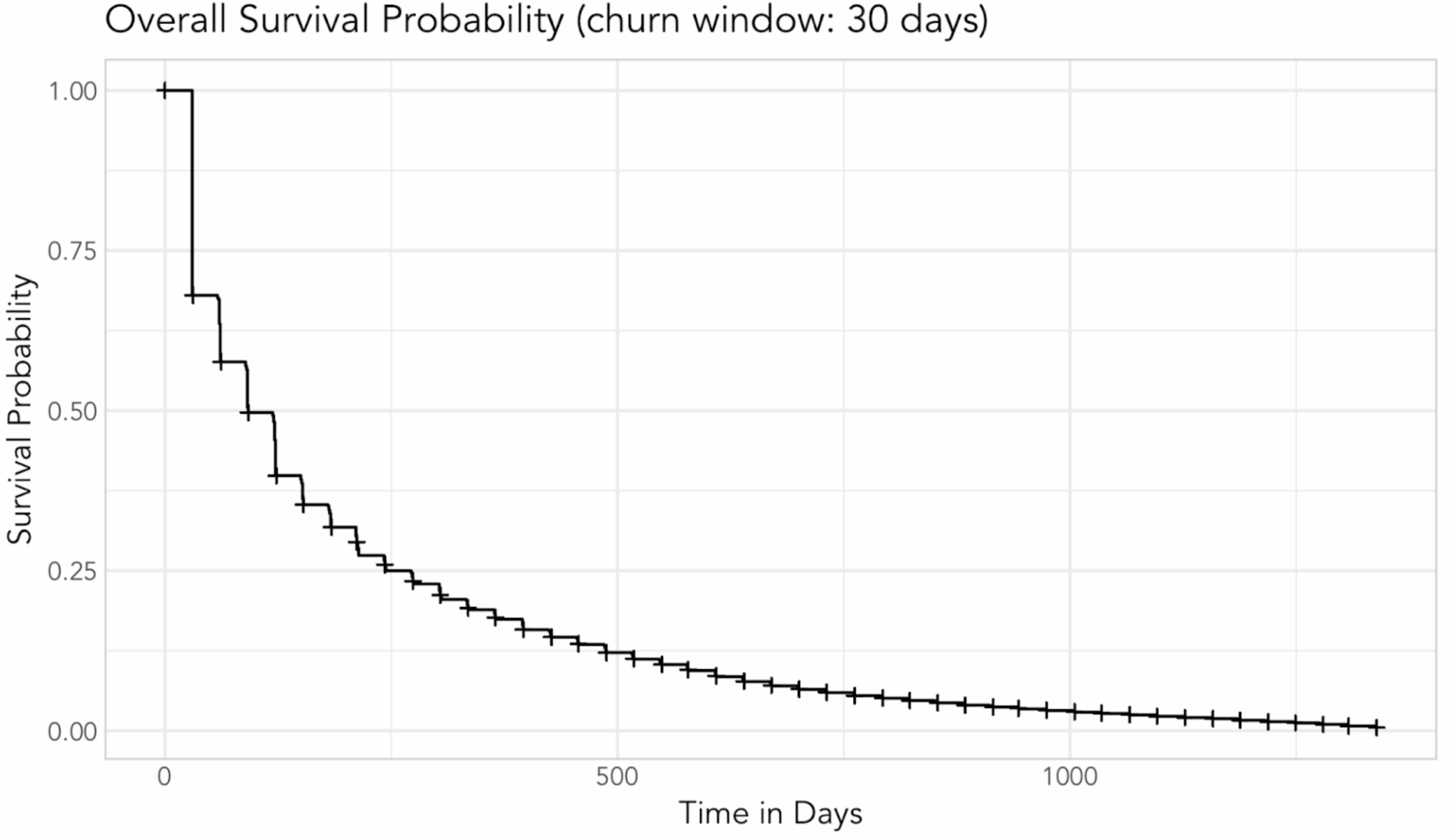
Imagine I have a new group of customers. Over time, the “bad” customers—those likely to drop—leave, while the “good” ones remain. These customers have lower drop rates, better engagement, and more predictable purchasing patterns.
```json
{
  "alt": "Graph showing overall survival probability over time in days with a churn window of 30 days.",
  "caption": "Explore how survival probability declines over time with this insightful graph, highlighting trends over a 30-day churn window.",
  "description": "This plot illustrates the overall survival probability as a function of time in days, displaying a clear logarithmic decline. The churn window is set at 30 days, adding context to the survival trends observed. The graph serves as a helpful visual for understanding retention rates, with axes labeled for probability and time. It is an essential tool for analysts looking to track changes and predict future behavior."
}
```

This decreases overall churn propensity over time, known as the shakeout effect, and results from heterogeneity among customers.

Typically, analysts use one-year windows or the entire purchase history; the timeframe can vary.

For businesses with monthly subscriptions, analyzing the window after the first 30 days is crucial. No purchases after this period often indicate churn.

When assessing overall churn probability over time, I look for trends like the one in this example.

```json
{
  "alt": "Line graph showing survival probability by first UTM medium over 1000 days, with various marketing mediums.",
  "caption": "Explore how different marketing channels impact user retention over a 30-day churn window with this insightful survival probability graph.",
  "description": "This line graph illustrates the survival probability over time by first UTM medium, with a churn window of 30 days. The x-axis represents time in days, while the y-axis shows survival probability. Various marketing channels like email, Facebook, Google, and paid mediums are color-coded for clarity. The graph provides a visual comparison of how each channel retains users over a span of 1000 days, valuable for understanding marketing impact and user behavior."
}
```

Breaking out retention rates across dimensions like UTM medium reveals heterogeneity. For example, email as a first touch shows higher retention, around 27% after 500 days, compared to Google’s 18%.

Dig deeper: How to use CRM data to inform and grow your PPC campaigns

Why should the shakeout effect matter to marketers?

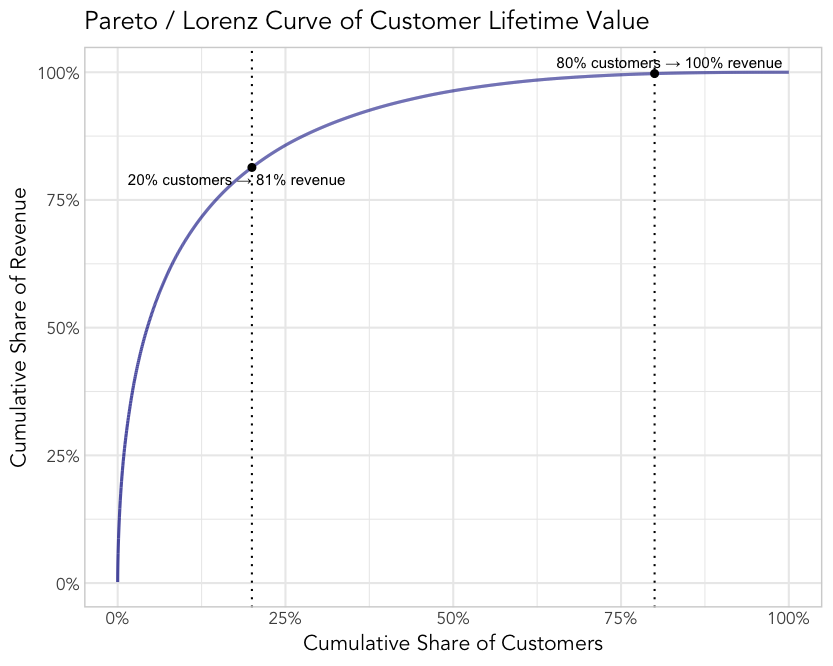
In my view, not all customers are equal in terms of CLV. Many businesses lose money on new customers who churn before achieving a CLV sufficient to cover acquisition costs.

Profitability is typically concentrated in a small segment of loyal customers.
```json
{
  "alt": "Pareto curve graph showing cumulative share of revenue vs. customers.",
  "caption": "This graph illustrates the Pareto principle in customer lifetime value, where 20% of customers generate 81% of revenue, emphasizing key income sources.",
  "description": "The image shows a Pareto/Lorenz curve of customer lifetime value. The graph plots the cumulative share of revenue against the cumulative share of customers, demonstrating that 20% of customers contribute to 81% of revenue. The curve illustrates the vital concept that a small portion of customers accounts for most of the revenue, highlighting the importance of focusing business efforts on key customer segments. The graph is labeled with percentage markers for easy interpretation and strategic planning."
}
```

If I ignore the shakeout effect and don’t analyze churn adequately, I risk overestimating long-term churn or CLV by misjudging early losses.

A strategic view incorporates the Lorenz curve and the Pareto principle—often, 80% of CLV comes from 20% of customers.

Identifying this loyal core, understanding their demographics and preferences, can generate insights to engage similar potential customers.

How to identify heterogeneity in your CRM

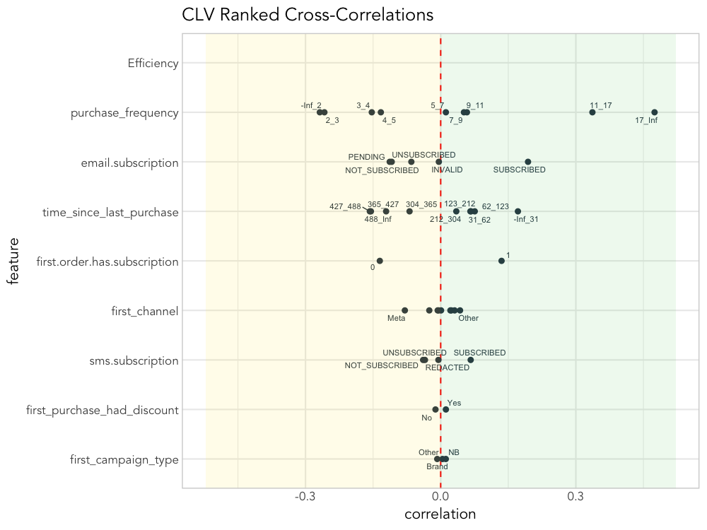
I’ve found that ranked cross-correlation analysis (RCC) is an effective way to explore CRM data and understand CLV drivers.
```json
{
  "alt": "Scatter plot of CLV ranked cross-correlations with features on y-axis and correlation values on x-axis.",
  "caption": "Explore the correlation between various features and customer lifetime value with this insightful scatter plot, highlighting key data points and patterns.",
  "description": "This image is a scatter plot illustrating CLV ranked cross-correlations. The y-axis lists features such as purchase frequency and email subscription, while the x-axis shows correlation values. Data points represent the correlation between each feature and CLV, with a vertical red dashed line indicating zero correlation. This detailed visualization aids in identifying feature impact on customer lifetime value. Keywords: CLV, correlation, scatter plot, data analysis."
}
```

Initially, I check if features in the data exhibit significant variance in CLV.

For instance, customers with above-average CLV often show frequent purchases, subscribe to newsletters, and make recent or initial product-related purchases.

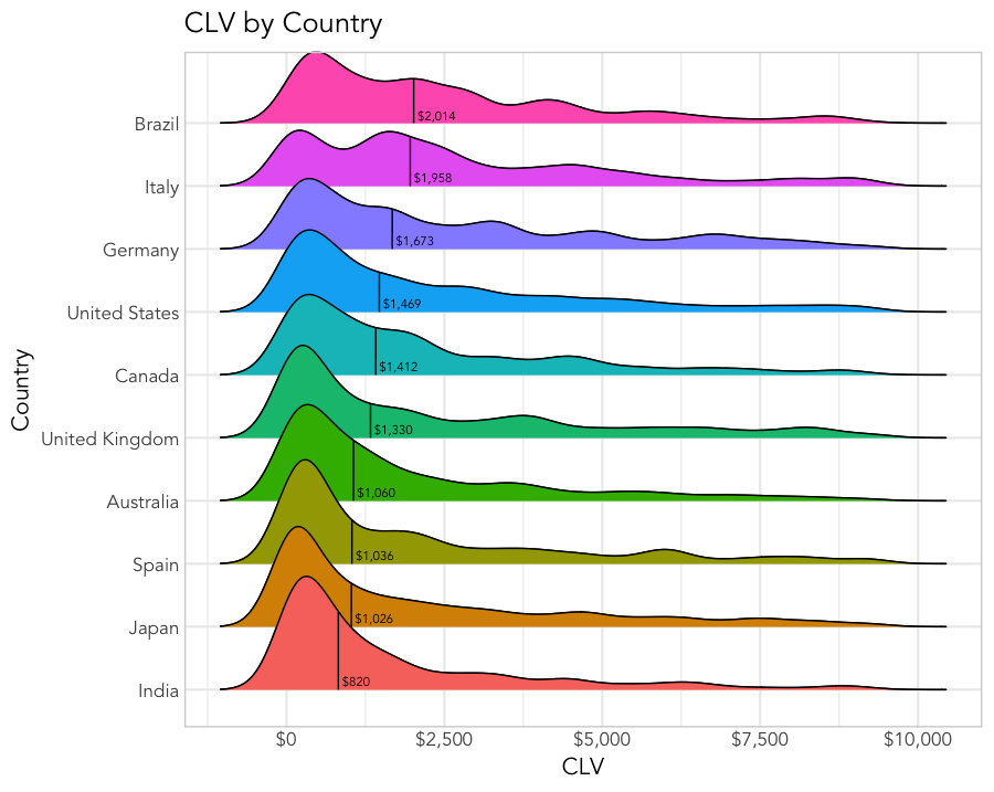
Further, I find visualizing CLV distribution by dimensions like purchase frequency and geo provides valuable insights.

For B2B, I consider job title, vertical, and account types in my analysis.
```json
{
  "alt": "Ridgeline plot showing CLV distribution by country, highlighting peak values for Brazil, Italy, Germany, and others.",
  "caption": "Dive into the global landscape of Customer Lifetime Value (CLV) across various countries, with Brazil leading and India trailing in peak CLV values.",
  "description": "This ridgeline plot illustrates the distribution of Customer Lifetime Value (CLV) across multiple countries such as Brazil, Italy, and Germany, highlighting the peak values for each. Brazil tops the list with the highest peak value at $2,014, while India shows the lowest at $820. Each country's data is color-coded for clarity, making it easy to compare and analyze the CLV trends globally. Ideal for visualizing consumer value in international markets."
}
```

Advanced statistical methods, while beyond this discussion, can further refine these insights.

Dig deeper: LTV:CAC explained: Why you shouldn’t rely on this KPI

CLV takeaways from the shakeout effect

To sum up, as a marketer, I should:

  • Account for the shakeout effect to accurately estimate CLV.
  • Use descriptive and predictive analytics to understand CLV influences.
  • Investigate core loyal segments to find similar future customers.

Inspired by this post on Search Engine Land.


crushpress.ai community screenshot

FAQs

What is the shakeout effect in CLV analytics?

Early churn filters out lower-value customers from a cohort, leaving a smaller, more stable group with higher engagement. These customers have lower drop rates and more predictable purchasing patterns.

Why should the shakeout effect matter to marketers?

Not all customers are equal in terms of CLV; profitability is concentrated in a small segment of loyal customers. Many businesses lose money on new customers who churn before achieving a CLV sufficient to cover acquisition costs.

How can you identify heterogeneity in your CRM?

Ranked cross-correlation analysis (RCC) is an effective way to explore CRM data and understand CLV drivers. Customers with above-average CLV often show frequent purchases, subscribe to newsletters, and make recent or initial product-related purchases.

What are the CLV takeaways from the shakeout?

Account for the shakeout to accurately estimate CLV. Use descriptive and predictive analytics to understand CLV influences and identify core loyal segments to find similar future customers.

Comments

Leave a Reply

Your email address will not be published. Required fields are marked *