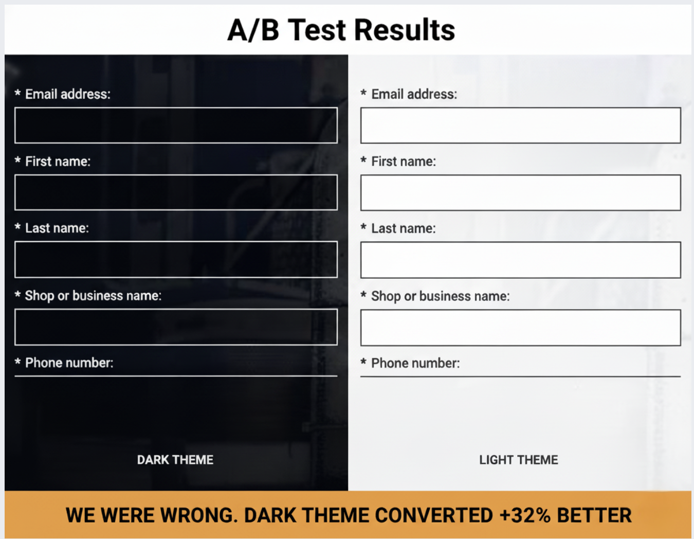
I have to admit, I was surprised when our dark-themed landing page outperformed the light one.
Everything I believed about conversion optimization suggested the light background would dominate.
Light themes are generally the norm for B2B lead generation due to their readability and clean look, aligning perfectly with accessibility standards.
Unbounce’s study of 41,000 landing pages backs up this trend for light backgrounds. Betting on the light theme seemed like a safe decision.
However, after dividing our paid traffic equally between a dark and a light landing page for our industrial fleet repair SaaS, despite a 16.62% higher CTR for the light variant, it resulted in 42% fewer conversions.
This isn’t a call for adopting dark themes universally.
Rather, it’s a case study showing how audience context and industry-specific associations can outweigh best practices drawn from broader samples.
We cater to a niche in the B2B SaaS market, particularly serving the transportation industry—businesses maintaining commercial vehicles and equipment.
Our intended audience includes shop owners and operators engaged in industrial settings, managing technicians, equipment, and demanding commercial clients.
Going into this test, my expectations were clear.
I anticipated light backgrounds would be more effective for our text-heavy lead generation pages, given their emphasis on whitespace and visual hierarchy. Our 7-field form aimed at busy shop operators seemed poised for success with light mode.
I also assumed blue CTAs would yield better results, with blue being associated with trust and security crucial for B2B software purchases. Thus, we used a blue CTA button.
I was incorrect on both fronts.
We conducted this test by isolating the visual design, directing traffic through Google Ads and Meta to two vastly different landing pages with identical copy.
The control page sported a dark theme with a black background, white text, high-contrast form fields, and a subtly outlined black CTA button. The header lacked a brand logo, intensifying the focus on the content.
Conversely, the treatment page featured a light theme, employing white and light gray elements, dark text, and a blue CTA button. Here, our brand logo was prominently placed in the header.
All other variables remained the same, emphasizing the importance of isolating design as the sole differentiating factor.
This test spanned three to four weeks, with Google Ads search campaigns topping $8,205.97, yielding 767 clicks and 30 conversions.
The light theme’s seemingly advantageous CTR masked the truth—it attracted less qualified traffic, converting at a similar or worse rate than expected.
A consistent preference for the dark theme also emerged in Meta tests, reinforcing the role of audience preference rather than algorithmic anomaly.
Understanding why the dark theme won lies in recognizing how it aligns with the psychological and environmental cues of our target audience in the industrial sector.
The dark theme resonated well with the familiarity of industrial aesthetics—functional, robust environments characterized by dark, metallic tones.
The contrast provided by white form fields on a dark background was unmistakable, drawing eye attention naturally.
Dark themes carry a tone of seriousness and value, fitting for the weighty decision-making expected in B2B software acquisitions.
Moreover, embracing familiar industry conventions, the dark interface enhanced trustworthiness and familiarity.
This test taught me that testing design psychology is just as crucial as testing visual elements themselves. Before embarking on similar experiments, consider what your design communicates to your audience rather than just aesthetic appeal.
Finally, ensure your experiments include significant contrast between variations while keeping other elements constant to draw accurate conclusions.
Audience context should guide optimization efforts more than generalized best practices. By focusing on specific audience needs and signals, I’ve learned that real, lasting optimization success can be achieved.
Inspired by this post on Search Engine Land.

Leave a Reply