Unlocking the Secrets of Google Discover Headline Formats

```json
{
  "alt": "Digital artwork depicting a cracked symbol with glowing lines connecting various colored panels and digital files.",
  "caption": "Unravel the mystery of information flow with this striking digital artwork showcasing connectivity and data transformation.",
  "description": "A visually stunning digital artwork featuring a large cracked question mark and quotation mark, symbolizing the breakdown of traditional information. Glowing lines extend from the cracks, connecting to colored panels that represent various digital entities. Behind these panels, a stream of digital files flows, illustrating the concept of data transformation and connectivity. The dark background accentuates the vibrant colors and dynamic composition, making it an ideal visual for themes of technology and information flow."
}
```

I recently delved into a fascinating study on Google Discover headline formats, looking at a staggering 3.4 million articles. The results were eye-opening and showed that a simple headline rewrite often doesn’t yield the expected lift.

You might have come across these bold statements before:

```json
{
  "alt": "Bar charts comparing mean hits per article by headline format for EN and FR languages.",
  "caption": "Discover how headline formats impact article engagement in English and French. Which format tops the list?",
  "description": "The image presents two bar charts showing the mean hits per article based on headline format for English (EN) and French (FR) languages. The formats include quote-led, quote inside, question, and statement. EN results show 'quote-led' headlines perform best with a mean of 13 hits, while 'statement' headlines have the lowest with 9.5. For FR, 'quote-led' also leads with 52.8 hits, and 'statement' headlines are at 35.7. This comparison highlights the engagement variance across different formats."
}
```
  • Quote-led headlines outperform plain declarative ones by nearly 29%.
  • Question headlines underperform both, sometimes by 24%.
  • Format drives the result: Rewrite a statement as a quote, or add that magic word, and you should expect a real lift.
```json
{
  "alt": "Bar chart showing the quote versus statement bonus in English and French publishers.",
  "caption": "The chart unveils a disparity in 'quote-led' bonuses, showcasing a significant difference between English and French publishers.",
  "description": "This bar chart illustrates the 'quote-led' bonuses, comparing English (EN) and French (FR) publishers. The vertical axis displays the bonus percentage, while the bars for English and French show a +37% and +48% raw aggregate view bonus respectively. Within the same publisher context, English displays a +3.1% and French a +5.5% bonus. A red dashed line indicates the commonly cited level of +~29%."
}
```

To put these claims to the test, I examined 1,674,518 English articles and 1,690,295 French articles from the 1492.vision Discover corpus. That’s quite a hefty sample size!

```json
{
  "alt": "Bar chart comparing percentage of publishers where quotes beat statements, with EN and FR data.",
  "caption": "Exploring the impact of quotes vs. statements: EN and FR publishers' preferences revealed!",
  "description": "This bar chart illustrates the percentage of English (EN) and French (FR) publishers who report that quotes outperform statements at the same site. Data shows EN with 31.5% and 55.9% and FR with 47.6% and 57.4%, respectively, for median and mean hits per article. The chart analyzes 324 EN publishers and 439 FR publishers, indicating a higher tendency in FR publishers to favor quotes over statements."
}
```

What I found was a deeper flaw than just numbers. It turns out that all three claims treat headline format as a leverage point for visibility. However, the data clearly shows that the impact of a headline’s format mainly reflects the publisher’s audience and the specific Discover surface used.

```json
{
  "alt": "Bar chart showing performance differences between various datasets and statement headlines.",
  "caption": "Analyzing performance: This bar chart reveals intriguing differences in question performance against statement headlines across datasets.",
  "description": "This image is a bar chart titled 'Questions: same Simpson, opposite direction.' It presents the performance of different datasets versus statement headlines, measured in percentage differences. The chart compares 'commonly cited level,' 'Our data EN raw,' 'Our data EN within-publisher,' 'Our data FR raw,' and 'Our data FR within-publisher,' showing variances ranging from -24% to +16%. Useful for understanding data evaluation and analysis discrepancies between mentioned categories."
}
```

One striking analysis was Simpson’s paradox. An anomaly that, once noticed, appeared across the entire dataset.

```json
{
  "alt": "Two line graphs showing trends in publisher quote comparison and bonus from November 2025 to May 2026 for English and French.",
  "caption": "A comparative view of publisher quotes: English vs. French from 2025-2026. Discover how quote effectiveness and bonuses fluctuate over time!",
  "description": "This image features two line graphs comparing publisher data from November 2025 to May 2026. The left graph tracks the percentage of publishers where quotes outperform statements for English (EN) and French (FR). The right graph shows the median within-publisher quote bonus across the same timeframe. For both graphs, the English data is represented in orange squares, while French data is depicted in blue circles. The graphs reflect trends and variations in quote performance by language over time."
}
```

Here’s what we’re really measuring:

```json
{
  "alt": "Bar charts showing top 10 publishers where quotes work best and hurt. BBC and IMDb lead the charts, respectively.",
  "caption": "Explore how quotes impact publishers: BBC benefits the most, while IMDb suffers, showcasing diverse media dynamics.",
  "description": "This image displays two horizontal bar charts, illustrating the effect of quotes on top publishers. On the left, BBC leads with an 85% increase in efficiency for quote usage, followed by Yahoo UK at 74%. The right side shows negative impacts, with IMDb experiencing a 54% decrease, indicating where quotes are less effective. The charts highlight the varying influence of quotes across different media platforms."
}
```

Rather than clicks from Discover, our metric is hits per article: how often an article appears across the 1492.vision fleet. This serves as a proxy for visibility.

```json
{
  "alt": "Bar chart showing top 10 French publishers where quotes work best versus hurt the most.",
  "caption": "Explore how quotes impact articles: Discover which French publishers benefit the most from quotes and which suffer, with programmertv.ouest-france.fr leading positively and madeinfoot.ouest-france.fr negatively.",
  "description": "This dual bar chart illustrates the impact of using quotes in articles across various French publishers. The left chart (in green) lists the top 10 publishers where quotes enhance article performance, led by programmertv.ouest-france.fr at +163%. The right chart (in red) shows publishers where quotes harm article performance, with madeinfoot.ouest-france.fr at -57%. Key terms include quote impact, French publishers, and article performance."
}
```

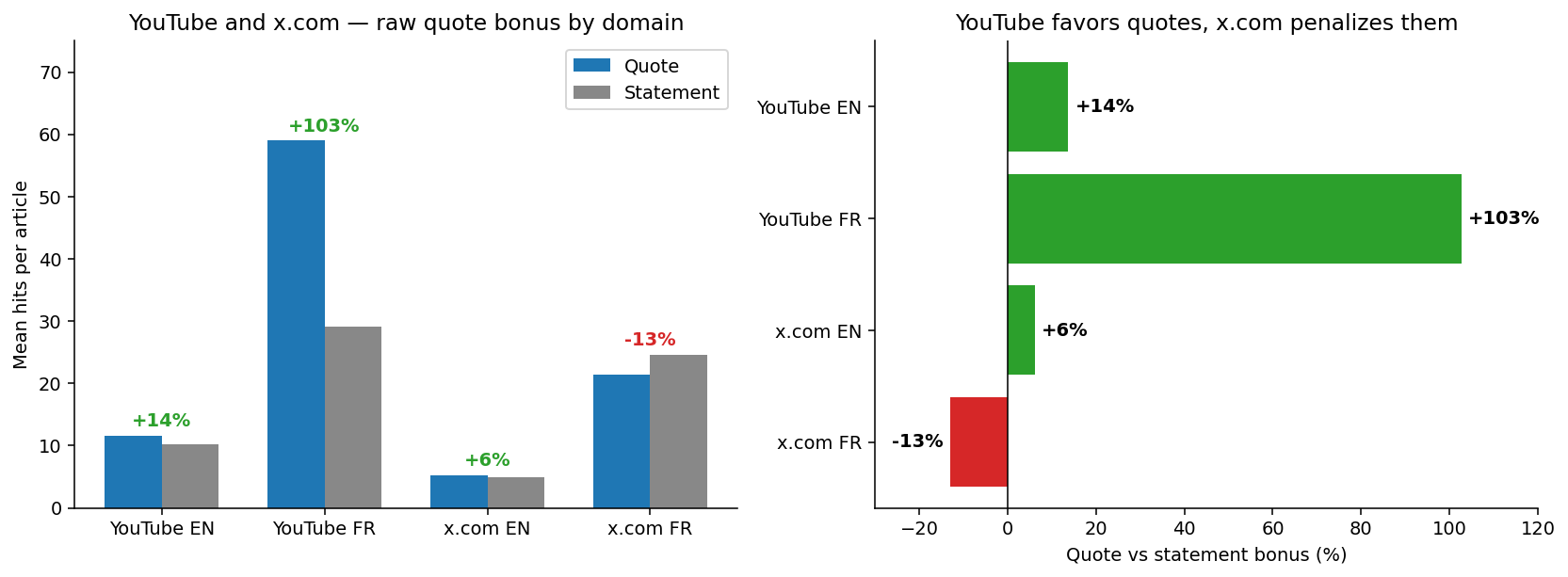
The dataset was limited to editorial articles, excluding platforms like YouTube because they have different headline norms. We’ll dive back into these at the end, as they bring more clarity than anything else.

```json
{
  "alt": "Two bar charts comparing 'Quote articles' and 'Statement articles' percentages by format for English and French pipelines.",
  "caption": "A visual comparison of English and French pipeline content formats, highlighting the distribution of Quote and Statement articles.",
  "description": "This image features two bar charts side by side, showcasing the mix of content formats in English (EN) and French (FR) pipelines. Each chart lists formats such as content, creatorcontent, paginationpanoptic, and others, with bars depicting the percentage for 'Quote articles' in blue and 'Statement articles' in gray. The charts provide a visual comparison of how content is distributed between the two types of articles across different formats."
}
```

Why is volume important? The crux of the argument depends on slicing this vast dataset by publisher, Discover surface, topic, and language while still keeping enough data in each segment for valid insights. This is where the real difference between numbers and insights, and between a genuine format effect and a statistical illusion, lies.

```json
{
  "alt": "Bar chart showing quote versus statement bonus by pipeline within publisher, with green and red bars indicating varying percentages.",
  "caption": "Explore the impact of quotes versus statements in publishing pipelines with this insightful bar chart. From freshvideos.f at +22.2% to userpersonascontent.f at -14.1%, see the shifts in median captures.",
  "description": "This bar chart illustrates the median percentage change in captures per article, comparing quotes and statements across differing publisher pipelines. Green bars show positive increases, led by freshvideos.f at +22.2%, while red bars indicate declines, with userpersonascontent.f showing a significant -14.1% drop. This visual data serves as a guide to understanding content dynamism within the publishing landscape."
}
```

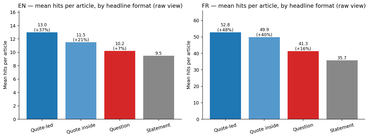
Here’s a sneak peek: when you pool all publishers together, a clear gradient appears with quote-led headlines leading the pack and statements trailing.

```json
{
  "alt": "Bar charts comparing question vs statement bonus by pipeline for English and French publishers.",
  "caption": "Explore the variations in question vs statement bonus across different pipelines for English and French publishers, revealing interesting insights.",
  "description": "This image showcases two bar charts comparing the question vs statement bonus by pipeline for English (EN) and French (FR) publishers, respectively. On the left, the English chart displays data for various pipelines such as mustntmiss.f and deeptrends.f, showing both positive and negative median changes in capture rates. The right chart shows similar data for French pipelines like c.f and mustntmiss.f, with varied capture rate changes. Green bars indicate positive changes, while red bars represent negative changes, providing a clear visual representation of performance metrics across different language-driven pipelines."
}
```

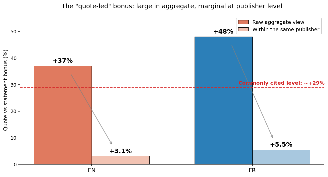
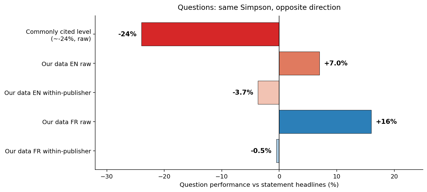
The frequently cited +29% is actually a conservative estimate for editorial pieces: quote-led headlines achieve a +37% lift in English and +48% in French. Even questions don’t lag behind as much as expected since they outperform statements to some extent (+7% EN, +16% FR).

```json
{
  "alt": "Bar charts comparing raw quote bonuses by domain for YouTube and x.com in English and French.",
  "caption": "Explore how YouTube and x.com handle quote bonuses differently across English and French domains through these insightful bar charts.",
  "description": "This image includes two bar charts analyzing the raw quote bonus by domain for YouTube and x.com. The left chart shows mean hits per article with quotes outperforming statements on YouTube, especially in French, and x.com having a penalty in French. The right chart compares quote bonuses, showing YouTube favors quotes, while x.com penalizes them. Keywords: YouTube, x.com, quote bonus, domain comparison."
}
```

Though claim 1 appears understated and claim 2 misguided at the aggregate level, these are the observations on which most headline advice leans. Let’s delve further to understand what the data is really revealing.

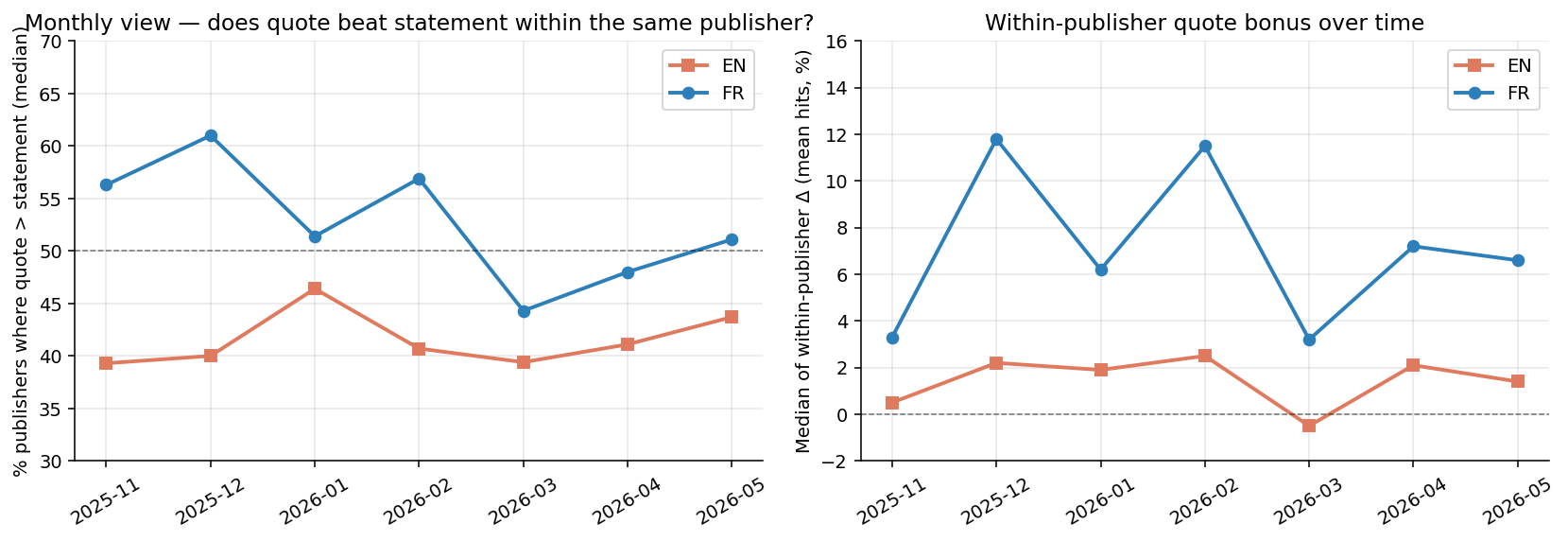
Let’s shift to the hidden aspects, starting with publishers. The raw comparison isn’t effectively between quotes and statements. It’s more about one set of publishers versus another because the publishers employing quotes often differ from those who don’t.

Some media, like celebrity-focused outlets, regional newspapers, and sites attuned to trending topics, gravitate towards quotes, and naturally earn more Discover hits compared to entities that prefer factual presentations.

This is a prime example of Simpson’s paradox: a strong trend at the aggregate level that fades or reverses when segmented into groups.

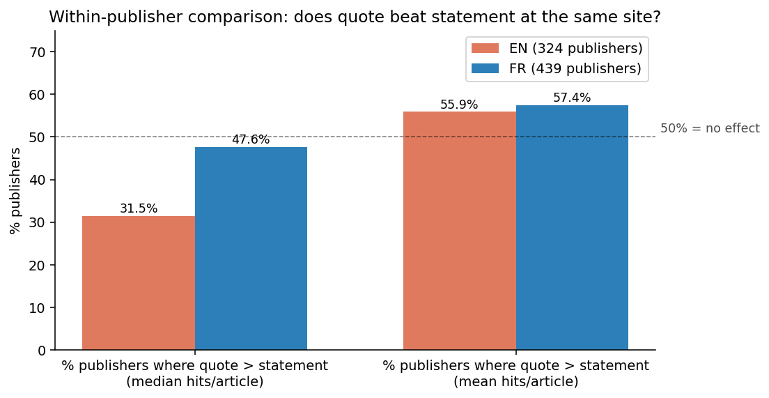
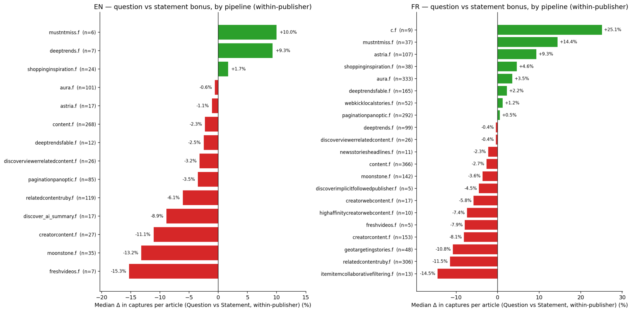
To focus on the format itself, publishers must each be their own baseline: comparing quotes with statements within the same publishing entities while controlling for audience and topic diversity.

So, the question is, how does each format fare on its own? Let me walk you through the rest of this journey as we unpack these layers.


Inspired by this post on Search Engine Land.


crushpress.ai community screenshot

FAQs

What headline formats perform best according to the study?

Quote-led headlines outperform plain declarative ones by a sizable margin. In English, they yield about a 37% lift, and in French about a 48% lift.

Do question headlines outperform statements?

Question headlines underperform both quote-led and statement formats, sometimes by around 24%.

What metric does the study use to measure visibility?

The metric is hits per article, i.e., how often an article appears across the 1492.vision Discover corpus.

How do publisher differences affect headline performance?

Publisher differences drive much of the observed effects, with Simpson’s paradox showing that a strong aggregate trend can reverse when data is grouped by publisher.

Which languages and dataset were analyzed?

The study analyzes English and French articles from the 1492.vision Discover corpus, with English and French sample sizes of 1,674,518 and 1,690,295 respectively.

Comments

Leave a Reply

Your email address will not be published. Required fields are marked *