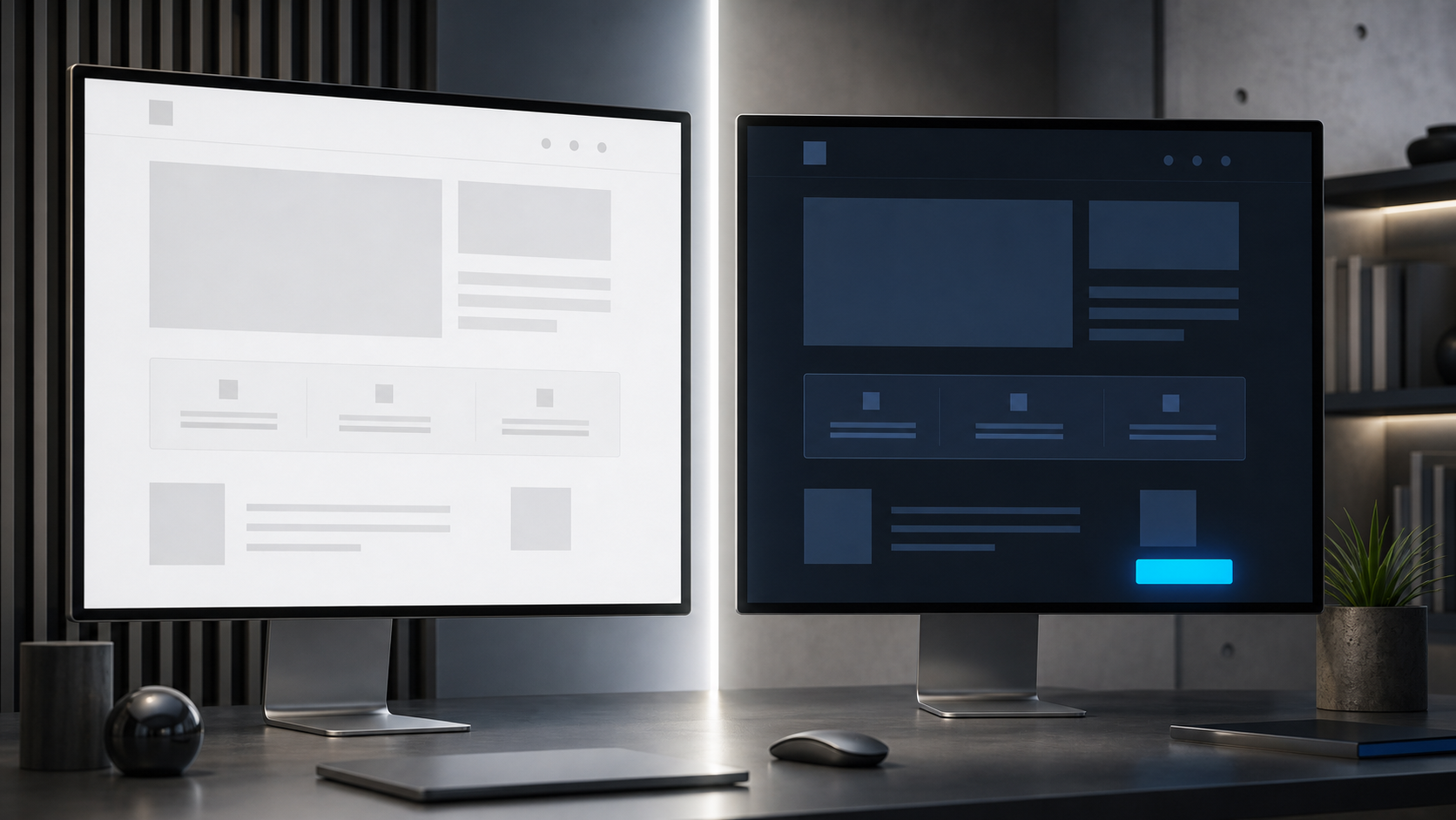
You chose a light B2B landing page because it looks clean, credible and safe. Now a darker concept feels more natural for your audience, but changing the visual system without evidence could put paid traffic and lead flow at risk.
Don’t settle the decision through taste or a generic benchmark. A dark design can outperform when it reflects the buyer’s working world, supports the right brand associations and makes the conversion path unmistakable. It can also lose when it weakens readability or merely follows a design trend. The useful question is not whether dark pages convert better. It is whether a dark page communicates your particular offer better to your particular buyer.
A dark theme is a hypothesis, not a best practice
One industrial fleet-repair SaaS experiment sent paid traffic evenly to dark and light landing pages with identical copy. During a three-to-four-week Google Ads search run, the campaigns spent $8,205.97 and produced 767 clicks and 30 conversions. The light variant recorded a 16.62% higher click-through rate, yet it generated 42% fewer conversions. Meta testing also favored the dark direction.
That is meaningful evidence that audience context can overturn a common design default. It is not evidence that dark backgrounds are universally better for B2B. The result belongs to a specific market, offer, traffic mix and page treatment. A finance buyer working in spreadsheets, a healthcare administrator reviewing compliance software and a commercial shop operator surrounded by equipment do not necessarily interpret the same visual language in the same way.
The industrial audience provides a plausible explanation for the result. Dark and metallic tones were familiar within the buyers’ operating environment. The visual treatment could communicate durability, seriousness and functional value, while white form fields against the dark background created an obvious destination for attention. Those explanations are useful mechanisms to test, but they are not independently proven causes.
Consider a dark concept when it has a defensible connection to the buyer’s environment or expectations. Do not choose it because your design team prefers it, because a competitor uses it or because dark interfaces currently look modern. If you cannot complete the sentence, “This treatment should work for this audience because…”, you do not yet have a testable rationale.
Translate audience context into a design hypothesis

A buyer persona containing a job title and company size will not tell you whether to use a black background. You need to examine the context in which the buyer works, the visual conventions of the category and the meaning your page must convey at the moment of decision.
- Inspect the working environment. Look at the equipment, materials, interfaces, documents and spaces your buyer encounters every day. Record recurring colors, textures and levels of visual density.
- Identify category signals. Decide which visual cues already mean dependable, technical, premium, efficient or familiar to this audience. Separate useful conventions from competitors’ arbitrary styling.
- Define the decision state. A buyer urgently trying to restore an operation may need a forceful, obvious path to action. A committee comparing a complex platform may need more reading comfort and visible evidence.
- Name the conversion target. Decide whether the design must direct attention to a form, demo request, pricing path or another action. Contrast should support that target rather than decorate the page evenly.
- Document the risk. Write down what the treatment might accidentally communicate, such as low readability, consumer entertainment, excessive luxury or a lack of transparency.
Turn those observations into one sentence before anyone opens a design tool: “For this audience in this context, this visual system will make the offer feel more familiar and the action easier to locate, increasing completed lead forms.” That statement gives you an audience, a proposed mechanism and a measurable outcome.
For commercial shop operators, the hypothesis might connect an industrial palette with familiarity and seriousness, then connect high-contrast fields with easier form discovery. For another audience, the same palette could create distance or make a text-heavy evaluation harder. Design psychology should generate the hypothesis; observed behavior should decide whether you keep it.
Dark is not the same as accessible
White text on a dark background does not make a page accessible by itself. Check body copy, headings, links, field labels, entered text, borders, keyboard focus, validation errors and disabled states. A form can appear high-contrast at a glance while still hiding field boundaries or error messages from someone trying to complete it.
Run the same checks on the light version. Accessibility is not a reason to assume one theme will win; it is a requirement both variants must satisfy before their conversion results are worth comparing. If one treatment is difficult to read or operate, you are testing usability failure against a functional page, not audience preference.
Decide whether you are testing a theme or a design system
The most important methodological distinction is easy to miss. A broad concept test tells you which complete experience performs better. An isolation test tells you whether one component caused a difference. Both are legitimate, but they answer different questions.
In the industrial SaaS experiment, the copy stayed constant, but several visual elements changed together. The dark version used a black background, white text, prominent white form fields, a subtly outlined black call-to-action button and no header logo. The light version used white and gray surfaces, dark text, a blue button and a prominent header logo. The experiment therefore showed that one complete design treatment beat the other. It did not establish that the background color alone produced the conversion difference.
Use a concept test to choose a direction
A concept test is appropriate when you need to choose between substantially different visual systems. Make the alternatives different enough to express distinct hypotheses, but preserve the underlying commercial proposition.
- Keep the offer, copy, form fields, call-to-action wording and post-submit experience unchanged.
- Define each visual system in advance, including its background, typography, field treatment, button styling, imagery and brand presence.
- Send the same audience and advertising promise into a stable random assignment. An even split is useful when traffic permits it.
- Record the assigned variant, landing-page visit, form completion and any downstream lead-quality outcome.
- Name the primary success metric before launch. Do not promote whichever metric looks favorable after results arrive.
- Plan the required sample using your normal test method and expected conversion rate. Do not borrow the three-to-four-week duration from another campaign as a universal stopping rule.
- Review the overall result first. Treat source, device or audience-segment differences as follow-up hypotheses unless the original test was designed to evaluate them.
This approach answers a practical production question: which page should receive traffic? It does not tell you which ingredient inside the winner mattered most.
Use isolation tests to find the cause
Once a concept wins, clone it and test its components deliberately. You might compare logo presence, form-field contrast or button treatment in separate experiments. If your claim is specifically about dark versus light, keep the logo, layout, field count, copy, button wording and promotional promise the same. Treat the foreground and background palette as the variable, while ensuring both versions remain readable and operable.
This two-stage sequence prevents an attractive but unsupported conclusion. A dark concept may win because of its field contrast, its reduced header distraction, its overall tone or an interaction among those elements. Selecting the winning bundle is still valuable. Naming the cause requires another test.
Do not let click-through rate choose the landing page

Click-through rate measures behavior before the visitor experiences the landing page. Unless the page design is visible in the ad creative, a user cannot react to its theme before clicking. A variant-level CTR difference should therefore trigger a review of traffic assignment, campaign delivery and tracking. It should not automatically be credited to the landing-page palette.
The industrial SaaS result makes the practical danger clear: the light treatment’s CTR was 16.62% higher while its conversion count was 42% lower. Choosing the page on CTR alone would have favored the upstream metric and ignored the action the landing page existed to produce.
| Metric | What it answers | How to use it |
|---|---|---|
| Ad click-through rate | Did the ad and its targeting earn a click? | Use it to diagnose traffic acquisition, not to declare a landing-page theme the winner. |
| Landing-page conversion rate | What proportion of landing-page visitors completed the intended action? | Use it as the primary page metric when a form completion is the immediate objective. |
| Qualified lead rate | What proportion of visitors became leads your business considers usable? | Use it to catch variants that generate more forms but poorer-fit prospects. |
| Cost per qualified lead | How much media spend produced each usable lead? | Use it when deciding which experience should receive budget. |
Also distinguish conversion volume from conversion rate. If variants receive different numbers of visitors, raw form totals cannot make a fair comparison on their own. Use the actual visitor count assigned to each experience. And do not describe one page’s leads as better qualified merely because it generated fewer clicks and more forms; lead quality requires downstream evidence such as acceptance, sales progression or another definition your team applies consistently.
Key takeaways
- Do not adopt dark mode as a general conversion rule. Use it when you can connect the treatment to a specific audience context and buying task.
- Write the proposed mechanism before designing: identify what the theme should communicate, where it should direct attention and which outcome should change.
- Choose between a broad concept test and an isolated variable test. A bundle can select a production winner, but it cannot prove which component caused the result.
- Keep the offer, copy, form requirements and traffic assignment controlled. Make both variants accessible enough that usability failure does not decide the experiment.
- Treat ad CTR as an acquisition diagnostic. Judge the landing page by visitor conversion and, where available, qualified lead or business outcomes.
- Use a winning concept as the start of component testing, not as permission to declare that all B2B audiences prefer the same theme.
Your next move is simple: create two annotated mockups and label the audience signal each important choice is meant to send. Decide whether you need a concept winner or an explanation of one component, then write down the primary metric before traffic begins. If dark wins, isolate the elements that may have produced the lift. If light wins, revise the audience hypothesis rather than forcing the aesthetic. Either outcome replaces an assumption with something you can use on the next campaign.
Leave a Reply