Tag: Accessibility

  • How to Control Accessibility Risk in AI-Generated Websites

    How to Control Accessibility Risk in AI-Generated Websites

    Your AI-built page renders cleanly, the form submits, and the structured data validates. None of that tells you whether a customer can navigate it with a keyboard, understand it through a screen reader, or recover from an error without sight.

    The practical decision isn’t whether to use AI. It is whether your team treats AI output as an untrusted draft or as proof that a page is ready. A reliable process keeps the speed while putting human usability, measurable acceptance criteria, and release authority around it.

    AI scales familiar accessibility failures

    AI-generated experiences do not need exotic defects to exclude people. The persistent failures are ordinary: low-contrast text, images without useful alternative text, form fields without labels, links and buttons without accessible names, and pages that do not declare their language.

    The 2026 WebAIM Million report found detectable accessibility failures on 95.9% of the top one million homepages, averaging 56.1 errors per page. The number of detected errors increased 10.1% after six consecutive years of improvement. At the same time, the average homepage grew to 1,437 elements, 22.5% more than a year earlier and nearly twice the 2019 count.

    Those numbers do not prove that AI alone caused the increase. They do show the environment in which AI tools now operate: complex pages, rapid production, and recurring defects embedded in the examples that code generators can reproduce. When one flawed component is reused across a navigation system, form builder, landing-page template, or personalization layer, the problem scales with it.

    The hardest failures are often invisible in a visual review. An empty button can still have a polished icon. A field can appear to have a label even when the label is not programmatically connected to it. A modal can look correct while trapping keyboard focus. A validation message can be bright red yet never be announced by assistive technology.

    This is where SEO and AI-optimization teams need a precise distinction. Machine-readable is not the same as human-operable. Valid JSON-LD, descriptive metadata, crawlable text, and clean schema relationships cannot make an inaccessible checkout, lead form, menu, or account flow usable. Treat accessibility as a property of the rendered experience, including every interactive state, rather than another item on a technical SEO validation report.

    Make accessibility a release gate, not a prompt adjective

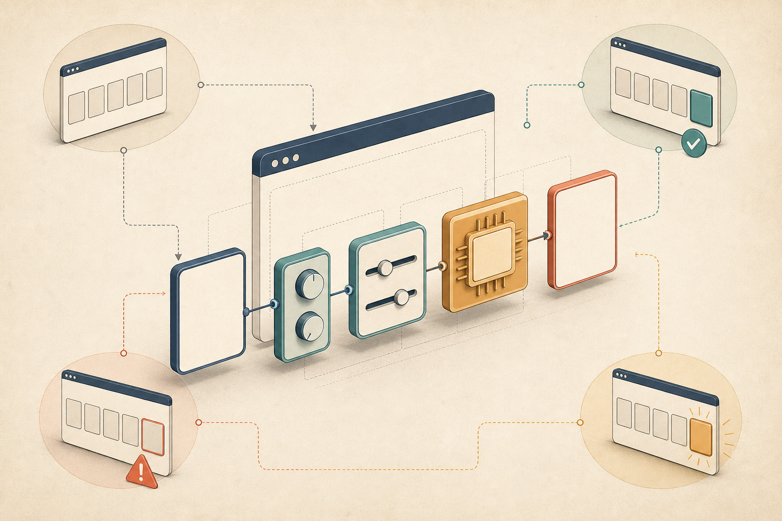
    Three reviewers test an unlabeled website interface with a keyboard, headphones, braille display, and mobile device before a closed release gate.

    Adding the word accessible to an AI prompt can improve the direction of an output. It cannot certify the result. The prompt is an instruction; the release gate is the evidence that the instruction was followed.

    Define what ready means before generation starts

    Your acceptance criteria should describe observable behavior. They should apply to the initial page and to the states created after a person opens a menu, submits incomplete information, changes a filter, launches a modal, or receives a success message.

    Release layerWhat to verifyReason to stop publication
    Page structureDocument language, meaningful headings, semantic regions, and native controls where availableStructure or reading order does not convey the same meaning as the visual layout
    Content and perceptionRequired contrast, useful image alternatives, understandable instructions, and information that is not conveyed by color aloneA person cannot perceive essential content or distinguish a required state
    Forms and controlsConnected labels, descriptive control names, instructions, validation, and error recoveryA field or action is unnamed, ambiguous, or impossible to correct
    Keyboard behaviorLogical focus order, visible focus, activation, backward navigation, and a way to leave overlaysA task traps focus, hides focus, or requires a pointer
    Dynamic behaviorChanges in state, expanded or collapsed controls, loading, errors, and completion feedbackImportant changes are visible but not exposed to assistive technology

    Set the applicable accessibility requirement with a qualified specialist before you turn this table into a formal conformance gate. Legal obligations, contractual commitments, and technical standards can differ by market and product. The table is an operational starting point, not a legal opinion or a substitute for a conformance assessment.

    Give the generator constraints it can act on

    An effective generation brief names the behavior you expect and asks the model to expose uncertainty. Include requirements such as these:

    • Use semantic HTML and native links, buttons, inputs, and headings before creating custom interactive elements.
    • Give every interactive control a clear accessible name that describes its action or destination.
    • Connect each form field to its label, instructions, required state, and error message.
    • Make the complete task operable by keyboard, with a logical order and visible focus.
    • Provide meaningful alternative text for informative images and handle decorative images so they do not create noise.
    • Declare the document language and preserve a meaningful heading hierarchy.
    • Do not use color, position, shape, or animation as the only way to communicate information.
    • List any requirement the generated output cannot verify without browser testing or human review.

    That final instruction matters. It separates code generation from verification and makes unsupported assumptions visible before they become release assumptions.

    Put the same constraints into your component specifications, CMS templates, design-system documentation, and definition of done. A good one-off prompt cannot compensate for a shared component that keeps producing empty buttons or disconnected labels.

    Test the journeys an automated scan cannot complete

    Two usability participants test abstract web forms using a braille display, keyboard, headphones, and an adaptive switch while a researcher observes.

    Automated inspection is valuable because it can cover many pages quickly and catch repeatable markup problems. It is not an end-to-end usability test. AudioEye estimates that automated tools can detect about two-thirds of accessibility issues and automatically fix about half of the issues they detect. Because that is a vendor-supplied estimate rather than a universal benchmark for every tool and website, use it as a warning about coverage limits, not as a guaranteed detection rate.

    Use four complementary checks:

    1. Run automated inspection across templates and states. Scan more than the public URL. Include opened menus, validation errors, filtered results, modals, account states, and any page variation inserted by your CMS or personalization system.
    2. Complete the task with a keyboard. Start before the first control, move forward and backward, activate every required action, and confirm that focus remains visible and predictable. Verify that overlays can be closed and that focus returns somewhere sensible.
    3. Complete the task with assistive technology. Check whether headings describe the page, controls have useful names, expanded and selected states are communicated, fields have connected instructions, and errors are announced at the point where the user needs them.
    4. Review meaning with a person. Automation can detect a missing text alternative more easily than it can judge whether the supplied text communicates the image’s purpose. The same distinction applies to generic link text, unclear instructions, confusing heading order, and technically present but unhelpful labels.

    Do not begin with a random sample of low-impact pages. Start with the journeys whose failure blocks a result: purchase, lead submission, registration, authentication, search, account management, and support. Then test the shared header, navigation, cookie controls, forms, and modal components that appear across many URLs. Fixing the reusable component reduces recurrence; patching individual generated pages leaves the underlying production fault in place.

    For each journey, write the task in plain language before testing. For example: find a product, choose an option, add it to the cart, correct an invalid field, and finish checkout. A pass means the person can complete the entire task and understand the result. A clean scan on the opening screen is not a substitute.

    When a failure appears, prioritize it by consequence and reach:

    1. A blocker that prevents a person from completing a critical task.
    2. A defect in a shared component that affects many pages or states.
    3. A serious information or error-recovery failure that can produce a wrong action.
    4. An isolated content defect on a high-traffic or high-intent page.
    5. A lower-impact issue that does not block the task but still needs a named owner and deadline.

    Do not suppress a scanner warning merely to improve a dashboard score. Resolve it, document why it does not apply, or have someone qualified review the ambiguity. The goal is a usable journey, not a smaller count.

    Make ownership and evidence visible

    Accessibility fails operationally when everybody can influence the experience but nobody can stop its release. Assign responsibility at the point where each type of defect enters the system:

    • The requester or marketer owns the brief, content clarity, image intent, link purpose, and acceptance criteria.
    • The designer owns contrast choices, focus treatment, interaction states, responsive behavior, and the visual presentation of errors.
    • The developer or platform owner owns semantic implementation, keyboard behavior, programmatic relationships, dynamic state, and regression fixes.
    • A qualified accessibility reviewer performs the manual and assistive-technology checks that automation cannot settle.
    • The release owner has explicit authority to block publication or record a time-bound exception with its risk, owner, and remediation date.

    One person may hold several of these roles in a small team. The important part is that none of them remain implied.

    A purchased tool is not evidence that a journey works

    AudioEye’s 2026 litigation analysis reports that U.S. digital accessibility lawsuits doubled from 2020, with 26,253 combined federal and state claims filed in 2025. Ecommerce accounted for 78% of the cases in its dataset. More revealingly, 38.5% of companies facing claims already had an accessibility tool in place.

    That does not show that accessibility tools increase litigation risk. It shows why buying a tool, installing a badge, or reporting a partial score should not be confused with verifying a working experience.

    Partial coverage can also be a weak legal position. On June 4, 2026, a French court ordered Carrefour to bring its website and app to full accessibility conformance within six months, rejecting claimed conformance levels of 50% to 70% as a defense in that case. The ruling is jurisdiction-specific; it is not a universal interpretation of every accessibility law. If you need to determine your legal obligations or exposure, involve qualified accessibility professionals and legal counsel familiar with each market in which you operate.

    Report outcomes, not just defect totals

    An issue count is useful for triage, but it can hide severity. One unnamed checkout button can matter more than many low-impact warnings on an informational page. Put these measures beside the marketing and product metrics your team already reviews:

    • Critical journeys tested and the states covered in each test.
    • Blocking defects, affected templates, and affected business actions.
    • Repeated defects traced to shared components or generation instructions.
    • Open issue age, named owner, target date, and retest status.
    • Regressions found after CMS, component, campaign, or personalization changes.
    • Conversion, completion, abandonment, and bounce metrics for remediated high-traffic pages.

    Record the page or component version, test date, automated tool, manual scenarios, reviewer, results, and fixes. That history helps you distinguish an isolated content mistake from a systemic production problem. It also gives the next release team a known test set instead of forcing them to rediscover the journey.

    If you compare conversion before and after remediation, avoid claiming that accessibility alone caused the change when traffic mix, campaign creative, pricing, or other page elements also changed. Use a controlled test where practical, or annotate the competing changes. Accessibility should not need an immediate conversion lift to justify removing a barrier, but weak attribution will not help you secure lasting operational support.

    Key takeaways

    • Treat AI-generated code and content as drafts until the rendered journey passes defined accessibility checks.
    • Test interactive states and task completion, not only the opening screen or public URL.
    • Combine automated coverage with keyboard, assistive-technology, and human meaning reviews.
    • Fix shared components and generation constraints before patching the same defect page by page.
    • Assign a release owner who can block publication and require evidence of retesting.
    • Do not treat a tool, badge, issue score, or partial conformance percentage as proof that customers can use the experience.

    Start with the next high-consequence page in your production queue. Write down the three tasks a visitor must complete, name the person who will test them without relying on a mouse, and reserve time to fix the shared component if one fails. Do that before publication, then carry the same gate into every AI-assisted template. That is how accessibility becomes part of production rather than an emergency after launch.

    References


  • Multi-Location SEO Page Architecture That Scales Cleanly

    Multi-Location SEO Page Architecture That Scales Cleanly

    Your location URLs keep multiplying, but rankings, calls and visits are not. Launching another city page may look like the quickest way to reach a new market, yet excess geographic pages can make your own URLs compete, divide authority and contradict one another.

    A durable architecture works in the opposite direction. You represent the places where the business actually operates, give every page a distinct customer job and publish the smallest set of geographic URLs that can do those jobs well. Here is how to design that system, evaluate proposed city pages and clean up an existing footprint without discarding useful local information.

    Map the operating footprint before choosing URLs

    Hands arrange branch, service-area and customer markers on an unlabeled layered regional map.

    Start with the business, not a keyword export. Build a working inventory of facilities, teams, services and markets before deciding what belongs under /locations/. This prevents a common category error: treating every place name as evidence of a separate local entity.

    Your inventory should record:

    • Every customer-facing facility, including its official name, address, hours and primary contact path.
    • The staff or team responsible for each facility and market.
    • The services actually available at each location, rather than the complete company-wide service list.
    • The regions used operationally by the business, such as states, metro areas or franchise territories.
    • The communities each facility or field team can genuinely serve.
    • Material local differences, including access, logistics, regulations, delivery conditions or customer procedures.
    • The person or system responsible for keeping each local fact accurate.

    Then classify each geographic concept. A physical facility, a regional market, a service area and a city the company wants to rank in are not interchangeable.

    Operating realityCustomer needDefault architectural response
    Customer-facing facilityConfirm where it is, when it is open, what it offers and what visiting involvesCreate an authoritative location page
    Region containing multiple facilitiesUnderstand the brand’s presence and choose the appropriate facilityCreate a regional hub only when it materially helps that choice
    Service area reached by a facility or field teamConfirm coverage and understand how service is deliveredExplain it on the responsible location or service page unless the market has enough distinct substance for an exception
    City the business wants to rank inDiscover a relevant providerTreat it as a marketing objective, not an automatic page type

    Service-area settings in Google Business Profile should not determine this map. Adding a city to a profile does not require a city landing page, and publishing a page does not create a physical presence there. The website must remain honest about whether customers visit you, you travel to them, or both.

    At the end of this exercise, every proposed page should point back to an operating fact. If all you can point to is search volume, you have found a keyword opportunity, not yet a reason for a new URL.

    Build a hub-and-spoke system around customer decisions

    Most multi-location sites need a central locations directory connected to regional or individual location pages. The depth depends on the business. A larger network might use /locations/, /locations/pennsylvania/ and /locations/pennsylvania/philadelphia/. A smaller regional company might need only /locations/ and /locations/philadelphia-pa/. Neither folder pattern is inherently more optimized; the useful pattern is the one that mirrors the real hierarchy without inserting empty layers.

    The main locations hub helps people orient themselves

    The hub should explain the overall footprint and help a visitor reach the right facility. A map, postcode search or location finder can improve the experience, but it should complement a crawlable directory rather than replace it. Include direct links to important regional and location pages so people and crawlers can navigate the footprint without operating an interactive widget.

    Organize that directory in the way customers choose: by region, proximity, service availability or another real decision factor. Do not add state and city levels merely to make the URL look comprehensive.

    Regional hubs resolve a choice between facilities

    A regional page earns its place when it helps someone understand a meaningful market or compare several facilities. It can describe the coverage model, identify available locations, clarify material differences and send the visitor to the correct next page.

    A region with only a heading, generic brand copy and links to a single destination is an unnecessary layer. Link the main hub directly to the location unless the regional URL has a durable job of its own.

    Location pages represent real facilities

    A location page is more than an organic landing page. It is the business’s authoritative digital representation of that facility. Someone arriving from search, navigation, an AI answer or a shared link should be able to confirm that the place is real and decide what to do next.

    Include the local facts that change the decision:

    • Official location name, address, contact details and opening hours.
    • Services available at that facility, with links to the relevant service pages.
    • Local staff or team information when it helps customers know whom they will deal with.
    • Directions, arrival instructions and recognizable local context.
    • Parking, entrances, mobility access and other accessibility details.
    • What happens after the visitor calls, books or arrives.
    • A conversion action appropriate to that facility, such as calling, booking, requesting service or getting directions.

    Do not manufacture superficial rewrites merely to achieve an arbitrary uniqueness percentage. Accurate service descriptions, brand language and booking instructions may need to recur. The decisive question is not whether some copy is shared, but whether the page has a distinct reason to exist. Its differentiation should come from local reality, not a thesaurus.

    Service and location pages answer different questions

    A service page explains what the company offers. A location page explains where and how customers receive it. Keep both roles intact and connect them deliberately:

    • From a location page, link only to services genuinely available there.
    • From a service page, help the customer find the facilities or teams that provide it.
    • From a regional hub, link to the facilities contained in that market.
    • From the main hub, expose the regional or location pages that form the real operating hierarchy.

    A service-area page is a controlled exception within this system. It may be justified when the market has a dedicated team, distinct logistics, local regulatory conditions or substantial project experience that cannot be handled properly on an existing page. Willingness to drive into a city is not enough.

    Make every proposed geographic page pass an evidence test

    Keyword demand can reveal an audience, but it cannot tell you whether that audience needs a separate destination. Before approving a geographic page, require the requester to answer these questions in writing:

    • What customer task will this page complete? The answer should be more specific than ranking for a city term.
    • What real operation does it represent? Name the facility, team, territory, logistics model or other business fact behind it.
    • Why can’t an existing page satisfy the same intent? Identify the gap instead of assuming a new URL is the cure.
    • Which facts are genuinely local? Look for distinct staff, services, access, regulations, logistics, projects or customer expectations.
    • Does it lead to a meaningful local action? The conversion path should match how the business serves that market.
    • Where does it belong in the hierarchy? Define its parent page and the service, regional or location pages that should link to it.
    • Who will maintain it? A page containing hours, services or team details needs an accountable owner.
    • Would its purpose survive if you removed the city name from the draft? If nothing substantive remains, you probably have a keyword variant rather than a useful page.

    The physical-location question carries the clearest answer: a real customer-facing facility generally warrants a location page. A service-area proposal needs stronger operational evidence because the place name alone does not represent a separate entity.

    Consider a field team that leaves from one facility and serves surrounding communities with the same staff, services, process and booking path. A separate page for every community would mostly change the city name while funneling every visitor to the same operation. The better answer is usually one strong facility or service page that clearly explains its coverage.

    Now consider a market with its own team, different delivery constraints, local rules and a body of market-specific work. That page can answer questions the parent location page cannot. It has an operational identity and a customer job, not merely a keyword.

    This distinction also keeps the site away from a doorway-like pattern. Pages become risky when they target closely related queries, offer little market-specific value and send visitors toward the same destination. Not every weak city page constitutes doorway abuse, but a large collection of near-identical funnels is poor architecture even before policy becomes the concern.

    Consolidate geographic bloat without erasing useful local value

    A maze of similar doorways merges into a central hall leading to a few distinct local spaces.

    Geographic sprawl usually accumulates through individually plausible decisions: a city-keyword project, neighborhood pages around a branch, a franchise microsite or a replacement URL structure that leaves the old one intact. The result is often an architecture that no team fully owns.

    Do not begin the cleanup by changing folders or deleting low-traffic pages. Begin with a complete URL inventory and group pages by the intent they satisfy, the operation they represent and the conversion destination they use.

    1. Find every geographic URL. Combine CMS exports, XML sitemaps, crawl data, navigation links and known campaign landing pages. Include orphaned pages that are still indexable even if they no longer appear in menus.
    2. Record evidence before making changes. Capture each page’s business entity, target intent, organic landing activity, conversions, internal links, external links and current indexation status. This keeps a quiet but useful customer page from being mistaken for dead weight.
    3. Cluster overlapping pages. Put URLs together when they answer the same geographic query, represent the same facility or team, and send visitors to the same conversion path. Similar titles alone are not enough; compare the job each page performs.
    4. Assign a disposition. Keep a page with a clear, durable job. Merge pages whose useful information belongs on one authoritative destination. Repurpose a page only when a genuine uncovered customer need exists. Retire a URL that has no distinct entity, intent or maintained value.
    5. Select the surviving destination by utility. The winner should best represent the real operation and satisfy the visitor, even if another duplicate happens to have the preferred slug. Traffic is evidence to consider, not a substitute for architectural logic.
    6. Preserve worthwhile local information. Move accurate directions, accessibility details, team information, service availability or project context to the surviving page before retiring a duplicate.
    7. Redirect deliberately. When content has a relevant replacement, use a permanent redirect to that destination. Do not send every retired city URL to the homepage; that breaks the geographic intent instead of resolving it.
    8. Update the system around the URL. Change internal links, navigation, directory listings, canonical references and XML sitemaps so they point directly to the surviving page rather than through a redirect.
    9. Verify the result. Crawl the revised section, test important customer paths and watch indexation, landing-page activity and conversions for unexpected losses or lingering duplicate URLs.

    A page should not be removed merely because it attracts little organic traffic. Location pages also help customers verify a facility, understand the visit and take action. If the page serves that role well, improve its discoverability and local facts rather than judging it as a failed keyword landing page.

    Add governance so the bloat does not return

    A cleaner tree will expand again unless page creation has an owner and an approval rule. Use a short request record for every new geographic URL. It should name the page type, operating entity, customer job, parent page, market-specific evidence, conversion path and maintenance owner.

    Maintain one dependable business-data record for addresses, hours, contacts, services and local ownership. Templates can then reuse stable brand and service information while pulling the local facts that make each facility accurate. This is more valuable than asking writers to disguise duplication with cosmetic wording changes.

    When the business opens, closes, relocates or changes what a facility offers, update that record and its dependent pages as one operational task. Architecture is not finished when URLs launch; it succeeds when the site can remain correct as the footprint changes.

    Key takeaways

    • Build the location tree from facilities, teams, services and real markets before using keyword demand to refine it.
    • Treat physical locations, regional markets, service areas and desired ranking cities as different concepts.
    • Use regional hubs only when they help customers understand a market or choose among multiple facilities.
    • Make each location page the authoritative customer resource for its facility, including services, hours, staff, directions, access and next steps.
    • Approve service-area pages only when distinct operations or market-specific information give them a durable customer purpose.
    • Consolidate pages that satisfy the same intent and lead to the same operation, then redirect and update internal signals deliberately.
    • Require a business owner and maintenance plan for every geographic URL.

    If you take one action this week, freeze new city-page requests long enough to build the operating-footprint matrix. Place every current and proposed URL beside the facility, region, team or service condition that justifies it. The blank rows will show you where keyword ambition has outrun business reality.

    Start cleanup with the clearest overlap, preserve the information customers still need and give the surviving page a single accountable owner. A leaner location system will not manufacture local relevance, but it will make the relevance you genuinely have easier for customers, search engines and AI retrieval systems to understand.

    References


  • AI Agent Website Accessibility: A Practical Framework

    AI Agent Website Accessibility: A Practical Framework

    AI agent website accessibility is the ability of an automated assistant to discover a page, retrieve its contents, identify the relevant facts, and cite the business as the source. A site can work well for a human visitor yet fail this sequence when important information is hidden, dynamically rendered, ambiguous, or difficult to fetch.

    The practical goal is not to redesign every page for bots. It is to ensure that decision-critical facts survive the agent’s path from search to answer, especially when a prospective buyer asks about pricing, features, integrations, security, or compliance.

    Agent accessibility is a chain, not a page feature

    An agent typically starts with a task rather than a preferred website. It searches for relevant pages, fetches their contents, extracts an answer, and identifies sources it can cite. Failure at any stage can remove the vendor from the resulting answer even if the information appears somewhere on its site.

    This makes agent accessibility broader than visual presentation. A polished pricing grid offers little machine value if its values appear only after client-side code runs. A detailed PDF may contain the answer but make individual plan terms difficult to isolate. A contact-sales page may be accessible and accurate, but it cannot support a numeric answer that the company has chosen not to publish.

    This operational definition should not be confused with, or used as a replacement for, accessibility for people with disabilities. Human accessibility and agent accessibility address different users and failure modes, even though clear structure and understandable content can benefit both.

    Pricing exposes weaknesses that other product facts do not

    A geometric AI assistant faces layered website panels where pricing symbols are visible on one panel but obscured behind a modal and fragmented elements on others.

    A CrushPress.AI analysis conducted with Siteline founder David Kaufman examined three buyer tasks across 100 B2B products. The agent had to find each official vendor site without being given a starting URL, and each task was run five times to account for variable model behavior.

    Buyer taskFirst-party answer rateFirst-party citation share
    Pricing and features79%84%
    Integrations93%99%
    Security and compliance92%99%

    According to the analysis, pricing and feature research generated 77% of all third-party citations in the study. The contrast matters because pricing is both commercially sensitive and central to comparison. Integrations and security information can often be stated as straightforward facts; pricing may depend on plans, billing periods, usage, optional services, negotiated terms, or eligibility rules.

    Non-disclosure was only part of the problem. When a vendor did not publish a real price, 45% of pricing runs cited at least one third-party source. When a numeric public price was present, third-party sources still appeared in 18% of runs. Publishing information therefore improves the opportunity for first-party attribution, but does not guarantee that an agent can extract or trust it.

    Three failure gates determine whether the vendor remains the source

    Disclosure: is there a direct answer?

    The first gate is whether the company states the requested fact. If a price is unavailable, the page can still give an authoritative first-party answer by clearly saying that pricing is customized or requires sales contact. Vague packaging language creates a larger information gap, which third parties may fill without the vendor controlling the context.

    Extraction: can the fact be separated from the interface?

    The second gate is machine-readability. The source identified JavaScript interfaces, calculators, toggles, screenshots, PDFs, and ambiguous tables as potential obstacles. Its Zendesk example described a pricing grid that loaded for people but left the agent without usable plan data, leading to a 53-second process involving six tool calls before the agent turned to third-party blogs.

    The underlying editorial requirement is precision. A price needs an associated plan, unit, billing period, qualification rule, and any material condition. If those relationships are conveyed mainly through layout or interactive state, an agent may retrieve the values without understanding what they mean.

    Reachability: can the page be fetched consistently?

    The third gate is access. Fetch failures, blocking, rate limits, or unreachable pages appeared in 7% of all runs reported by CrushPress.AI, but their effect was disproportionate. Within pricing runs, an access error was associated with third-party fallback in 77% of cases, compared with 17% when no access error occurred.

    The study also compared high- and low-friction runs at the 90th and 10th percentiles. It reported a 4.4-fold cost difference, a 4.7-fold token difference, and a twofold time difference. Those costs are borne by the agent operator rather than the website, but they indicate how quickly retrieval friction can make an alternative source more attractive.

    A practical audit should follow the agent’s full journey

    A luminous AI agent travels through search, web document, fact extraction, and source-link stations along a pathway with three gateways and one blocked side route.

    Start with buyer questions, not page templates

    An audit can begin with the questions a buyer would delegate: What does the product cost? What is included? Which systems does it integrate with? Which security or compliance claims does the vendor make? Testing should begin from external discovery rather than a supplied page URL, mirroring the study’s method and revealing whether the intended first-party page can be found at all.

    Separate essential facts from interactive presentation

    Core plan and product facts should appear as clear page text that a fetcher can retrieve, even when the human experience also uses toggles or calculators. Labels should make relationships explicit: which plan a value belongs to, what the billing basis is, and which conditions change the amount. Complex pricing can remain complex, but its methodology should be explained in a form that can be quoted and cited without reconstructing the interface.

    Evaluate the answer and the citation separately

    A successful audit asks two different questions: did the agent produce an accurate answer, and did it support that answer with the vendor’s page? An answer sourced from a directory or editorial site may appear satisfactory while still showing that the vendor has lost control of attribution. In the reported pricing fallbacks, editorial pages accounted for 52.2% of fallback citations, directories for 45.7%, and ecosystem pages for 2.1%.

    Repeated testing is important because one successful retrieval does not establish reliable access. Results should be checked across multiple attempts, with special attention to blocked fetches, empty dynamic components, inconsistent plan labels, and facts that change when an interface control is activated.

    Key takeaways

    • Agent accessibility depends on discovery, retrieval, extraction, interpretation, and citation; a failure at any gate can push the answer to another source.
    • Pricing is a demanding test because disclosure choices and technical presentation can both prevent first-party attribution.
    • Publishing a number is insufficient when its plan, billing basis, conditions, or surrounding methodology remain ambiguous.
    • Access errors were uncommon in the reported study but sharply increased third-party fallback when they occurred.
    • Audits should test realistic buyer questions from search, repeat the attempts, and score answer accuracy separately from first-party citation.

    As agents assume more research and comparison work, the most resilient sites will treat machine access as part of publishing quality. The priority is a first-party record that remains understandable and citable after the interface itself is removed.

    References

  • Why Accessibility Is an $18 Trillion Marketing Advantage

    Why Accessibility Is an $18 Trillion Marketing Advantage

    Illustration of an online storefront against a green background, featuring a digital shop window, clothing items, a sold sign, and icons representing growth, accessibility, and customers.

    Every so often, I see a product launch turn into a marketing lesson bigger than the product itself. Selena Gomez’s Rare Beauty did that with a new fragrance, but it was not only the scent that drew attention. The bottle became the story. Its accessible, easy-to-use packaging sparked conversation, earned praise from accessibility advocates, and reminded me how powerful inclusive design can be when it is built into the product from the start.

    For me, the lesson is clear: accessibility is not a side note. It can become the campaign. One thoughtful design choice created cultural impact that would be hard to buy with media spend alone. It also showed why accessibility can build loyalty, strengthen brand reputation, support compliance, and drive measurable growth.

    Accessibility as a campaign strategy

    I do not see Rare Beauty’s accessibility work as a one-off moment. From packaging to pricing to its ongoing mental health advocacy, the brand has consistently made inclusivity part of its identity. That matters because consumers can usually tell when a brand is chasing attention versus when it is acting from a real strategy. They reward brands that lead with values and follow through.

    Rare Beauty is not alone. I see leading brands across industries using accessibility as a differentiator, not a footnote. Apple often frames accessibility features as part of product innovation. Microsoft has brought inclusive design into mainstream campaigns, including adaptive gaming products that positioned accessibility as a source of creativity and connection. In fashion and retail, brands like Tommy Hilfiger and Unilever have put adaptive design into product launches and brand identity instead of treating it as a niche offering.

    Studies from Edelman and McKinsey show why this shift matters. According to those studies, 73% of Gen Z choose to buy from brands they believe in, and 70% say they try to purchase products from companies they consider ethical. I do not see those as fringe preferences. I see them as mainstream expectations that should change how marketers build trust and growth.

    The $18 trillion market marketers overlook

    More than 1.3 billion people globally live with a disability. Together with their friends and family, they control more than $18 trillion in spending power, according to the Return on Disability Group. I believe marketers should view this as more than a compliance issue. It is a growth opportunity, a reputation opportunity, and a trust-building opportunity with one of the world’s largest and most passionate consumer groups.

    That passion often turns into advocacy. In discussions with AudioEye’s A11iance Team, a group of individuals with disabilities who regularly share feedback on real-world accessibility experiences, one member said, “If I find a website that works and works very well for me, I will always recommend it to friends and family because I want people to have the same experience that I have.”

    Another A11iance Team member, Maxwell Ivey, put it this way: “The cheapest form of advertising is word of mouth, and people with disabilities can have some of the loudest voices when we find people willing to make the effort. Because it’s that sincere effort over time that really counts with us.”

    When accessibility becomes part of the customer experience, I see it create something media budgets cannot easily buy: trust and loyalty that scale through advocacy. But the reverse is also true. In a survey of assistive technology users, 54% said they do not feel eCommerce companies care about earning their business.

    That should get every marketer’s attention. Too many brands are still fighting for the same crowded audience segments while overlooking a major opportunity in plain sight. When they do, they leave loyalty, advocacy, and revenue on the table.

    Here is where I see many brands stumble: accessibility often stops at the shelf. Marketers invest heavily in packaging, store displays, and product design, while digital experiences lag behind. Yet those digital experiences are often the first and most important touchpoints customers have with a brand.

    As accessibility-led design earns more attention, loyalty, and earned media, the gap between physical product innovation and digital experience becomes harder to ignore.

    AudioEye’s 2025 Digital Accessibility Index found an average of 297 accessibility issues per web page detectable by automation alone. Each issue can create friction in the customer journey, cost a conversion, or introduce compliance risk under frameworks such as the Americans with Disabilities Act (ADA) and the European Accessibility Act (EAA).

    I would not launch a campaign without a brand review or a legal check. In the same way, I do not think any digital touchpoint should go live without an accessibility review.

    Four moves marketing leaders can make

    Too often, I see accessibility treated as a risk to manage instead of an advantage to use. The marketers who gain ground will be the ones who change that mindset. I would start with four practical moves.

    1. Make accessibility your campaign hook

    I would not hide accessibility in the fine print. I would lead with it. Brands like Rare Beauty have shown that inclusive design is the story. Build campaigns where accessibility is not an afterthought, but the differentiator that earns attention and loyalty.

    2. Bake it into your brand system

    Accessibility should not sit off to the side. I would make Web Content Accessibility Guidelines (WCAG) alignment part of the brand system, right alongside typography, logos, and tone of voice. When accessibility is documented and expected, it becomes easier to apply across every campaign.

    3. Use data as your proof point

    Marketers are storytellers, but numbers strengthen the story. I would track accessibility improvements such as fewer user-reported barriers, higher accessibility scores, stronger alt text, better color contrast, and more usable forms. Then I would connect those metrics to business outcomes like conversion, reach, and sentiment to show how accessibility drives ROI, not just compliance.

    4. Protect accessibility like brand safety

    I would treat accessibility with the same seriousness as brand safety. Every update, seasonal campaign, and product drop should be monitored for accessibility. Trust and reputation are too valuable to leave exposed.

    The competitive advantage

    Rare Beauty’s fragrance launch proved something important to me: when a brand leads with accessibility, the story can write itself. Loyalty builds more authentically, and momentum feels more natural because the value is real.

    The larger opportunity is that many brands still do not see it. They continue to treat accessibility as a compliance checkbox when it can be a growth strategy.

    For marketers, that is the wake-up call. Accessibility builds loyalty. It strengthens brand reputation. It supports compliance. And it can drive measurable growth across marketing efforts.

    Rare Beauty showed how accessibility can capture attention at the shelf. Now I see the next opportunity clearly: making sure that same accessibility carries through online. When every touchpoint welcomes everyone, every campaign has a better chance to deliver its full impact.


    Inspired by this post on Search Engine Land.


    crushpress.ai community screenshot
  • How to Build Vibe-Coded SEO Tools That Earn Search Demand

    How to Build Vibe-Coded SEO Tools That Earn Search Demand

    You have found a search query that deserves more than another long page. The user needs to calculate, compare, filter, check, choose or generate something, and an interactive tool could finish that job faster than prose.

    An AI coding assistant can shorten the path from idea to working interface. It cannot decide whether the idea deserves a page, make unreliable logic trustworthy or turn a frustrating widget into a useful search result. Your advantage comes from choosing the right task, specifying it clearly and building the surrounding page as carefully as the tool.

    Key takeaways

    • Start with a repeatable user decision, not a keyword that merely contains the word calculator or generator.
    • Choose the smallest interface that removes a meaningful step from the user’s work.
    • Write the rules, inputs, outputs, edge cases and failure states before asking AI to generate code.
    • Keep the methodology, assumptions and useful supporting information visible in ordinary page content.
    • Verify the logic independently, then test accessibility, mobile use, performance, privacy and analytics.
    • Scale a tool format only after real search and usage data show that people can find and complete it.

    Choose a task that deserves an interactive result

    Vibe coding is the use of natural-language instructions to generate and refine software with an AI coding assistant. For an SEO team, its immediate value is a shorter prototyping loop. A marketer can describe a calculator, selector or comparison interface, inspect a working version and refine the behavior without waiting for every experiment to enter a development roadmap.

    That lower barrier creates a new problem: it becomes easy to publish tools nobody needs. A useful tool compresses a task. It accepts information the user already has, applies a defensible rule and returns an answer that changes what the user does next.

    Before you build, test the idea with these questions:

    1. What decision is the user trying to make? Write it as a sentence that ends with an action, such as choosing an option, checking likely eligibility or finding a date.
    2. Which inputs change the answer? If every visitor receives the same result, you probably need a concise answer page rather than a tool.
    3. Can you explain the transformation? You should be able to state how each input affects the result without hiding behind the AI that wrote the code.
    4. Is the result useful immediately? A tool should return the answer, show the important assumptions and make the next step obvious.
    5. Can you maintain the rules? If rates, deadlines, program criteria or product data change, someone must own those updates.

    The interface should follow the task. A calculator fits deterministic arithmetic. An eligibility checker fits a set of explicit conditions. A checklist fits a process with completion states. A calendar or countdown fits a date-based question. A dynamic table fits comparison across variables. A persona selector fits a situation in which different users care about different parts of the same offer. A generator fits a request for a novel output, provided you can keep the output relevant and safe.

    Calculators, checklists, calendars, countdown timers and generators have all worked as the central experience on search-focused tool pages. Their simplicity is part of the lesson. You do not need a miniature software platform when a focused control and a clear result eliminate the user’s immediate friction.

    Persona controls deserve special attention. A traveler arranging an airport transfer with children has different concerns from someone traveling alone. Tabs can let each visitor identify their situation and reveal the safety, convenience or flexibility information that matters to them. The control is useful because it resolves a real information-selection problem, not because tabs look more sophisticated than headings.

    Use your own search data to find comparable opportunities. Group Search Console queries by the task behind them. Look for repeated questions involving cost, quantity, dates, eligibility, compatibility, comparison or selection. Read the landing page for each group and identify the manual work it still leaves to the visitor. Then inspect the search results. A results page filled with explanations can expose an interface gap, but only when the query actually requires interaction.

    Reject an idea when the answer is static, the underlying data cannot be maintained, the result would imply certainty you cannot support or the tool would collect sensitive information without a necessary reason. Faster code generation does not improve a weak premise.

    Turn the idea into a behavior contract before prompting

    An exploded blank web interface connects input, control, processing and result modules, surrounded by empty, valid, warning and completed states.

    A loose prompt such as “build an SEO calculator” delegates the product decision to a model that does not know your audience, business rules or tolerance for error. The first deliverable should be a behavior contract: a plain-language specification detailed enough that another person could predict what the tool will do.

    Include the following in that contract:

    • User and job: who is using the tool, the question they bring and the decision the result should support.
    • Inputs: every field, its format, unit, valid range, default state and whether it is required.
    • Rules: the calculation, decision tree, data mapping or content-selection logic in plain language.
    • Output: the primary answer, supporting explanation, assumptions, rounding behavior and next action.
    • Edge cases: empty fields, invalid values, unavailable combinations, boundary conditions and conflicting selections.
    • States: the initial view, active input, validation error, completed result, loading state and external-service failure where relevant.
    • Data ownership: where changeable rules come from, who approves them and how an expired rule will be detected.
    • Privacy boundary: which inputs stay in the browser, which are transmitted and what does not need to be collected at all.
    • Measurement: the user actions that indicate a start, successful completion, error or valuable next step.
    • Accessibility: labels, keyboard behavior, focus movement, error announcements and a result that does not depend on color alone.

    Now split generation into reviewable stages. Ask for the input model and core logic before visual polish. Review those rules. Ask for the smallest working interface. Review it on narrow and wide screens. Add validation and error states. Review them with a keyboard. Add tracking only after the event names and permitted data are clear. Small changes make it easier to see when a later prompt breaks behavior that already worked.

    Keep reference outcomes outside the generated implementation. Work through representative cases manually or with an independently reviewed calculation, record the expected result and compare the tool against it. If the model writes both the logic and the only test that declares that logic correct, the same misunderstanding can appear on both sides.

    Do not expose credentials in browser code or paste private production data into a coding prompt. Bring a developer into the loop when the tool requires authentication, sensitive data, payments, complex integrations or infrastructure that must handle material scale. Vibe coding changes prototype speed; it does not remove engineering, security or operational ownership.

    Build a page that remains useful without operating the tool

    The tool should be the main event, but it should not be the page’s only intelligible content. A person, crawler or answer system should be able to understand the purpose, method and limitations without guessing what happens after every possible interaction.

    A strong tool page usually follows this order:

    1. State the job. Use a short opening that identifies what the tool returns and the information the visitor will need.
    2. Present the interface. Keep labels explicit, put units beside their fields and avoid making users read a long preamble before they can begin.
    3. Explain the result. Show the answer in selectable text, name the assumptions and say what the user can do with it.
    4. Show the method. Describe the formula, rules or decision path in language a qualified reader can audit.
    5. Prevent predictable mistakes. Cover confusing inputs, common interpretation errors and cases the tool does not handle.
    6. Support the next step. Add the relevant walkthrough, comparison, application path or related resource.
    7. Expose maintenance context. When the tool depends on changeable criteria, identify what the criteria cover and make updates visible on the page.

    This combination can be more competitive than either a bare widget or a text-only page. An eligibility page that paired its interactive check with a transparent algorithm, application-error guidance, historical updates and a walkthrough reached the first page within three days in one documented launch. Treat that outcome as an example of what strong intent satisfaction can enable, not as a ranking timetable you can promise.

    Make the experience legible to search and answer systems

    • Give the page a stable canonical URL. Do not create indexable URLs for every input combination unless each state represents a durable search intent and has unique, maintainable value.
    • Keep the task definition, input meanings, method, assumptions and limitations in ordinary HTML content. Do not place all useful context inside a canvas, image or interaction-only state.
    • Write labels and explanations with explicit entities and units. “Monthly cost in Canadian dollars” is clearer than “Amount,” both for a visitor and for a system extracting meaning.
    • Return a result that can be selected, copied and understood out of context. A number without its unit, period or qualifying condition is not a complete answer.
    • Use accessible control semantics. Tabs should behave like tabs, form controls need associated labels, and keyboard focus should move predictably when an error or result appears.
    • Apply JSON-LD only when the selected type accurately describes the visible page. Keep names, descriptions and other marked-up claims consistent with what the visitor can verify. Structured data can clarify a page; it cannot repair misleading logic or missing content.
    • Link the tool from pages that already serve the same intent. A relevant guide can explain the problem and hand the calculation to the tool, while the tool can return users to the deeper explanation.

    Performance is part of the product decision. A simple formula does not need a heavy application shell. Load only what the interaction uses, reserve space for results so the layout does not jump and make external-service failures understandable. If a remote API is optional, decide whether a local fallback can still answer part of the user’s question.

    Verify logic and consequence, not just appearance

    A polished result can still be wrong. Build a test matrix before publication and repeat it whenever a rule, dependency or generated component changes.

    Test caseWhat to verify
    Empty stateThe tool explains what is required without showing a misleading default result.
    Invalid inputThe message identifies the field, explains the correction and preserves valid work.
    Boundary conditionThe rule changes at the intended point and the explanation matches the output.
    Representative inputThe result agrees with an independently established reference outcome.
    Conflicting selectionsThe interface prevents or clearly resolves combinations the rules do not support.
    Refresh, back and shared stateThe page retains, resets or reconstructs inputs according to the behavior contract.
    Keyboard and assistive useEvery control, error and result can be reached and understood without a pointer.
    Dependency failureThe page avoids false answers and gives the user a safe next step.

    If the output could influence a medical, legal or financial decision, do not let an AI-generated implementation become the final authority. Have the rules and wording reviewed by an appropriately qualified person, distinguish an estimate from a determination and state the limits beside the result. The specific downside is false confidence: an interface can make uncertain or incomplete logic look definitive.

    Measure task completion before you scale the format

    A researcher observes three people testing a blank web tool, with one reaching a result, one seeing a warning and one hesitating at a control.

    Organic visits tell you that a page was discovered. They do not tell you whether the tool worked. Instrument the interaction as a short funnel: tool view, meaningful start, validation error, successful completion and result action. A result action might be copying the answer, opening a relevant application page, viewing a recommended option or continuing to a related guide.

    Do not send raw personal inputs into analytics simply because the interface makes them available. Record the minimum event information needed to diagnose the experience. For many tools, the event name, tool version, broad error type and completion state are more useful than the user’s exact values.

    Read search and product signals together:

    • Impressions increase but clicks do not: check whether the title and description make the utility clear and whether the page is appearing for the intended task.
    • Clicks arrive but starts are scarce: check query-to-page fit, the placement of the interface and whether the required inputs feel disproportionate to the promised answer.
    • Starts are healthy but completions are weak: inspect validation events, confusing labels, mobile controls, load failures and unnecessary fields.
    • Completions occur but the next step is ignored: confirm that the action logically follows the result. Do not force a commercial call to action onto an informational task.
    • Usage is strong but search discovery is weak: improve internal links, visible explanations and query alignment before rebuilding a tool users already understand.
    • Search traffic grows but rule maintenance slips: pause expansion and fix ownership. An outdated answer becomes more harmful as its audience grows.

    A dedicated category can become worthwhile once several tools serve related demand and each has a clear purpose. One documented category containing ten simple tool pages generated more than 5,000 clicks in two months, even with seasonal variation. That is a useful proof of possibility, not a portfolio benchmark. Your decision to scale should depend on your own query demand, completion data, maintenance cost and downstream value.

    When a format works, standardize the repeatable parts: the input shell, validation patterns, result component, methodology section, analytics events, accessibility behavior and update record. Keep the rules and explanatory content specific to each task. A shared component system speeds later launches; duplicated thin pages merely multiply maintenance.

    Start with one Search Console query family in which users must perform work after reading the current answer. Write the behavior contract, calculate the reference outcomes and build the smallest interface that completes that work. If people can find it, finish it and trust the explanation, you have a format worth extending.

    References

  • AI Search Adoption Is Unequal: How Brands Should Respond

    AI Search Adoption Is Unequal: How Brands Should Respond

    If your search strategy begins with the assumption that everyone is moving from Google to ChatGPT at roughly the same pace, stop before you move the budget. The shift is real, but the average adoption figure hides the people, circumstances, and confidence levels driving it.

    You need a strategy that serves confident AI-search users without making conventional search worse for everyone else. That means maintaining two discovery paths, designing AI features as optional assistance, and measuring who benefits rather than treating every AI interaction as progress.

    The average adoption number hides different search realities

    In UK monitoring that began in early 2025, 27% of users said they regularly used ChatGPT. That topline becomes much less useful once household income enters the picture: higher-income households were substantially more likely to use generative AI tools.

    Treat that result as a segmentation signal, not a universal market adoption rate. It tells you that AI use can cluster around particular audiences. It does not tell you that every high-income person uses AI, that lower-income users lack interest, or that the same distribution applies in every country and category.

    Income matters partly because it sits alongside several mechanisms that affect whether someone makes AI part of a normal search journey:

    • Access: Can the person readily use the relevant tool in the context where the question arises?
    • Exposure: Do their workplace, peers, or professional routines encourage them to use AI? People in digital and corporate environments may encounter more prompts to incorporate it into daily work.
    • Capability: Can they frame a useful request, add context, refine a weak response, and inspect the supporting material?
    • Confidence: Do they trust themselves to use the interface and know when an answer needs checking?

    These factors reinforce one another. Frequent exposure builds skill. Skill can improve results. Better results can increase confidence and make the tool feel like the natural place to begin the next task. Someone without that loop may try the same interface once, receive an unhelpful answer, and return to a familiar search box.

    Trust also needs context. Perplexity users have reported high trust while the platform remains comparatively niche. Strong confidence inside a self-selecting user group is not proof of broad public confidence. It may simply describe the people who chose that tool and stayed.

    This is where an average can misdirect strategy. A revenue-weighted customer view may make AI search appear nearly universal if affluent decision-makers are overrepresented among early adopters. A traffic-weighted view may make it look marginal if the larger audience still relies on conventional results. Neither view is sufficient by itself.

    Before reallocating search investment, audit four questions for each important audience:

    1. Where does this audience normally encounter the problem: at work, at home, during a purchase, or while learning?
    2. Which interface do they use to begin, and which interface do they use to verify?
    3. What capability does the journey assume, such as prompting, comparing options, or checking citations?
    4. What happens when confidence fails: do they reformulate, open a conventional result, ask another person, or abandon the task?

    Do not use household income as a shortcut for individual behavior. Use it, when legitimately available and appropriately governed, as one possible research variable. Behavioral evidence such as entry path, repeated feature use, verification actions, and successful task completion is more useful for designing an experience.

    Build one evidence base for two discovery paths

    A shared foundation of connected content and evidence supports both an abstract conventional search interface and an abstract conversational AI interface.

    You do not need an AI site and a non-AI site. You need one dependable body of content that can support two ways of exploring it.

    Journey stageConventional search behaviorAI-search behaviorWhat your content must provide
    Frame the problemEnters a short query and scans resultsDescribes a situation and refines it through follow-up promptsA direct statement of the problem, audience, scope, and relevant terminology
    Compare optionsOpens several pages and compares claims manuallyRequests a synthesis, shortlist, or side-by-side explanationConsistent attributes, explicit differences, limitations, and decision criteria
    VerifyChecks the page, publisher, evidence, and supporting materialInspects citations or leaves the answer to check the underlying pageVisible evidence, clear authorship, dates where relevant, and traceable claims
    ActNavigates to a product, form, store, or next-step pageActs on a shortlist and may enter the site late in the journeyAccurate facts and an obvious next action that does not depend on AI

    The shared content layer matters because optimization for AI discovery cannot rescue weak information. A machine-readable page that never gives a clear answer is still unclear. A polished conversational response built from unsupported claims is still unsupported.

    For every high-value page, make the evidence layer usable in both paths:

    • Lead with the decision-relevant answer. State who the page is for, what question it resolves, and where the answer changes by circumstance.
    • Name entities consistently. Use the same product, organization, service, location, and category names throughout the visible content and metadata.
    • Expose comparison attributes. If a buyer must compare eligibility, compatibility, availability, process, or limitations, place those facts in plainly labelled sections rather than implying them through promotional copy.
    • Separate fact from judgement. Make it obvious which statements describe a documented feature and which represent your recommendation or interpretation.
    • Show evidence near the claim. A reader should not have to hunt through a generic resources page to discover what supports an important assertion.
    • Keep structured data aligned with visible content. JSON-LD should clarify the entities and relationships already present on the page, not introduce claims that visitors cannot verify.
    • Preserve a complete human-readable route. Do not require an AI assistant to reveal essential instructions, terms, limitations, or next steps.

    This approach lets conventional SEO, answer engine optimization, and generative engine optimization share the expensive part of the work: producing content precise enough to retrieve, interpret, compare, and verify. The delivery layer can vary without creating competing versions of the truth.

    Prioritization should reflect audience value without turning early adopters into a stand-in for the market. Fast adopters often include decision-makers and higher-income consumers, so AI visibility may deserve early investment even when total usage remains limited. The correct conclusion is to add coverage for an influential segment, not to remove coverage from everyone else.

    Add AI interfaces as assistance, not as a gate

    People choose between a conventional search panel and an optional conversational assistant while using a range of devices and accessibility methods.

    An on-page AI button can shorten a difficult task. It can also add ambiguity, expose visitors to weak generated output, or hide information behind an interface they do not want to use. The debate around AI buttons spans usability benefits, SEO risk, and fears of AI poisoning, so the useful question is not whether a button looks innovative. It is whether it helps a defined user complete a defined job safely.

    Start with the verb. Labels such as Summarize this policy, Compare these plans, or Ask about eligibility tell the visitor what the feature will do. A vague AI button asks the visitor to understand the technology before understanding the benefit, which creates exactly the kind of confidence barrier you are trying to reduce.

    Use six release gates before putting an AI interface into a search or content journey:

    1. Defined task: Write down the user job in one sentence. If the feature is meant to summarize, compare, explain, or route, choose one primary job and design for it.
    2. Optional path: Confirm that a visitor can reach the same essential information and next action without opening the AI experience.
    3. Clear boundary: Tell users what information the assistant uses and what it cannot determine. Do not invite sensitive or consequential input merely because a free-text box makes that possible.
    4. Grounded output: Make the response traceable to the approved page content or other clearly identified material. AI poisoning, in this context, is the risk that manipulated content or instructions distort what the system produces; limiting and validating the material available to the feature reduces the opportunity for that distortion.
    5. Recovery route: Provide a visible way to open the relevant page section, inspect supporting details, start over, or continue through the standard journey when the response is unhelpful.
    6. Success measure: Define success as task completion or a meaningful next step, not the number of times the button is clicked.

    Progressive enhancement is the right operating principle. Publish the essential content in stable, accessible HTML. Keep navigation, forms, and core actions usable without generated assistance. Then add the AI layer where summarization, comparison, or conversational clarification removes genuine work.

    This also protects the conventional search journey. If important information exists only inside a generated interaction, users cannot reliably scan it before opting in, and the standard page no longer carries the complete answer. The feature has stopped being assistance and become a gate.

    Test the full experience, not just whether the button opens. Check keyboard operation, focus order, labels, loading and error states, generated links, narrow screens, and the non-AI fallback. Review sample outputs for unsupported claims, missing qualifications, inconsistent names, and recommendations that exceed the page’s evidence.

    Measure adoption without averaging away inequality

    A single AI engagement rate cannot tell you whether the feature broadens access or merely serves the people who were already confident enough to try it. Build reporting around exposure, use, usefulness, recovery, and outcome.

    • Eligible exposures: How many visits actually encountered the feature on a relevant page?
    • Activation rate: Of those eligible visits, how many initiated the feature?
    • Task completion: How many users reached the intended next step after using it?
    • Fallback rate: How often did users leave the AI flow for the standard page, search, navigation, or support route?
    • Correction signals: How often did users regenerate, reformulate, dispute, or abandon the response?
    • Downstream outcome: Did the interaction support the real goal, such as finding the right page, understanding a requirement, completing a form, or making an informed selection?

    Break these measures down by relevant, ethically collected context. Useful views may include entry channel, task, first-time versus returning visit, exposure to the AI feature, prior feature use, and voluntarily reported confidence. If your organization has a legitimate basis for audience or income research, keep that analysis aggregated and governed rather than turning a population-level pattern into an assumption about an individual.

    Read the combinations, not just the totals:

    • Low activation and high completion can mean the feature is useful once discovered, but its label, placement, or trust cues are weak.
    • High activation and high fallback can mean curiosity is strong while output quality, task fit, or confidence is poor.
    • Strong outcomes concentrated among experienced users can mean the interface rewards existing AI literacy rather than reducing the skill barrier.
    • Rising AI engagement alongside falling conventional completion can mean the new interface is disrupting the baseline journey instead of improving it.
    • High commercial value from a small AI-search cohort can justify targeted investment, but it does not justify treating that cohort’s behavior as universal.

    Keep external AI discovery separate from on-site AI usage. Mentions, citations, referrals, assisted visits, and landing-page behavior describe visibility outside your site. Button activations, response quality, fallback, and completion describe the experience you control. Combining them into one AI score makes it harder to identify whether the problem is discoverability, content quality, interface design, or audience readiness.

    Your investment decision should follow the constraint. If the right audience cannot find you in AI-generated results, improve retrievability, entity clarity, and evidence. If people arrive but cannot verify the answer, strengthen the page. If an AI feature attracts clicks but blocks completion, fix or remove the feature. If conventional search still carries most successful journeys for an important audience, maintain it.

    Key takeaways

    • Do not use an average AI-adoption rate as your audience model; segment by behavior, context, exposure, capability, and confidence.
    • Treat income-linked adoption as a planning signal, not as a rule about any individual user.
    • Build one verifiable content base that supports both conventional search and conversational discovery.
    • Keep AI buttons optional, label them by the job they perform, and preserve the complete non-AI route.
    • Measure task completion, fallback, correction, and downstream outcomes by cohort; a click on an AI feature is not success.
    • Invest early where AI-search users are commercially important, but do not weaken the search paths used by the rest of your audience.

    Your next move is not to choose between SEO and AI search. Take one high-value customer journey, draw its conventional and conversational paths, inspect the shared evidence beneath both, and define the cohort-level measures before adding another AI feature. If you cannot see who gains, who struggles, and how either group recovers, the experience is not ready to scale.

    References


  • How to Keep Modern Content Visible in Google Search

    Your page looks complete in a browser, answers the query well, and still struggles to appear or earn visits from Google. The problem may not be the writing. Modern visibility can break at several points: Google may receive the wrong rendered output, the important answer may be hard to extract, the result may lack the details people use to choose, or an AI response may satisfy the basic need without giving them a reason to click.

    You can diagnose those problems without treating SEO as one mysterious score. Separate visibility into rendering, interpretation, selection, and visitation. Then fix the layer that is actually failing.

    Treat visibility as a chain, not a single SEO score

    A page being technically available does not mean it is easy to understand. A page being understood does not mean it will be selected for a result. Selection does not guarantee a visit. Those are different outcomes, and each calls for a different test.

    Visibility layerQuestion to answerLikely failure signalWhat to inspect
    RenderingDoes Google receive the essential content?Important text, links, or page context are absent from the rendered output.The inspected URL, rendered text, primary links, and content loaded by JavaScript.
    InterpretationIs the page’s purpose and answer unambiguous?The page contains the information, but it is scattered, weakly labeled, or detached from its qualifiers.The title, main heading, opening answer, section labels, terminology, and structured-data parity.
    SelectionDoes the page expose the details needed to choose it?The content is relevant but lacks a concise overview, decision attributes, limitations, or a clear fit for the query.The direct answer, scope, prerequisites, distinguishing details, and useful summary information.
    VisitationIs there a clear reason and route to continue?The result can summarize the basic answer, but the destination promises no obvious additional value.Visible links, result-to-page continuity, deeper analysis, complete instructions, examples, and next-step utility.

    This model prevents two expensive misdiagnoses. The first is rewriting good content when the rendered page is incomplete. The second is rebuilding the front end when Google already sees the page and the real weakness is that the content does not help a searcher make a decision.

    Start every audit by writing down the failing outcome in plain language. Is the page absent? Is the wrong passage appearing? Is an important qualifier being lost? Is the page visible but not compelling enough to visit? A precise symptom gives you a testable next step.

    Prove what Google receives from your JavaScript pages

    JavaScript is not automatically an SEO barrier. Google has successfully rendered JavaScript-loaded content for years, which makes blanket warnings about client-rendered pages obsolete. It does not make every JavaScript implementation reliable.

    The distinction is simple: platform capability is not implementation verification. Google may be able to execute JavaScript while your page still returns an error, delays essential content, requires an interaction, depends on a personalized state, or renders something different from what you expected. You have to inspect your output, not infer it from Google’s general capability.

    1. Select representative URLs from every important template, especially templates that load the main answer, product details, navigation, or internal links dynamically.
    2. Open each URL as a normal visitor and record the elements that make the page useful: its main heading, central answer, important qualifiers, primary links, and any details needed to make a decision.
    3. Use URL Inspection in Google Search Console to verify what Google sees. Compare the inspected output with the visitor-facing page element by element.
    4. Classify every difference. Missing main copy is a rendering problem. Present but poorly labeled information is an interpretation problem. Missing links are a discovery and visitation problem. Do not group all of them under technical SEO.
    5. Repeat the check after changes to rendering, hydration, content APIs, consent handling, navigation, or reusable page components. A successful inspection of one template does not validate unrelated templates.

    Your comparison should focus on meaning, not visual perfection. Google does not need to see the page exactly as a person sees every animation or interface state. It does need the content and relationships that carry the answer. Confirm that headings still label the correct sections, qualifiers remain next to the claims they limit, and links retain descriptive destinations.

    Do not use a blank no-JavaScript view as automatic proof that Google sees a blank page. The old recommendation to disable JavaScript as a proxy for search visibility was removed after becoming outdated. A no-JavaScript test can still expose resilience problems, but it is not an accurate substitute for inspecting Google’s rendered result.

    Keep the essential answer portable

    Google’s rendering strength should not become an excuse to make every crawler reproduce your entire application before it can understand a page. Some emerging AI search systems may not process JavaScript as effectively. Where your architecture allows it, place the page’s purpose, central answer, meaningful headings, and essential links in the initial HTML. Let JavaScript enhance the experience rather than supply every piece of meaning.

    This is a portability decision as much as an SEO decision. A stable semantic layer can serve conventional search crawlers, AI retrieval systems, browser tools, and visitors on constrained devices. It also gives your team a simpler baseline to test.

    Do not maintain a separate hidden answer for machines. That creates a drift problem: the visible page says one thing while the machine-facing version says another. Render the same core facts for everyone, then add interactive controls, personalization, and presentation around them.

    Keep accessibility and search rendering as separate checks

    Google’s removal of old accessibility language from its JavaScript SEO material does not make accessibility optional. It means the earlier warning was no longer a useful description of Google’s rendering capability, and modern assistive technologies can generally process JavaScript. Your implementation can still create inaccessible controls, confusing focus behavior, or content that is difficult to navigate.

    Keep two acceptance criteria in your release process: Google must receive the essential rendered meaning, and people using assistive technology must be able to operate and understand the interface. Passing one check does not prove the other.

    Shape the page into a decision-ready answer

    Rendering gets your content into consideration. It does not make the content a good candidate for an AI-generated result. The page must expose an answer that can be understood without reconstructing it from scattered paragraphs, while preserving the context that keeps the answer accurate.

    Google’s AI Mode recipe experience illustrates the distinction. Searchers can open individual dishes, follow links to recipe creators, read a quick overview, and see details such as cook time. Those details help people decide which option to explore.

    That does not make cook time a universal ranking factor, and it does not mean every content type should imitate a recipe card. The transferable principle is that selection requires decision information. Your page should state not only what the answer is, but also when it applies, what it requires, where its limits are, and what makes the destination useful.

    Build a self-contained answer block

    Near the beginning of the page, give the reader a compact resolution to the primary question. Include the condition that would materially change the answer. Then expose the attributes a person would use to choose whether the page fits their situation.

    • Direct resolution: State the answer before the long explanation. Do not make the reader cross an introductory essay to discover your position.
    • Scope: Name the platform, content type, implementation pattern, or audience for which the answer applies.
    • Decision attributes: Surface prerequisites, compatibility, effort, constraints, or other details that determine fit.
    • Qualifiers: Keep exceptions beside the claim they modify. A distant caveat is easy for both readers and automated systems to miss.
    • Continuation: Indicate what the full page adds, such as the complete workflow, diagnostic branches, worked examples, or implementation details.

    For a page about JavaScript SEO, for example, the useful opening is not merely that Google supports JavaScript. The decision-ready answer is that Google can render it, each implementation still needs inspection, and essential meaning should remain portable when other retrieval systems may not execute the page as well. The additional conditions turn a technically true statement into actionable guidance.

    Apply the same discipline to headings. A heading such as Benefits carries little meaning outside its surrounding page. A heading such as When client rendering creates a visibility risk identifies the question the section resolves. Descriptive headings help the visitor scan and give extracted passages useful context.

    Use JSON-LD as a faithful machine-readable echo

    If you publish JSON-LD, make it agree with the visible page. Names, descriptions, relationships, attributes, and other claims should not conflict with what a person can read. Structured data should clarify an already coherent page, not compensate for missing content or introduce a more attractive machine-only version.

    Include schema parity in editorial QA. When a visible fact changes, identify every place that repeats it: body copy, summary modules, metadata, JSON-LD, and reusable components. A technically valid graph can still be unhelpful if it describes an earlier version of the page.

    Preserve a reason to visit after the basic answer is visible

    AI visibility and referral traffic are related, but they are not the same outcome. An AI result may use your information while resolving the immediate question inside the search experience. Even when Google adds a visible link, the link is only an opportunity. The searcher still needs a reason to follow it.

    The wrong response is to hide the central answer. If the page withholds the useful part, it becomes a weak candidate for selection and a frustrating destination. Instead, divide value by depth.

    • In the extractable layer, provide the direct answer, its scope, critical qualifiers, and the details needed to judge relevance.
    • On the destination page, continue with the complete method, edge cases, evidence you can substantiate, examples, troubleshooting paths, and tools that help the visitor act.
    • At the transition, make the next value explicit. A generic Learn more link hides the payoff; a descriptive destination tells the reader what the click will complete.

    This is especially important when a search result offers a quick overview. The overview can establish relevance, but the destination should resolve the work that remains. A recipe result can help someone choose a dish, while the creator’s page can still provide the full method and context needed to make it. Your content should have an equally clear division between selection value and completion value.

    Check continuity from result to page. The linked destination should open on the content promised by the result, use consistent terminology, and reveal the next useful step quickly. Sending someone from a specific AI citation to a generic category page wastes the moment of intent.

    Internal links deserve the same treatment. If a section introduces a decision that another page resolves, link with words that name that decision. This creates a route through the subject for readers and makes the relationship between pages explicit.

    Diagnose the failing layer before you rewrite

    A modern visibility audit should end with a classified defect, not a list of generic SEO recommendations. Use the observed symptom to choose the work.

    • Essential content is missing from Google’s inspected output: Fix rendering, delivery, or state dependencies before changing the prose. Confirm that the affected template works after the change.
    • The content renders, but the purpose is difficult to state: Tighten the title, main heading, opening answer, and section labels. Remove competing introductions that delay the primary resolution.
    • The answer is accurate but loses its conditions when extracted: Move the qualifier beside the claim, use a self-contained sentence, and keep the same qualification in summaries and structured data.
    • The page answers the topic but does not help a person choose: Add the relevant prerequisites, constraints, compatibility information, or other decision attributes supported by the page.
    • The basic answer is visible but visits remain weak: Clarify what the destination adds. Strengthen the result-to-page promise rather than repeating the same summary at greater length.
    • Google handles the page but other AI systems struggle: reduce dependence on client execution for the essential semantic layer while keeping richer interactions available to visitors.

    Audit at the template level as well as the URL level. If every page using a component loses its main link during rendering, editing individual pages will only conceal the shared defect. If only one page has an unclear answer, a site-wide rebuild is unnecessary.

    Keep a short record for each tested URL: the intended query, the essential visible answer, whether that answer appears in Google’s inspected output, the decision details present, the continuation value, and the defect class. That record gives developers, editors, and schema owners the same definition of done.

    Key takeaways

    • JavaScript is not inherently invisible to Google, but your own rendered output still needs verification in Search Console.
    • A page can pass rendering and still fail because its answer, scope, or qualifiers are hard to extract.
    • AI-oriented content needs decision details, not just a concise summary.
    • JSON-LD should mirror visible, current content rather than act as a substitute for it.
    • A link in an AI result does not guarantee a visit; the destination must promise useful continuation beyond the overview.
    • Classify the failure as rendering, interpretation, selection, or visitation before assigning the fix.

    Begin with one commercially important template. Inspect what Google receives, rewrite its opening as a self-contained answer, verify visible and structured-data parity, and make the next-step value unmistakable. Once that pattern passes all four layers, apply it to the rest of the site.

    References

  • How to Optimize Content for Humans and AI Discovery

    How to Optimize Content for Humans and AI Discovery

    Your page has two jobs before it can earn a business result. A person must understand why it matters, and a search or AI system must be able to identify what it says without guessing. Treat those as separate writing assignments and you usually get a stiff “AI version” alongside a more expressive page whose meaning remains implicit.

    Use one clarity-first page instead. Make its meaning explicit, its value hard to substitute and its next action easy to complete. That approach matters because generic informational content now competes with direct AI answers while visibility becomes scarcer. Publishing more is not enough. Each page must be understandable, retrievable, memorable and useful.

    Optimize the shared information, not two separate audiences

    People and AI systems process a page differently, but they tend to struggle at the same points: an unclear subject, an unsupported claim, an unexplained term, a buried qualification or an ambiguous next step. That is why clear messaging, usable experiences and technical precision form a shared foundation for people and automated systems.

    A person can sometimes infer meaning from visual position, tone or previous experience. An automated system may depend more heavily on labels, surrounding text and explicit relationships. The answer is not to flatten your writing into robotic prose. Keep the voice, examples and visual hierarchy that help people, but state the essential facts in text that can stand on its own.

    Page elementWhat a person needsWhat an AI system needs to identifyShared treatment
    OpeningWhether the page is relevantThe primary subject, audience and outcomeGive a direct answer or promise before background
    HeadingsA fast route to the right detailClear boundaries between subtopicsUse descriptive headings that name the question or decision
    EvidenceA reason to believe the claimThe relationship between a claim, its support and its limitsPlace support and qualifications beside the claim
    Call to actionConfidence about what happens nextThe action available and its destinationUse a specific label and a working, direct path

    Key takeaways

    • Optimize one canonical page for shared clarity instead of creating separate human and AI versions.
    • Put the main answer, offer or decision near the beginning, then add the context needed to evaluate it.
    • Use descriptive headings and self-contained sections so readers and systems can locate the right passage.
    • Keep evidence, definitions and limitations close to the claims they support.
    • Make the primary next action explicit in both its wording and its destination.
    • Plan how the page will reach its audience before committing resources to its production.

    Build every page as a question-to-action path

    A person follows a connected path of blank content cards from an initial question to a final action control.

    Optimization starts before the draft. Write a three-line page contract that prevents the page from drifting into a broad topic summary:

    • Audience: Who is making a decision or trying to complete a task?
    • Promise: What will this page help that person understand, choose or do?
    • Action: What should become possible after the promise has been fulfilled?

    Be specific enough that an editor could reject material that does not belong. “People interested in AI SEO” is too broad. “A content lead deciding how to revise service pages for human visitors and AI discovery” establishes a reader, a page type and a decision.

    1. Choose one dominant job. Decide whether the page primarily helps someone learn, compare, evaluate, buy or complete an action. A page may support secondary needs, but it should not give all of them equal weight.
    2. Answer before explaining. State the conclusion, offer or recommended direction early. Background belongs after the reader knows why it matters.
    3. Develop a visible reasoning chain. Move from the answer to the mechanism, supporting evidence or criteria, important limitations and the appropriate next step.
    4. Name important entities consistently. If you alternate among a product name, category name and vague phrases such as “the solution,” neither the reader nor a downstream system should have to infer whether they refer to the same thing.
    5. Close the loop. The call to action should follow from the page’s promise. A comparison page might lead to a specification, consultation or purchase path. An instructional page should let the reader perform or verify the task it explained.

    Then perform a sentence-level clarity audit. Replace pronouns whose antecedents are uncertain. Define an acronym at first use. Remove adjectives such as “advanced,” “leading” or “seamless” unless the page supplies a basis for them. Put exceptions beside the rule instead of hiding them in a closing note. Replace generic links such as “click here” and “learn more” with labels that identify the destination or action.

    A useful stress test is whether a 10-year-old could roughly explain what you offer, why it matters and how someone engages with it. That clarity test is meant to expose unnecessary complexity, not to make a technical subject childish. Keep the precise terms your audience needs, but define them in the same section where they become relevant.

    Write modules that survive scanning, extraction and reuse

    Blank visual content modules move from a central page into a mobile screen, an AI extraction frame, and a reader's reference card.

    There is no universally correct amount of text for a page. The right length is the amount required to explain the offer or answer, establish why it is credible, distinguish it from alternatives and support the intended action. A long page can be easy to use when it is modular. A short page can still fail when it omits the facts needed to decide.

    Give each section a repeatable internal shape:

    1. Descriptive heading: Name the subquestion, criterion or decision addressed by the section.
    2. Direct opening: Answer that subquestion in the first sentence or paragraph.
    3. Support: Add the mechanism, evidence, definition, example or comparison needed to evaluate the answer.
    4. Boundary: State any condition under which the answer changes or does not apply.
    5. Implication: Tell the reader what to notice, decide or do with the information.

    This structure makes a section useful when someone scans directly to it. It also reduces the risk that a sentence will be extracted without the qualifier that changes its meaning. Do not repeat the same conclusion in every module. Each section should advance the decision.

    Match formatting to the relationship in the information. Use bullets for criteria of the same kind, numbered lists when sequence matters and tables only when readers need to compare the same attributes across multiple options. Use images when they explain something the text cannot show as efficiently. Relevant alt text should communicate the image’s purpose or information, while decorative imagery should not be forced to carry a claim. Readable typography, adequate contrast and meaningful image descriptions support accessibility as well as comprehension.

    Once the visible copy is stable, align the structured layer. Treat JSON-LD as a machine-readable restatement of facts on the page, not as a second marketing message. Entity names, descriptions, relationships and available actions should agree with what a visitor can see. Do not add a claim to structured data that the page does not substantiate, and do not expect schema to rescue copy whose subject or purpose is unclear.

    • Use the same preferred name for the organization, product, service or person in the copy and structured data.
    • Make each marked-up type match the thing the page actually describes.
    • Keep dates, status information and other changeable facts synchronized wherever they appear.
    • Ensure an action described in structured data resolves to a real, functioning destination.
    • Remove obsolete markup when the corresponding visible content or capability is removed.

    When an AI agent must interact with tools or shared information rather than merely read a page, connection standards such as Model Context Protocol can help systems reach those resources. But clean, well-structured and actionable information is still required downstream. Connectivity does not correct an ambiguous offer, an unsupported statement or a broken workflow.

    Add value that cannot be replaced by a generic summary

    A generic explanation can be accurate and still be strategically weak. If a capable system can reproduce the page’s entire value from common knowledge, the reader has little reason to remember your brand or visit for the next step. As content production becomes easier, originality, distinctiveness and deliberate distribution carry more of the visibility burden.

    Do not confuse originality with novelty for its own sake. A useful page becomes harder to substitute when it contributes at least one defensible unit of value:

    • A decision rule: A clear way to choose between options, including the condition that changes the choice.
    • A bounded position: A recommendation that states where it applies, where it does not and why.
    • Owned evidence: Substantiated data, examples, observations or methods that your organization is entitled to publish.
    • An operational method: A checklist, sequence, template or diagnostic that lets the reader perform the work.
    • A revealing limitation: A tradeoff or failure mode that generic descriptions tend to omit.
    • A distinctive asset: A useful visual, framework or recurring editorial device that people can recognize and share.

    Use only material you can support. Invented data, anonymous anecdotes and manufactured certainty may make a page look specific, but they weaken trust and make its claims unsafe to reuse. Precision includes saying when evidence is limited or a recommendation depends on context.

    Apply a substitution test before publication. Could a competitor replace the logo and publish the page unchanged? Does the page contain a rule someone can use, or only a summary of the topic? Is there a sentence that expresses a recognizable point of view? Would a partner have a concrete reason to share it? If every answer points to interchangeability, revise the value proposition before polishing metadata.

    Distinctive content still needs a route to attention. Reverse the volume-era workflow that publishes first and asks about promotion later. Media, partnerships and events can push useful work toward an audience instead of leaving discovery entirely to search. Complete a distribution brief before approving the draft:

    • Audience: Name the specific group that will use the page and the decision it helps them make.
    • Carrier: Identify the newsletter, partner, community, media relationship, event, paid placement or owned channel capable of reaching that group.
    • Reason to share: State the practical value the carrier can offer its audience by distributing the work.
    • Portable asset: Choose the checklist, chart, decision rule, example or excerpt that can travel without stripping away the meaning.
    • Destination: Decide where interested people should land and what they should be able to do there.

    If you cannot identify a credible carrier or reason to share, that is useful information. Narrow the audience, strengthen the original contribution or reconsider whether the page deserves production. Distribution should shape the content brief, not become a rescue operation after publication.

    Use a publish gate for clarity, action and delivery

    Technical optimization belongs after the message and user path are coherent. It can expose and remove friction, but it cannot manufacture relevance. A fast, marked-up page with a vague offer remains vague. The final review should test meaning, task completion, rendering, discovery and distribution as one system.

    Run the same comprehension test with a person and an AI assistant

    Give the page to a colleague who was not involved in writing it. Ask that person to identify the intended audience, main answer or offer, supporting evidence, important limitation and primary next action. Do not explain the page before the test.

    Then give an AI assistant only the visible page copy and use this prompt: “Identify the intended audience, main claim or offer, supporting evidence, limitations and primary next action. Quote the text that supports each answer. If an answer is unsupported, write ‘not stated.’” Compare both responses with the page contract.

    A correct AI response does not prove that the page will rank, appear in an answer or receive a citation. Treat the exercise as an ambiguity detector, not a visibility score. When the assistant invents a benefit, misses a limitation or chooses the wrong action, find the wording or structure that allowed the misreading. The same ambiguity may also be costing human comprehension.

    Complete the action yourself

    • Follow the primary call to action and confirm that its destination matches its label.
    • Test phone numbers, email links, forms, validation messages and confirmation states where they are part of the path.
    • Remove form fields and separate steps that are not required to complete or qualify the action.
    • Check that a user can recover from an error without re-entering unrelated information.
    • Confirm that transactional or lead-generation intent is stated in visible language instead of being implied only by a button or form.

    Clear calls to action and simple task paths matter because unclear checkout and lead-generation flows obstruct people and automated agents alike. A button labeled “Submit” identifies an interface event. A label such as “Request the estimate” identifies the user’s action and expected outcome.

    Inspect the experience that carries the content

    • Load the page at common desktop and mobile widths and check whether text, controls or media move after they first appear.
    • Remove intrusive overlays, excessive advertising and visual elements that compete with the page’s primary purpose.
    • Check contrast, text readability, keyboard access, control labels and meaningful alternative text.
    • Verify that the complete page renders, internal resources load and security warnings are absent.
    • Review the visible copy and structured data after deployment rather than assuming the content management system published both correctly.

    Large layout shifts, incomplete rendering, weak contrast, malware warnings and disruptive pop-ups undermine usability and trust. Fix those problems because they interfere with the experience, not because a technical score can replace a clear answer.

    Measure the page by the job it was built to do

    Traffic remains useful context, but it is not a complete outcome. Informational visits have always been a proxy for business progress, and direct answers make that proxy less dependable on its own. Keep a small scorecard tied to the page contract:

    • Comprehension: Record which parts people or AI extraction tests misinterpret, omit or overstate.
    • Action: Track starts, completions, abandonment and errors for the page’s intended task.
    • Discovery: Monitor the relevant queries, impressions, brand mentions and AI-answer appearances that matter to the defined audience.
    • Demand and memory: Watch branded search, direct or returning visits and voluntary brand engagement without treating any one measure as conclusive.
    • Distribution: Record placements, partner participation, qualified referral activity and reuse of the portable asset.

    Tools can make individual checks easier. IndexNow can notify participating search engines about a changed URL more quickly, though notification is not a promise of indexing or visibility. Microsoft Clarity can reveal behavioral friction, including problems in chatbot experiences. Both are diagnostic aids for updates and user behavior, not substitutes for editorial judgment.

    Start with the page closest to a meaningful customer decision. Make its promise and action unmistakable, align its structured data, run the paired comprehension test and give it a real distribution path. Once that page passes, turn the same publish gate into the default for every high-value page you create or revise.

    References

  • When a Dark B2B Landing Page Can Outperform a Light One

    When a Dark B2B Landing Page Can Outperform a Light One

    You chose a light B2B landing page because it looks clean, credible and safe. Now a darker concept feels more natural for your audience, but changing the visual system without evidence could put paid traffic and lead flow at risk.

    Don’t settle the decision through taste or a generic benchmark. A dark design can outperform when it reflects the buyer’s working world, supports the right brand associations and makes the conversion path unmistakable. It can also lose when it weakens readability or merely follows a design trend. The useful question is not whether dark pages convert better. It is whether a dark page communicates your particular offer better to your particular buyer.

    A dark theme is a hypothesis, not a best practice

    One industrial fleet-repair SaaS experiment sent paid traffic evenly to dark and light landing pages with identical copy. During a three-to-four-week Google Ads search run, the campaigns spent $8,205.97 and produced 767 clicks and 30 conversions. The light variant recorded a 16.62% higher click-through rate, yet it generated 42% fewer conversions. Meta testing also favored the dark direction.

    That is meaningful evidence that audience context can overturn a common design default. It is not evidence that dark backgrounds are universally better for B2B. The result belongs to a specific market, offer, traffic mix and page treatment. A finance buyer working in spreadsheets, a healthcare administrator reviewing compliance software and a commercial shop operator surrounded by equipment do not necessarily interpret the same visual language in the same way.

    The industrial audience provides a plausible explanation for the result. Dark and metallic tones were familiar within the buyers’ operating environment. The visual treatment could communicate durability, seriousness and functional value, while white form fields against the dark background created an obvious destination for attention. Those explanations are useful mechanisms to test, but they are not independently proven causes.

    Consider a dark concept when it has a defensible connection to the buyer’s environment or expectations. Do not choose it because your design team prefers it, because a competitor uses it or because dark interfaces currently look modern. If you cannot complete the sentence, “This treatment should work for this audience because…”, you do not yet have a testable rationale.

    Translate audience context into a design hypothesis

    A professional works in a dim operations room while a laptop displays an abstract dark landing-page interface.

    A buyer persona containing a job title and company size will not tell you whether to use a black background. You need to examine the context in which the buyer works, the visual conventions of the category and the meaning your page must convey at the moment of decision.

    • Inspect the working environment. Look at the equipment, materials, interfaces, documents and spaces your buyer encounters every day. Record recurring colors, textures and levels of visual density.
    • Identify category signals. Decide which visual cues already mean dependable, technical, premium, efficient or familiar to this audience. Separate useful conventions from competitors’ arbitrary styling.
    • Define the decision state. A buyer urgently trying to restore an operation may need a forceful, obvious path to action. A committee comparing a complex platform may need more reading comfort and visible evidence.
    • Name the conversion target. Decide whether the design must direct attention to a form, demo request, pricing path or another action. Contrast should support that target rather than decorate the page evenly.
    • Document the risk. Write down what the treatment might accidentally communicate, such as low readability, consumer entertainment, excessive luxury or a lack of transparency.

    Turn those observations into one sentence before anyone opens a design tool: “For this audience in this context, this visual system will make the offer feel more familiar and the action easier to locate, increasing completed lead forms.” That statement gives you an audience, a proposed mechanism and a measurable outcome.

    For commercial shop operators, the hypothesis might connect an industrial palette with familiarity and seriousness, then connect high-contrast fields with easier form discovery. For another audience, the same palette could create distance or make a text-heavy evaluation harder. Design psychology should generate the hypothesis; observed behavior should decide whether you keep it.

    Dark is not the same as accessible

    White text on a dark background does not make a page accessible by itself. Check body copy, headings, links, field labels, entered text, borders, keyboard focus, validation errors and disabled states. A form can appear high-contrast at a glance while still hiding field boundaries or error messages from someone trying to complete it.

    Run the same checks on the light version. Accessibility is not a reason to assume one theme will win; it is a requirement both variants must satisfy before their conversion results are worth comparing. If one treatment is difficult to read or operate, you are testing usability failure against a functional page, not audience preference.

    Decide whether you are testing a theme or a design system

    The most important methodological distinction is easy to miss. A broad concept test tells you which complete experience performs better. An isolation test tells you whether one component caused a difference. Both are legitimate, but they answer different questions.

    In the industrial SaaS experiment, the copy stayed constant, but several visual elements changed together. The dark version used a black background, white text, prominent white form fields, a subtly outlined black call-to-action button and no header logo. The light version used white and gray surfaces, dark text, a blue button and a prominent header logo. The experiment therefore showed that one complete design treatment beat the other. It did not establish that the background color alone produced the conversion difference.

    Use a concept test to choose a direction

    A concept test is appropriate when you need to choose between substantially different visual systems. Make the alternatives different enough to express distinct hypotheses, but preserve the underlying commercial proposition.

    1. Keep the offer, copy, form fields, call-to-action wording and post-submit experience unchanged.
    2. Define each visual system in advance, including its background, typography, field treatment, button styling, imagery and brand presence.
    3. Send the same audience and advertising promise into a stable random assignment. An even split is useful when traffic permits it.
    4. Record the assigned variant, landing-page visit, form completion and any downstream lead-quality outcome.
    5. Name the primary success metric before launch. Do not promote whichever metric looks favorable after results arrive.
    6. Plan the required sample using your normal test method and expected conversion rate. Do not borrow the three-to-four-week duration from another campaign as a universal stopping rule.
    7. Review the overall result first. Treat source, device or audience-segment differences as follow-up hypotheses unless the original test was designed to evaluate them.

    This approach answers a practical production question: which page should receive traffic? It does not tell you which ingredient inside the winner mattered most.

    Use isolation tests to find the cause

    Once a concept wins, clone it and test its components deliberately. You might compare logo presence, form-field contrast or button treatment in separate experiments. If your claim is specifically about dark versus light, keep the logo, layout, field count, copy, button wording and promotional promise the same. Treat the foreground and background palette as the variable, while ensuring both versions remain readable and operable.

    This two-stage sequence prevents an attractive but unsupported conclusion. A dark concept may win because of its field contrast, its reduced header distraction, its overall tone or an interaction among those elements. Selecting the winning bundle is still valuable. Naming the cause requires another test.

    Do not let click-through rate choose the landing page

    Two abstract landing-page paths lead from clicks through forms and qualified prospects to a business handshake, with different numbers reaching the final outcome.

    Click-through rate measures behavior before the visitor experiences the landing page. Unless the page design is visible in the ad creative, a user cannot react to its theme before clicking. A variant-level CTR difference should therefore trigger a review of traffic assignment, campaign delivery and tracking. It should not automatically be credited to the landing-page palette.

    The industrial SaaS result makes the practical danger clear: the light treatment’s CTR was 16.62% higher while its conversion count was 42% lower. Choosing the page on CTR alone would have favored the upstream metric and ignored the action the landing page existed to produce.

    MetricWhat it answersHow to use it
    Ad click-through rateDid the ad and its targeting earn a click?Use it to diagnose traffic acquisition, not to declare a landing-page theme the winner.
    Landing-page conversion rateWhat proportion of landing-page visitors completed the intended action?Use it as the primary page metric when a form completion is the immediate objective.
    Qualified lead rateWhat proportion of visitors became leads your business considers usable?Use it to catch variants that generate more forms but poorer-fit prospects.
    Cost per qualified leadHow much media spend produced each usable lead?Use it when deciding which experience should receive budget.

    Also distinguish conversion volume from conversion rate. If variants receive different numbers of visitors, raw form totals cannot make a fair comparison on their own. Use the actual visitor count assigned to each experience. And do not describe one page’s leads as better qualified merely because it generated fewer clicks and more forms; lead quality requires downstream evidence such as acceptance, sales progression or another definition your team applies consistently.

    Key takeaways

    • Do not adopt dark mode as a general conversion rule. Use it when you can connect the treatment to a specific audience context and buying task.
    • Write the proposed mechanism before designing: identify what the theme should communicate, where it should direct attention and which outcome should change.
    • Choose between a broad concept test and an isolated variable test. A bundle can select a production winner, but it cannot prove which component caused the result.
    • Keep the offer, copy, form requirements and traffic assignment controlled. Make both variants accessible enough that usability failure does not decide the experiment.
    • Treat ad CTR as an acquisition diagnostic. Judge the landing page by visitor conversion and, where available, qualified lead or business outcomes.
    • Use a winning concept as the start of component testing, not as permission to declare that all B2B audiences prefer the same theme.

    Your next move is simple: create two annotated mockups and label the audience signal each important choice is meant to send. Decide whether you need a concept winner or an explanation of one component, then write down the primary metric before traffic begins. If dark wins, isolate the elements that may have produced the lift. If light wins, revise the audience hypothesis rather than forcing the aesthetic. Either outcome replaces an assumption with something you can use on the next campaign.

    References