Category: Analytics & conversion

  • Embrace the Future: Positionless Marketing Transforms Strategy

    Embrace the Future: Positionless Marketing Transforms Strategy

    In these unpredictable times, I’ve realized something important: it’s not talent but structure that often hinders our marketing performance. Positionless Marketing helps us overcome these constraints.

    Five days can now be condensed into five minutes, and six weeks into just six days. This isn’t about small improvements; it’s about enabling our marketing teams to move at the speed of customer behavior by dismantling outdated structural barriers.

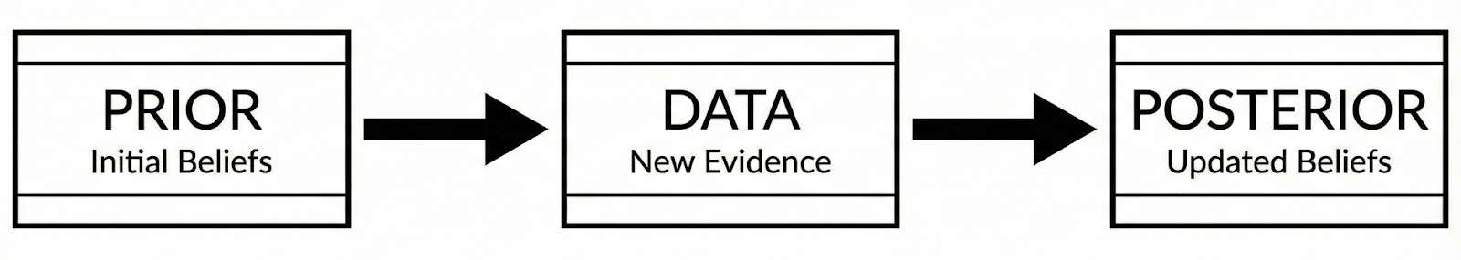
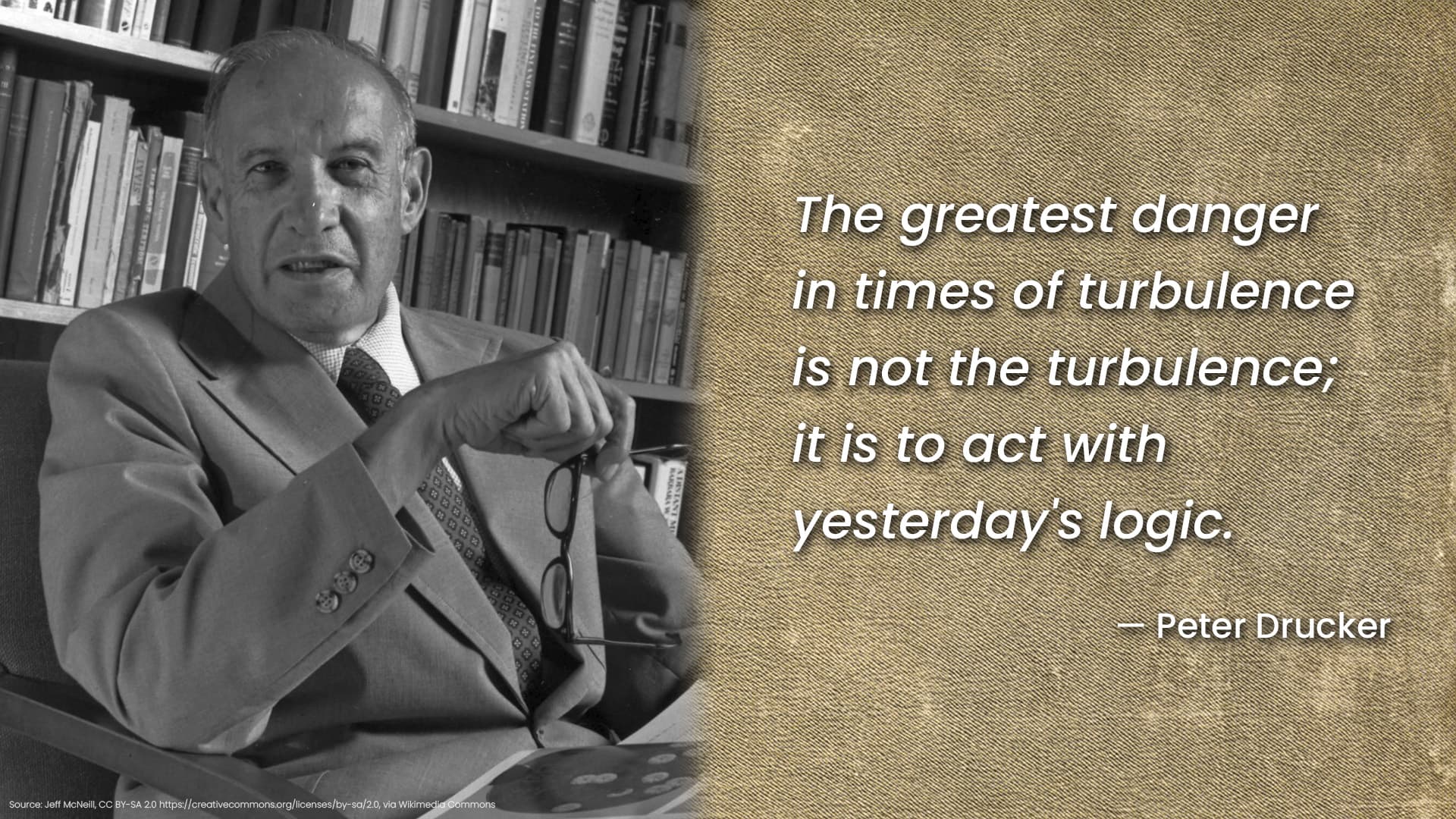
    I’ve discovered that Peter Drucker’s insights, particularly from his work “Managing in Turbulent Times,” resonate deeply with this idea. He cautioned against using “yesterday’s logic” in our ever-changing world, and I see this happening in marketing all too often.

    Markets are continuously shifting, and customer behaviors are changing in real time. Yet, many marketing groups are still stuck in old structures meant for slower eras, leading to missed opportunities.

    Understanding Structure: The Barrier to Performance

    Drucker emphasized that an organization’s structure is more impactful than individual talent. Even the smartest individuals will underperform if trapped in the wrong system.

    Consider a global gaming operator I worked with. They required seven teams and six weeks just to launch a single campaign. The Global Head of Customer Marketing noted, “We needed seven teams and six weeks to send a single campaign.”

    This wasn’t a problem of skills. The issue lay in fragmentation: insights were with analysts, creatives with designers, and execution depended on engineers. This led to delays and lost opportunities. Drucker saw this and advocated for breaking down barriers to give knowledge workers clarity and freedom.

    From Knowledge to Real-Time Execution

    In a leading U.S. iGaming firm, campaign execution once took five days. But in our real-time world, where customer actions shift instantly, five days is far too long. By streamlining processes to reduce handoffs, we cut execution time to just five minutes.

    This aligns with Drucker’s belief in empowering those closest to the action to make decisions swiftly and effectively. Positionless Marketing allows us to move from insight directly to action, faster than ever before.

    The results speak for themselves—better-targeted spending on the right customers and decisively enhanced outcomes.

    Shifting from Task Focus to Outcome-Driven Marketing

    Drucker’s concept of “management by objectives” introduced an outcome-focused mindset. Unfortunately, marketing had drifted back into task-focused operations over time. With Positionless Marketing, a global gaming operator transformed its campaign process from six weeks to mere hours.

    This change ensured accountability. Previously shared responsibility made no one truly accountable. Now, a single marketer manages the entire campaign, ensuring precision and ownership, driving not just tasks but tangible responses.

    Real-World Transformation: Speed Meets Effectiveness

    Across industries, adopting Positionless Marketing principles yields incredible results: execution cycles plummet from days to minutes, and planning shrinks from weeks to hours, all while enhancing personalization and relevance.

    These aren’t just tech advancements; they stem from restructuring processes. We’ve transitioned from dependency on hierarchical systems to empowered, outcome-focused teams.

    Technology Enhance Judgment, Not Replace It

    Drucker believed in technology as a means to enhance human decision-making, not replace judgment. Successful Positionless Marketing exemplifies this: AI aids prediction while automation removes friction, yet decisions remain human-centric.

    With comprehensive access to data and tools, marketers act promptly without waiting on cross-functional approvals, making Positionless Marketing a vehicle for immediate, improved decision-making.

    The Evolution Drucker Advocated For

    While Drucker envisioned nimble, autonomous organizations, he could not foresee today’s always-on customer engagement. In this reality, execution lag wastes potential, and structure without flexibility is risky.

    Positionless Marketing embodies Drucker’s philosophy, offering immediate information access and authority to act, transitioning from assembly-line operations to self-reliant marketing processes.

    From Thought to Action

    What Drucker defined for effective knowledge work, Positionless Marketing puts into fast-paced practice. It transforms waiting into swift action, cumbersome handoffs into clear ownership, and process-centric work into real-time relevance. The pivotal question is: will marketing teams evolve before their competitors do?

    Today’s knowledge worker isn’t merely informed—they’re finally empowered to act decisively, embodying Positionless freedom.

    To explore more on this topic, dive into this case study and this example.


    Inspired by this post on Search Engine Land.


    crushpress.ai community screenshot
  • Understanding the Shakeout Effect: Key to CLV Insights

    Understanding the Shakeout Effect: Key to CLV Insights

    I’ve come to realize that misinterpreting churn can lead to flawed assumptions about customer lifetime value (CLV). By analyzing retention over time, I can better identify which customers truly drive profit.

    In my experience, CLV is often viewed as a static metric, but in reality, it is shaped by how different customer types behave and churn over time. One critical dynamic to understand is the “shakeout effect.”

    The shakeout effect is when early churn filters out lower-value customers from a cohort, leaving a smaller, more stable group with higher engagement and predictable purchasing behavior.

    In this article, I’ll delve into the shakeout effect in CLV analytics, explore why it occurs, and discuss how marketers should consider it when evaluating churn, retention, and long-term profitability.

    What is the shakeout effect in CLV analytics?

    Imagine I have a new group of customers. Over time, the “bad” customers—those likely to drop—leave, while the “good” ones remain. These customers have lower drop rates, better engagement, and more predictable purchasing patterns.

    ```json
{
  "alt": "Graph showing overall survival probability over time in days with a churn window of 30 days.",
  "caption": "Explore how survival probability declines over time with this insightful graph, highlighting trends over a 30-day churn window.",
  "description": "This plot illustrates the overall survival probability as a function of time in days, displaying a clear logarithmic decline. The churn window is set at 30 days, adding context to the survival trends observed. The graph serves as a helpful visual for understanding retention rates, with axes labeled for probability and time. It is an essential tool for analysts looking to track changes and predict future behavior."
}
```

    This decreases overall churn propensity over time, known as the shakeout effect, and results from heterogeneity among customers.

    Typically, analysts use one-year windows or the entire purchase history; the timeframe can vary.

    For businesses with monthly subscriptions, analyzing the window after the first 30 days is crucial. No purchases after this period often indicate churn.

    When assessing overall churn probability over time, I look for trends like the one in this example.

    ```json
{
  "alt": "Line graph showing survival probability by first UTM medium over 1000 days, with various marketing mediums.",
  "caption": "Explore how different marketing channels impact user retention over a 30-day churn window with this insightful survival probability graph.",
  "description": "This line graph illustrates the survival probability over time by first UTM medium, with a churn window of 30 days. The x-axis represents time in days, while the y-axis shows survival probability. Various marketing channels like email, Facebook, Google, and paid mediums are color-coded for clarity. The graph provides a visual comparison of how each channel retains users over a span of 1000 days, valuable for understanding marketing impact and user behavior."
}
```

    Breaking out retention rates across dimensions like UTM medium reveals heterogeneity. For example, email as a first touch shows higher retention, around 27% after 500 days, compared to Google’s 18%.

    Dig deeper: How to use CRM data to inform and grow your PPC campaigns

    Why should the shakeout effect matter to marketers?

    In my view, not all customers are equal in terms of CLV. Many businesses lose money on new customers who churn before achieving a CLV sufficient to cover acquisition costs.

    Profitability is typically concentrated in a small segment of loyal customers.

    ```json
{
  "alt": "Pareto curve graph showing cumulative share of revenue vs. customers.",
  "caption": "This graph illustrates the Pareto principle in customer lifetime value, where 20% of customers generate 81% of revenue, emphasizing key income sources.",
  "description": "The image shows a Pareto/Lorenz curve of customer lifetime value. The graph plots the cumulative share of revenue against the cumulative share of customers, demonstrating that 20% of customers contribute to 81% of revenue. The curve illustrates the vital concept that a small portion of customers accounts for most of the revenue, highlighting the importance of focusing business efforts on key customer segments. The graph is labeled with percentage markers for easy interpretation and strategic planning."
}
```

    If I ignore the shakeout effect and don’t analyze churn adequately, I risk overestimating long-term churn or CLV by misjudging early losses.

    A strategic view incorporates the Lorenz curve and the Pareto principle—often, 80% of CLV comes from 20% of customers.

    Identifying this loyal core, understanding their demographics and preferences, can generate insights to engage similar potential customers.

    How to identify heterogeneity in your CRM

    I’ve found that ranked cross-correlation analysis (RCC) is an effective way to explore CRM data and understand CLV drivers.

    ```json
{
  "alt": "Scatter plot of CLV ranked cross-correlations with features on y-axis and correlation values on x-axis.",
  "caption": "Explore the correlation between various features and customer lifetime value with this insightful scatter plot, highlighting key data points and patterns.",
  "description": "This image is a scatter plot illustrating CLV ranked cross-correlations. The y-axis lists features such as purchase frequency and email subscription, while the x-axis shows correlation values. Data points represent the correlation between each feature and CLV, with a vertical red dashed line indicating zero correlation. This detailed visualization aids in identifying feature impact on customer lifetime value. Keywords: CLV, correlation, scatter plot, data analysis."
}
```

    Initially, I check if features in the data exhibit significant variance in CLV.

    For instance, customers with above-average CLV often show frequent purchases, subscribe to newsletters, and make recent or initial product-related purchases.

    Further, I find visualizing CLV distribution by dimensions like purchase frequency and geo provides valuable insights.

    For B2B, I consider job title, vertical, and account types in my analysis.

    ```json
{
  "alt": "Ridgeline plot showing CLV distribution by country, highlighting peak values for Brazil, Italy, Germany, and others.",
  "caption": "Dive into the global landscape of Customer Lifetime Value (CLV) across various countries, with Brazil leading and India trailing in peak CLV values.",
  "description": "This ridgeline plot illustrates the distribution of Customer Lifetime Value (CLV) across multiple countries such as Brazil, Italy, and Germany, highlighting the peak values for each. Brazil tops the list with the highest peak value at $2,014, while India shows the lowest at $820. Each country's data is color-coded for clarity, making it easy to compare and analyze the CLV trends globally. Ideal for visualizing consumer value in international markets."
}
```

    Advanced statistical methods, while beyond this discussion, can further refine these insights.

    Dig deeper: LTV:CAC explained: Why you shouldn’t rely on this KPI

    CLV takeaways from the shakeout effect

    To sum up, as a marketer, I should:

    • Account for the shakeout effect to accurately estimate CLV.
    • Use descriptive and predictive analytics to understand CLV influences.
    • Investigate core loyal segments to find similar future customers.

    Inspired by this post on Search Engine Land.


    crushpress.ai community screenshot
  • Discover the Best Open-Source MMM Tools for Your Needs

    Discover the Best Open-Source MMM Tools for Your Needs

    Marketing mix modeling (MMM) has become essential in today’s business landscape.

    I’ve noticed how companies like Google, Meta, and Uber have opened doors with their free open-source MMM frameworks.

    The challenge lies in figuring out which tool suits your needs without needing a PhD in statistics.

    Understanding the Different Roles of Open-Source MMM Tools

    These tools often get mentioned together but serve uniquely different purposes despite their collective fame.

    Google’s Meridian and Meta’s Robyn are designed to deliver actionable insights by turning your marketing data into strategic budget recommendations.

    These include valuable features like:

    • Data transformations that capture advertising decay.
    • Saturation curves to visualize diminishing returns.
    • Dashboards and budget optimizers for spend allocation guidance.

    Meanwhile, Uber’s Orbit and Facebook’s Prophet serve different needs.

    Orbit is more about time-series forecasting and requires significant development to transform into an MMM tool.

    Prophet acts as a forecasting component within other frameworks.

    Think of it like transportation:

    ```json
{
  "alt": "Budget allocation analysis for Model ID 1_143_2 showing total optimization results, per channel allocation, and simulated response curves.",
  "caption": "Explore the strategic budget allocation insights for Model ID 1_143_2, highlighting total optimization results and per channel performance with detailed simulation data.",
  "description": "This image provides an in-depth analysis of budget allocation for Model ID 1_143_2. It presents total optimization results, showing initial and bounded allocations, and highlights ROAS and mROAS metrics. The image details budget allocation percentages across channels like Facebook, OOH, print, search, and TV. Simulated response curves illustrate the impact of spending on total responses, reflecting the effect of different budget scenarios. Designed with readability and analytical precision, this one-pager is crucial for strategic marketing decisions."
}
```
    • Meridian and Robyn are ready-to-drive vehicles.
    • Orbit is a high-performance engine requiring further builds.
    • Prophet serves as the GPS navigation system within your car.

    Dig deeper: Marketing attribution models: The pros and cons

    Robyn: Making MMM Accessible and Powerful

    I admire Meta for creating Robyn, a tool that breaks down barriers with its automation and ease of use.

    Robyn turns weeks of model tuning into a quick data upload process, rapidly exploring thousands of configurations.

    It stands out by providing multiple high-quality model solutions, catering to various business needs and risk levels.

    Its capability to integrate real-world experimental outcomes boosts its credibility with decision-makers.

    However, keep in mind that it assumes consistent marketing performance, which might not align with real-world dynamics.

    Meridian: The Analytical Powerhouse

    Meridian, representing Google’s advanced Bayesian approach, models the intricate mechanisms behind advertising effects.

    Unlike Robyn’s practical strategies, Meridian focuses on answering what could happen with budget reallocation based on theoretical models.

    This approach, especially its geo-level modeling, provides insights that are crucial for market-specific decisions.

    ```json
{
  "alt": "Graphs displaying channel contribution, spend and revenue by marketing channel, and a pie chart of contribution percentage.",
  "caption": "Analyze the impact of different marketing channels on revenue with these insightful charts. Discover which channels drive the most revenue and how spend correlates with returns.",
  "description": "This image features three main graphical representations: a horizontal bar chart showing channel contribution to revenue, a vertical bar chart detailing spend and revenue contribution by channel, and a pie chart illustrating contribution percentages. The bar chart highlights the 'Baseline' as the largest contributor with 79.3% of revenue, followed by Channel_4 and Channel_5. The pie chart indicates 79% revenue from the baseline and 21% from all channels. These visualizations provide a comprehensive overview of revenue distribution across various marketing initiatives, crucial for optimizing channel strategies. Keywords: revenue, marketing channels, pie chart, bar graph, channel contribution."
}
```

    Although its methodology is robust, Meridian’s technical demands are high and require statistical expertise not common in most marketing teams.

    Dig deeper: How Bayesian testing lets Google measure incrementality with $5,000

    Uber Orbit: Expert Time-Series Forecasting

    Orbit shines in time-series forecasting with its Bayesian time-varying coefficients, offering flexibility many traditional MMM tools lack.

    It’s an advanced tool, best suited for teams that have the capacity for custom framework development.

    Prophet: Unraveling Temporal Patterns

    Prophet stands out in its primary role of time-series forecasting, effectively disentangling trends and seasonal influences from data.

    Remember, while it can support MMM processes, it won’t serve as a standalone solution for attribution or optimization.

    Dig deeper: MTA vs. MMM: Which marketing attribution model is right for you?

    Making Informed Choices for Your Team

    Your choice depends on your team’s statistical comfort and resource availability.

    • Robyn suits most teams, offering rigorous insights with minimal setup time.
    • Meridian is for those with the technical expertise to leverage its deeper capabilities.
    • Orbit is ideal for custom framework developers.
    • Prophet helps in preprocessing but isn’t a complete MMM solution on its own.

    Choose a tool that your team can realistically implement and maintain, maximizing the benefit from its insights.

    Dig deeper: How to avoid marketing mix modeling mistakes that derail results


    Inspired by this post on Search Engine Land.


    crushpress.ai community screenshot
  • Unlocking Incrementality with Bayesian Tests at a $5K Budget

    Unlocking Incrementality with Bayesian Tests at a $5K Budget

    I’ve recently been intrigued by how Bayesian testing allows Google to measure incrementality with just $5,000. It’s fascinating how this modern approach opens up new possibilities for advertisers.

    Through these tests, advertisers like me can now explore lift measurement options without needing big enterprise budgets, as reported by Search Engine Land.

    This change immediately raises an important question: How exactly does Google achieve accurate measurements of incrementality with significantly less data?

    Previously, achieving reliable lift measurements demanded substantial budgets, lengthy test timelines, and the patience to handle inconclusive outcomes.

    Given this context, Google’s claim of delivering precise results with merely $5,000 seems almost too good to be true. But it isn’t just marketing fluff; it’s a utilization of innovative mathematical models.

    This transformation is powered by a testing methodology that emphasizes probability and learning, rather than aiming for absolute certainty.

    Understanding this new approach is crucial for accurately interpreting these incremental results and for enhancing our PPC strategies.

    ```json
{
  "alt": "Mathematical formula for Z-score involving proportions and sample sizes.",
  "caption": "Dive into statistics with this formula for calculating the Z-score from sample proportions. A fascinating glimpse into the world of data analysis!",
  "description": "This image displays a mathematical formula for calculating the Z-score based on the difference between two proportions, p2 and p1, over the standard error of the sample sizes, n1 and n2. This statistical formula is essential in hypothesis testing and helps determine how far apart proportions are in terms of standard deviation. Key elements include the square root, fraction, and parentheses, crucial in advanced statistics and data analysis."
}
```

    Before we delve deeper, let’s quickly revisit some key Bayesian terms that marketers often encounter.

    Glossary: Bayesian terms for search marketers

    • Prior: What we assume before the test begins.
    • Posterior: Updated belief after analyzing the data.
    • Credible interval: It shows the likely range of the result.
    • P-value: Frequency-based probability indication.

    Traditional A/B testing, which most PPC advertisers know even if unknowingly, follows frequentist statistics.

    These conventional A/B tests use metrics like p-values and fixed sample sizes to evaluate if changes reach statistical significance, often restricting smaller-budget tests.

    In contrast, Bayesian testing veers away from this binary framework, instead asking, “Given all we know, how likely is this result to be true?”

    Let’s see how Google legitimately manages to make $5,000 tests work effectively by embracing priors combined with its extensive data resources.

    ```json
{
  "alt": "Diagram showing Bayesian inference with steps: Prior, Data, Posterior.",
  "caption": "Visualizing Bayesian Inference: From Prior Beliefs to Updated Understandings.",
  "description": "This image illustrates a Bayesian inference process, consisting of three main steps: Prior (Initial Beliefs), Data (New Evidence), and Posterior (Updated Beliefs). It represents the process of updating beliefs based on evidence. The diagram uses simple text boxes and arrows to connect the concepts, emphasizing the logical flow from initial assumptions to refined conclusions. Keywords: Bayesian inference, Prior, Data, Posterior, beliefs, evidence."
}
```

    Google’s strategy rests on informed priors, hierarchically modeling, and probability assessments based on extensive campaign history.

    This enables a competent analysis even with modest budgets, thus transforming limited data insights into actionable intelligence without averaging noise across campaigns.

    Bayesian methods provide flexibility and adapt as more data is gathered, making them ideal for dynamic marketing environments, unlike their frequentist counterparts.

    As more data rolls in, Bayesian tests evolve, relying increasingly on real results rather than priors, ensuring refined decision-making from smaller experiments to large-scale trials.

    Using Bayesian inference, Google allows advertisers to derive directional insights without needing enormous budgets, effectively bridging gaps where frequentist testing falls short.

    Takeaways for advertisers interested in Bayesian testing include understanding the diminishing role of priors as data accumulates, needing a discerning approach to interpreting outcomes.

    To conclude, this mathematical ingenuity leverages Google’s vast data resources, offering a practical perspective over traditional methods, empowering PPC campaigns with more cerebral decision-making.


    Inspired by this post on Search Engine Land.


    crushpress.ai community screenshot
  • Unlock the Power of Google’s PMax Channel Report

    Unlock the Power of Google’s PMax Channel Report

    For years, I’ve been fascinated by how PPC advertisers navigate the complexities of Google’s campaigns, especially Performance Max (PMax).

    While the automation behind PMax is impressive, the lack of transparency has often been a source of frustration for me and many others.

    Thankfully, Google has finally started to address some of these concerns with the introduction of the new Channel Performance report.

    ```json
{
  "alt": "Channel distribution table showing campaign data with clicks, impressions, interactions, conversions, and costs.",
  "caption": "Dive into your campaign's performance with detailed channel distribution metrics to enhance your advertising strategy.",
  "description": "This image displays a channel distribution table from a Performance Max campaign, detailing metrics such as impressions, clicks, interactions, conversions, conversion value, and costs across various platforms like Discover, Display, Gmail, Maps, Search, and YouTube. The table aids in understanding ad performance, providing insights into clicks, engagements, and overall effectiveness for optimizing marketing strategies. Source: Smarter Ecommerce."
}
```

    This guide is designed to help you understand the report, its benefits, and how you can leverage it effectively.

    The Channel Performance report represents a major shift in how we can view and assess campaign performance.

    ```json
{
  "alt": "Spreadsheet displaying channel performance data for various ad campaigns, including impressions, clicks, and conversions.",
  "caption": "Dive into the detailed performance metrics of your ad campaigns. This table showcases insights into impressions, clicks, and conversions, guiding your marketing strategy.",
  "description": "This image depicts a tabular display of channel performance data for ad campaigns. The table includes columns for impressions, clicks, interactions, conversions, conversion value, and cost. It highlights performance for campaigns with and without product data. This snapshot is integral for analyzing marketing efficiency and guiding strategic decisions in digital advertising. Keywords: ad performance, marketing data, campaign analysis."
}
```

    Located under Campaigns > Insights and Reports > Channel Performance (beta), it’s a pre-built network report offering tabular and flow diagram data.

    It’s currently exclusive to Performance Max campaigns but could potentially expand to other types in the future, hinting at a broader applicability.

    ```json
{
  "alt": "Channel performance data filter interface showing options for clicks, cost, conversions, and reports.",
  "caption": "Explore your channel performance with customizable columns for clicks, costs, interactions, and more. Fine-tune your analytics for September 2025.",
  "description": "This image depicts a data interface for channel performance analysis, allowing users to modify columns such as clicks, impressions, cost, interactions, conversions, and reports. Users can customize their view by selecting relevant metrics to drag and drop for reorder. The time frame is set from September 1 to 30, 2025. This interface aids in detailed performance analysis for ecommerce campaigns."
}
```

    Previously, getting insights into channel performance required tedious manual reports, or at best, third-party tools with limited capabilities.

    Now, the Channel Performance report provides a direct, Google-native solution to this problem.

    ```json
{
  "alt": "Sankey diagram showing ad conversions across channels like Discover, Display, and Search with costs and results.",
  "caption": "Discover the power of your ad channels with this insightful Sankey diagram, illustrating interactions and conversions across platforms like Discover, Display, and Search.",
  "description": "This Sankey diagram displays the conversion sources and efficacy of ad channels, including Discover, Display, Gmail, Maps, and Search. Key metrics shown are impressions, interactions, and results. Discover has a cost of $73.79, Display $12.96, and Search $4,585.49, with Search holding the highest share of cost at 91.46%. The results value for 'Purchase' is noted at $21,989.92. Source: Smarter Ecommerce (smec)."
}
```

    The report has two primary components: an account-level view and a campaign-level view, complete with a data table and a Sankey diagram.

    The account-level view offers a new perspective with a convenient table displaying campaign and channel metrics, making it easier to analyze at a glance.

    ```json
{
  "alt": "Channel performance report flowchart with data on impressions, interactions, and conversions.",
  "caption": "Decoding the Channel Performance report—a visual flowchart unraveling the intricate paths from impressions to conversions.",
  "description": "This image showcases a data visualization flowchart detailing a Channel Performance report. It illustrates the journey from 3,418,904 impressions through 53,910 interactions to 2,440.72 conversions. Various channels such as Discover, Display, and Search are analyzed for metrics like dynamic remarketing, responsive display, and video ads. Keywords: channel performance, data visualization, impressions, conversions, digital marketing."
}
```

    This view allows for sorting by different metrics, which is a handy way to compare and prioritize campaigns.

    My favorite feature is the ability to switch segments, offering insights into ‘ads using product data’ versus ‘ads not using product data’, which was a significant challenge in understanding PMax campaigns.

    ```json
{
  "alt": "Three-panel diagram titled 'Lack of proportion' showing the disproportion in impressions between asset-based and product-based ads on Search and YouTube.",
  "caption": "Explore the disparity in digital ad impressions: asset-based vs. product-based. These visualized figures reveal the significant difference in search and YouTube ad performance.",
  "description": "This image displays a three-panel diagram highlighting the imbalance in impressions between asset-based and product-based ads, titled 'Lack of proportion'. It shows a stark contrast with 4,492 impressions for asset-based ads versus 1,242,147 for product-based ads. The data indicates that asset-based ads account for only 0.36% of Search Network impressions, countering a common belief of around 17%. The diagram aims to offer clear visualization of digital ad performance between different types on platforms like Search and YouTube. Source attribution: Smarter Ecommerce (smec)."
}
```

    Upon switching to the campaign-level view, you’ll notice a striking Sankey diagram that visualizes user interactions from impressions to conversions.

    Though visually impressive, the data table below is more reliable for detailed analysis, showing performance metrics by channel and ad type.

    ```json
{
  "alt": "SMX introduces SPN with enhanced data segmentation in Google Ads performance reports, currently showing only impressions.",
  "caption": "Discover SPN: A notable move towards transparency in Google Ads. Currently, only impressions are available, but segmentation enhancements are on the way.",
  "description": "This image showcases a new feature coming soon to SMX: SPN, which enhances data segmentation in Google Ads Performance Max campaigns. The current interface includes icons for Google services and a highlighted section for channel performance data, showing only impressions. This update marks an important step towards greater transparency in ad reporting, emphasizing the future availability of segmented data for Search Partners. Source: Smarter Ecommerce (smec)."
}
```

    For a deeper dive, I recommend exporting the data and using it in spreadsheets for comprehensive analysis.

    However, the report has some drawbacks, like the misleading proportions in the Sankey diagram and lack of ratios in the data table.

    Despite this, it offers valuable insights into which channels are genuinely delivering results, enabling you to maximize asset and traffic quality.

    Utilizing placement data for quality control and customizing reports through Google Sheets can enhance your strategy.

    Google has promised future features like API access, which will expand the report’s utility significantly.

    As we continue to explore these insights, the challenge lies in accurately interpreting the data to make informed decisions.


    Inspired by this post on Search Engine Land.


    crushpress.ai community screenshot
  • Unlocking the Power of Share of Search in the AI Era

    Unlocking the Power of Share of Search in the AI Era

    As I dive into the evolving world of SEO, I’ve noticed one thing: the industry is entering its most unpredictable phase yet. With traffic on the decline and AI increasingly handling informational queries, it’s clear that the landscape is shifting beneath our feet.

    It’s fascinating to observe how social platforms are now serving as search engines, and Google is transforming from a gateway to a comprehensive answer engine. This transformation leaves many of us in the industry uncertain about what metrics matter, what we should optimize, and essentially, what SEO’s role truly is in this new digital era.

    Despite the chaos, I’ve found clarity in one specific marketing metric that cuts through the noise: share of search. This metric offers a straightforward insight into brand health and potential future demand, aligning marketers and SEOs with confidence.

    Share of search becomes particularly important as we notice a significant shift in how discovery and measurement need to adapt. The days of accidental discovery through traditional search behavior are dwindling.

    AI and platforms like Meta are increasingly providing direct answers without directing traffic elsewhere, shifting the focus towards metrics that provide a clearer indication of consumer interest, like share of search.

    Interestingly, share of search, a concept developed by James Hankins and Les Binet, calculates a brand’s search volume against the total search volume for its category. This simple yet powerful metric correlates strongly with market share and future buying behavior.

    In our rapidly changing environment, share of search provides a critical signal for marketers, showing whether a brand is being searched for more or less compared to competitors. This insight offers a palpable reflection of underlying consumer interest and demand.

    While traffic as a metric is losing its significance because of AI pre-answering queries, share of search cannot be manipulated easily. It stands resilient as a reflection of authentic consumer desire.

    Moreover, this metric crosses platforms effortlessly, as people now search across various digital spaces such as Amazon, TikTok, YouTube, and potentially even LinkedIn. Share of search adapts to fragmented discovering behavior precisely.

    It’s exciting to see how, even if AI-driven systems like ChatGPT rarely generate clicks, they often trigger brand searches, emphasizing the importance of this metric as a measure of marketing effectiveness.

    For SEOs like me, adopting share of search means transforming our roles from content producers into strategic partners, providing deeper insights into consumer behavior and brand demand.

    Ultimately, embracing share of search elevates our value within an organization, offering a fresh narrative around brand visibility and performance. As AI continues to reshape the digital landscape, this metric is becoming indispensable for those of us in SEO and marketing. I encourage everyone to learn more about this compelling metric and explore its potential to transform how we measure success in the AI era.


    Inspired by this post on Search Engine Land.


    crushpress.ai community screenshot
  • Rethink Your Dashboards: Beyond Click-Based Attribution

    Rethink Your Dashboards: Beyond Click-Based Attribution

    As someone deeply involved in marketing, I’ve seen how the explosion of marketing channels and touchpoints has made measuring success a truly strategic endeavor.

    I’ve noticed that click-based attribution models—such as last-click and first-click—are still widely used as standard. Yet, as I delve deeper into these metrics, I realize they’re becoming less effective as standalone measures.

    These models dominate executive dashboards, giving me pause because this reliance can impose significant limitations.

    In my experience, click-based metrics can indeed be valuable for understanding digital interactions. However, it’s risky for executives to center major strategies and budget allocations solely around clicks, as this can lead to neglecting vital parts of the customer journey—parts that truly count.

    In this article, I want to explore:

    • What click-based attribution really captures.
    • How it falls short in a complex, multi-channel world.
    • The risks of over-relying on click metrics for business decisions.
    • Alternative measurement approaches that better align marketing with actual business results.
    • Ways marketing leaders, like myself, can guide executives toward more comprehensive outcome-focused frameworks.

    My goal isn’t to dismiss clicks; they have their place. They should, however, provide context rather than serve as the core measure of success.

    What Does Click-Based Attribution Actually Measure?

    Click-based attribution tracks ad clicks and assigns conversion credit to the responsible marketing touchpoints. In my role, I observe that models vary—first-click, last-click, linear, time-decay, to name a few—but fundamentally, they all divide credit along the user journey differently.

    Platforms tend to default to click-based models because clicks are straightforward to capture and report. However, their clarity can often mislead.

    I’ve learned that click-based attribution hinges entirely on user interaction with tracking links. Without a click, or with delayed decisions, important touchpoints might be misattributed or entirely overlooked.

    While this approach might work in simplistic funnels, today’s customer journeys are multi-device and multi-channel, quickly diminishing the value of clicks in context.

    Dig deeper: The end of easy PPC attribution – and what to do next

    The Problems with Solely Relying on Click-Based Attribution

    When I examine today’s buyers, I see that they rarely follow neat, linear paths—an assumption made by click-based models.

    Instead, buyers interact across many devices, channels, and may even engage through offline touchpoints. Consider social media, AI like ChatGPT, or brand recognition from videos, influencers, or website content.

    Many valuable interactions go untracked by clicks, though they meaningfully influence buyer perception and conversion readiness.

    Imagine a buyer: they watch a video on LinkedIn, then research your product through third-party reviews and your case studies on your website. Days later, they directly Google your brand and make a purchase.

    In click-based systems, only the final branded search click would be credited, overlooking all previous touchpoints that educated and persuaded the customer.

    Such blind spots aren’t trivial; they form a canyon between reality and measurement.

    … (content continues in the same format) …

    Inspired by this post on Search Engine Land.


    crushpress.ai community screenshot
  • How Dark Themes Outperformed in Our B2B Landing Page Test

    How Dark Themes Outperformed in Our B2B Landing Page Test

    I have to admit, I was surprised when our dark-themed landing page outperformed the light one.

    Everything I believed about conversion optimization suggested the light background would dominate.

    Light themes are generally the norm for B2B lead generation due to their readability and clean look, aligning perfectly with accessibility standards.

    Unbounce’s study of 41,000 landing pages backs up this trend for light backgrounds. Betting on the light theme seemed like a safe decision.

    However, after dividing our paid traffic equally between a dark and a light landing page for our industrial fleet repair SaaS, despite a 16.62% higher CTR for the light variant, it resulted in 42% fewer conversions.

    This isn’t a call for adopting dark themes universally.

    Rather, it’s a case study showing how audience context and industry-specific associations can outweigh best practices drawn from broader samples.

    We cater to a niche in the B2B SaaS market, particularly serving the transportation industry—businesses maintaining commercial vehicles and equipment.

    Our intended audience includes shop owners and operators engaged in industrial settings, managing technicians, equipment, and demanding commercial clients.

    Going into this test, my expectations were clear.

    I anticipated light backgrounds would be more effective for our text-heavy lead generation pages, given their emphasis on whitespace and visual hierarchy. Our 7-field form aimed at busy shop operators seemed poised for success with light mode.

    I also assumed blue CTAs would yield better results, with blue being associated with trust and security crucial for B2B software purchases. Thus, we used a blue CTA button.

    I was incorrect on both fronts.

    We conducted this test by isolating the visual design, directing traffic through Google Ads and Meta to two vastly different landing pages with identical copy.

    The control page sported a dark theme with a black background, white text, high-contrast form fields, and a subtly outlined black CTA button. The header lacked a brand logo, intensifying the focus on the content.

    Conversely, the treatment page featured a light theme, employing white and light gray elements, dark text, and a blue CTA button. Here, our brand logo was prominently placed in the header.

    All other variables remained the same, emphasizing the importance of isolating design as the sole differentiating factor.

    This test spanned three to four weeks, with Google Ads search campaigns topping $8,205.97, yielding 767 clicks and 30 conversions.

    The light theme’s seemingly advantageous CTR masked the truth—it attracted less qualified traffic, converting at a similar or worse rate than expected.

    A consistent preference for the dark theme also emerged in Meta tests, reinforcing the role of audience preference rather than algorithmic anomaly.

    Understanding why the dark theme won lies in recognizing how it aligns with the psychological and environmental cues of our target audience in the industrial sector.

    The dark theme resonated well with the familiarity of industrial aesthetics—functional, robust environments characterized by dark, metallic tones.

    The contrast provided by white form fields on a dark background was unmistakable, drawing eye attention naturally.

    Dark themes carry a tone of seriousness and value, fitting for the weighty decision-making expected in B2B software acquisitions.

    Moreover, embracing familiar industry conventions, the dark interface enhanced trustworthiness and familiarity.

    This test taught me that testing design psychology is just as crucial as testing visual elements themselves. Before embarking on similar experiments, consider what your design communicates to your audience rather than just aesthetic appeal.

    Finally, ensure your experiments include significant contrast between variations while keeping other elements constant to draw accurate conclusions.

    Audience context should guide optimization efforts more than generalized best practices. By focusing on specific audience needs and signals, I’ve learned that real, lasting optimization success can be achieved.


    Inspired by this post on Search Engine Land.


    crushpress.ai community screenshot
  • Accelerate B2B Optimization with Proxy Metrics

    Accelerate B2B Optimization with Proxy Metrics

    Embarking on the complex B2B journey can feel like navigating a labyrinth. I know this from firsthand experience, especially when it comes to optimizing campaigns amidst long sales cycles and low conversion volumes.

    In the realm of selling high-value items, waiting for months to see tangible results can be frustrating. That’s where I discovered the power of proxy metrics, or micro-conversions, to drive faster optimization.

    Let’s dive into the specifics of proxy metrics and their transformative impact on B2B campaigns.

    Understanding Proxy Metrics

    From my perspective, proxy metrics are like the early indicators of success that help predict final outcomes. Think of them as a weather vane pointing towards future achievements.

    Engagement rates hint at potential conversions, while add-to-cart events often precede sales. Watching these early signs allows me to course-correct campaigns sooner and optimize budget allocations.

    Proxy metrics also prove invaluable when navigating Google’s 90-day latency window. I’ve learned to identify key predictors within this time frame to maintain tracking efficiency.

    Dig deeper: How to use GA4 predictive metrics for smarter PPC targeting

    Enhancing Algorithmic Bidding with Proxy Metrics

    In my work with digital ad platforms like Google and Meta, I’ve seen the crucial role of machine learning in campaign optimization. Feeding these systems with early signals like micro-conversions enhances their ability to target quality users effectively.

    ```json
{
  "alt": "Digital illustration of a correlation funnel showing predictors like engaged sessions, newsletter signups, and add to cart leading to sales.",
  "caption": "Unlocking Sales Success: A visual guide to the correlation funnel, showcasing how online activities like engagement and signups drive sales.",
  "description": "This image illustrates a correlation funnel concept, displaying predictors such as engaged sessions, newsletter signups, and cart additions funneling into sales. The diagram highlights the importance of each component in the digital sales process. Keywords: correlation funnel, predictors, sales strategy, digital marketing."
}
```

    With metrics like time on site and scroll depth, I can refine targeting even when conversion data appears sparse, creating training signals that define algorithms’ paths.

    Building Audiences and Gaining Insights with Proxy Metrics

    Segmentation through proxy metrics opens up smarter audience building. By identifying engaged users, I craft lookalike audiences that mirror high-value customers, shifting focus from mere click-through metrics.

    I’m also able to expedite testing cycles by employing leading indicators instead of waiting for long-term data, thereby speeding up hypothesis validations and subsequent decisions.

    Proxy metrics frequently offer more robust statistical significance in models than distant revenue markers, enabling reliable market assessments.

    Evaluating the Trustworthiness of Proxy Metrics

    I’ve learned that not all proxy metrics pack the same punch. Some signal genuine interest more effectively than others. Newsletter signups, for example, often predict engagement, whereas add-to-cart events can be misleading due to frequent abandonment.

    To choose the right proxies, I measure correlation strength, timeliness, actionability, and stability to ensure they provide reliable guidance for strategic decisions.

    By focusing on these factors, I navigate the intricate path of B2B optimization with confidence, leveraging insights to drive impactful outcomes.


    Inspired by this post on Search Engine Land.


    crushpress.ai community screenshot