I’ve always found SEO reporting to be a bit of a hassle. It used to mean spending hours exporting data from Google Search Console (GSC), tidying it up in spreadsheets, and then trying to make sense of it all in Data Studio.
Now, with AI tools like Claude Code, my workflow has completely changed. I can instantly create customized data visuals and reports in a fraction of the time it used to take.
Let me walk you through the journey of transforming GSC data into tailored reports, streamlining the entire process.
Using Claude Code is different from the standard Claude experience. While the regular Claude.ai acts like a chatbot, Claude Code functions as an AI coding assistant right on my computer. It’s capable of reading GSC CSV files, analyzing large datasets, and transforming raw data into clear, visual reports.
Initially, setting up Claude Code can be daunting, especially if you aren’t familiar with technical tasks. But don’t worry, the setup is a one-time effort. Once it’s up and running, generating reports takes just minutes.
The real magic happens after you connect Claude to GSC. Whether you’re in an enterprise environment or you’re an independent SEO consultant, having Claude Code set up is invaluable.
Starting your journey with Claude Code begins by creating an account on Claude.ai. Even without a paid subscription, I find the platform extremely helpful for generating SEO reports.
A crucial step in using Claude Code is installing Node.js on your machine. For this tutorial, I used a Mac, but it’s compatible with other operating systems too. Once Node.js is installed, I am able to install Claude Code and verify my setup through simple terminal commands.
After setting everything up, I navigated a series of prompts in Claude, choosing how to access GSC data and defining key parameters for my reporting.
Connecting Claude to GSC involves interacting with the Search Console API, albeit a bit technical. But Claude guides me through each step, ensuring a smooth setup.
The exciting part comes after the connection is established. I can now rapidly create focused reports, such as identifying top-performing pages or tracking keyword trends over time, tailor-made for my needs.
Overall, Claude Code redefines how I manage SEO reporting. It offers the perfect balance of speed, flexibility, and control. Once the groundwork is laid, it makes my reporting both dynamic and precise, adapting to the demands of my stakeholders with ease.
I’ve recently delved into Google’s exciting release of Ads API version 24.1, and it’s packed with valuable updates for advertisers. This version brings us advanced reporting capabilities, expanded AI campaign testing, and improved security measures.
In this update, Google has prepared us for their upcoming data retention policy changes, which will commence next year—something I believe every developer should be ready for.
Why we care. The latest release highlights three crucial areas: performance visibility, creative control, and testing automation, which are becoming vital for advertisers like me.
What’s more, brands now have greater control over creative displays in Demand Gen campaigns, overcoming the typical limits imposed by automation. It’s a significant update that I’m excited to explore further.
Those of us who lean heavily on reporting infrastructures should also be mindful of Google’s impending 37-month data retention limit, set to impact historical performance analysis come 2026.
Mobile reporting gets more granular. One of the features I’m most thrilled about is the new mobile device platform segment that allows for reporting by operating system.
With the new segments.mobile_device_platform field, I’m able to differentiate performance across iOS and Android, a game-changer for app marketers and ecommerce advertisers alike.
Demand Gen adds classic image support. I love how Google is providing us with more creative control in Demand Gen campaigns, specifically through the classic_display_images field.
This new field allows us to upload and display static image ads exactly as designed, which is perfect for maintaining branding consistency without AI alterations.
Passkeys come to Google Ads. Security is always a top concern of mine, so I’m pleased to see the inclusion of the passkey_enabled field to boost account security through passwordless authentication.
Experiment support expands. I’ve noticed that Google has significantly enhanced the support for Experiments, allowing us to run and analyze tests across AI Max, Video, Demand Gen, and Performance Max campaigns.
This update also enables us to view metrics such as clicks and conversions more transparently, making experiment analysis straightforward and insightful.
A major data retention change is coming. From June 1st, Google Ads and related APIs will enforce a 37-month data retention limit, something I must prepare for to avoid disruptions in performance analytics.
The release includes a new error code: DateRangeError.REQUESTED_DATE_GRANULARITY_NOT_SUPPORTED, and it’s essential that I update reporting workflows accordingly.
What’s next. I’ve already checked out the updated client libraries and code samples for v24.1, and I plan to participate in Google’s live walkthrough on Discord, YouTube Live, and LinkedIn Live for additional insights.
I’m thrilled to share some exciting news from Microsoft Advertising. They’ve made a significant leap in Performance Max reporting by adding conversion and spend data to PMax placement reports. This means I now have a much clearer understanding of how my ad placements are performing, which is fantastic for optimizing my campaigns.
What’s happening. According to Microsoft Ads Product liaison Navah Hopkins, the PMax Website Publisher URL report now includes conversion and spend metrics. This update takes us beyond just seeing where our ads appear; it lets us see actual performance data in action.
This new visibility allows me to pinpoint exactly which placements are driving meaningful results, not just impressions or clicks. It’s a game-changer for understanding what really works.
Why we care. Having this level of detail means I can make smarter decisions about where to allocate my budget. It helps me scale successful inventory and eliminate waste, providing a stronger foundation to trust Performance Max’s capabilities with tangible data rather than estimates.
How advertisers can use it. This update opens several practical doors. I can leverage high-performing placements to shape my Audience Ads strategies, like building remarketing campaigns or targeting audiences based on successful inventory.
At the same time, I can spot placements that aren’t a good fit and exclude them using account-level URL exclusion lists. This not only protects brand safety but also boosts efficiency.
Between the lines. This development further enhances the transparency of automated campaigns. It’s evident that while automation handles much of the heavy lifting, platforms are keen on giving us advertisers clearer insights into what’s effective and where we need to intervene.
What to watch:
Will this transparency extend even further in PMax reporting?
How will advertisers balance the power of automation with manual tweaks?
Could similar reporting features be rolled out across other platforms?
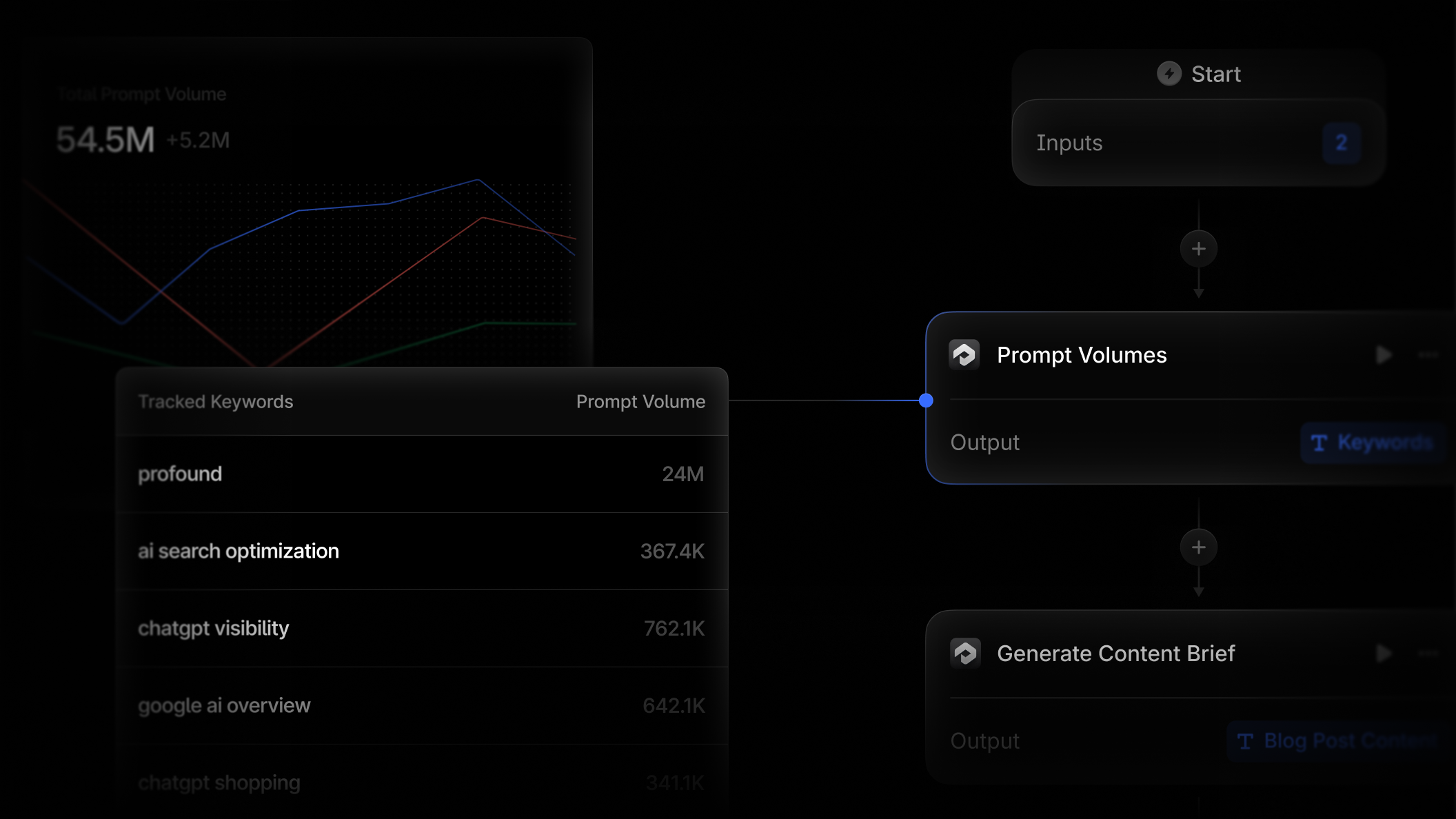
I’ve found an incredible new way to streamline content creation, competitive analysis, reporting, and monitoring with the latest Profound Agents feature. We can now effortlessly integrate prompt volume data directly into any Profound Agent, bringing together all our workflows into a single platform. This innovation is perfect for marketers looking to enhance efficiency.
Many advertisers might be experiencing discrepancies in reporting on Google Ad Manager, which could impact their ability to effectively track performance and optimize their campaigns.
Google has acknowledged a disruption in the Google Ad Manager service, as noted on the Google Ads Status Dashboard, and they are actively investigating the matter.
The incident surfaced at 13:49 UTC on March 4. By 13:54 UTC, Google identified the issue where users could log into Ad Manager but not access the most current data.
What’s happening: The issue primarily affects reporting consistency. There’s a mismatch between Ad Exchange match rate and request values in Ad Manager’s reports when compared to the legacy reporting tool, which complicates data interpretation.
Why this matters to me: This discrepancy in reporting can hinder my ability to accurately evaluate performance and make informed decisions on campaign pacing, forecasting, and revenue adjustments.
What it means: While I’m still able to log into Ad Manager, the issues may lead to inaccuracies in my data, affecting campaign insights temporarily. Although there’s no complete outage reported, the mismatch in metrics can pose challenges for real-time performance analysis.
Next steps: Google is actively investigating the situation and will issue updates as more information becomes available. Meanwhile, I’m advised to monitor the status dashboard for further updates and reach out to support if I encounter any unlisted issues.
Data serves as more than just a report card; it’s the roadmap for our performance marketing strategies. To make the most of this roadmap, I’ve learned it’s necessary to go beyond Google Analytics 4’s default tools.
If I were to rely solely on GA4’s built-in reports, I’d find myself juggling multiple interfaces and struggling to tell a clear story to stakeholders. That’s where Looker Studio becomes a game-changer for me.
Looker Studio allows me to transform raw GA4 and advertising data into interactive dashboards that provide decision-grade insights and drive campaign improvements.
In this guide, I’ll show you how to use GA4 and Looker Studio effectively for PPC reporting by comparing their roles, highlighting recent updates, and sharing specific use cases—from budget pacing visualizations to waste-reduction audits.
GA4 vs. Looker Studio: How They Differ for PPC Reporting
GA4 serves as my ultimate reference point for website and app interactions, offering insights into user behavior, clicks, page views, and conversions through a flexible, event-based model. It’s integrated with Google Ads, pulling key ad metrics into its Advertising workspace. However, GA4 primarily focuses on data collection and analysis, not on creating client-ready reports.
Conversely, Looker Studio is my go-to for creating comprehensive reports. It connects to over 800 data sources, allowing me to build interactive dashboards that consolidate all my data in one place.
Data Sources
While GA4 primarily focuses on on-site analytics, its late 2025 update allowed native integration for platforms like Meta and TikTok, enabling automatic imports of cost, clicks, and impressions. However, I find it to be somewhat rigid, requiring strict UTM matching and lacking the capability to clean campaign names or import specific conversion values.
In contrast, Looker Studio allows me more flexibility in blending data sources and connecting to platforms that GA4 doesn’t support natively, such as LinkedIn or Microsoft Ads.
Metrics and Calculations
GA4 has improved its reporting UI, now enabling up to 50 custom metrics per standard property, which is quite an upgrade from the previous limit of five. However, these metrics can often be static.
Looker Studio, on the other hand, lets me perform real-time calculations on my data through calculated fields. This allows for dynamic data manipulation, such as computing profit by subtracting cost from revenue, without altering the source data.
Data Blending
Looker Studio lets me blend multiple data sources to create richer insights. Even though enterprise users on Looker Studio Pro can utilize LookML models for robust data governance, the standard free version still offers flexible data blending capabilities to align ad spend with downstream conversions.
Sharing and Collaboration
While sharing insights in GA4 often requires granting property access or exporting static files, Looker Studio offers live web links that update automatically. I can even schedule the automatic email delivery of PDF reports for free.
The enterprise features in Looker Studio Pro provide advanced delivery options to Google Chat or Slack, although standard email scheduling is accessible to everyone.
Here’s why Looker Studio transitions from being simply helpful to absolutely essential for PPC teams like mine.
1. Unified, Cross-Channel View of PPC Performance
Managing multiple ad platforms, I find that a Looker Studio dashboard acts as my single source of truth, blending intent-based Google Ads data with awareness-driven Meta and Instagram Ads to provide a holistic view.
For example, with Looker Studio, I can normalize data and discover that X Ads drove 17.9% of users, while Microsoft Ads drove 16.1%, enabling me to allocate budgets based on actual blended performance.
2. Visualizing Creative Performance
In sectors such as real estate, visuals sell the clicks. Saying “Ad_Group_B performed well” doesn’t resonate with clients.
Utilizing the IMAGE function in Looker Studio, I can display the actual image of a luxury condo or HVAC promotion directly in the report table alongside the CTR, providing clients with a clear view of which creative elements are driving results.
3. Deeper Insight Into Post-Click Behavior
Effective reporting extends beyond the initial click. By integrating GA4 data with my Looker Studio reports, I can link ads to subsequent actions.
For instance, I might notice that a Cheap Furnace Repair campaign has a high CTR but a 100% bounce rate. Looker Studio enables me to visualize engaged sessions per click alongside ad spend, validating that lead quality is more crucial than sheer volume.
4. Custom Metrics for Business Goals
Every enterprise has unique KPIs. While a real estate firm might track tour-to-close ratios, an HVAC enterprise might prioritize seasonal efficiency.
Looker Studio allows me to create these unique formulas just once, with automatic updates. I can even bridge data gaps and calculate return on ad spend (ROAS) by dividing CRM revenue by Google Ads costs.
5. Storytelling and Narrative
Data alone lacks context. With Looker Studio, I can add text boxes, dynamic date ranges, and annotations, transforming numbers into compelling narratives.
An example is using annotations to explain metrics fluctuations. If cost per lead spiked in July, I might annotate, “Seasonal demand surge + competitor aggression,” preempting client queries and turning the report into a powerful strategic resource.
Use Cases: PPC Dashboards That Drive Real Insights
These dashboards extend beyond basic metrics, providing actionable insights for immediate implementation.
The Budget Pacing Dashboard
Concerned about overspending? Standard reports reveal what’s been spent but don’t indicate its relationship to the monthly budget cap.
With bullet charts in Looker Studio, I set targets to align with linear monthly spend. For instance, if halfway through the month, the target line aligns with 50% of the budget. This visual helps stakeholders see real-time pacing to ensure budget compliance.
The Zero-Click Audit Report
High spending without conversions is a costly mistake, especially in service industries.
By creating a dedicated table to highlight wasteful spending — showing keywords with conversions at zero and a cost exceeding a set threshold — I can quickly identify and pause ineffective keywords, demonstrating proactive budget management internally and to clients.
Geographic Performance Maps
For local services, my geographic location is critical. While GA4 provides local reports, Looker Studio takes visualization to the next level.
In Looker Studio, I build geographic performance pages that shade areas based on cost per lead rather than mere traffic volume, helping me identify that while City A drives more traffic, City B yields leads more efficiently.
Getting the Most Out of GA4 and Looker Studio in 2026
To maximize success with GA4 and Looker Studio, I’ve learned a few essential tips.
Watch Your API Quotas
One of the main technical challenges today involves managing GA4 API quotas. If a dashboard has excessive widgets or draws too many concurrent viewers, charts might break or fail to load.
For heavy reporting demands, I consider extracting GA4 data to Google BigQuery first, then connecting Looker Studio to BigQuery, which bypasses API limits and greatly enhances report speed.
Enable Optional Metrics
Different stakeholders have varied needs. By enabling the “optional metrics” feature in charts, I provide viewers the convenience of toggling between metrics, such as changing a chart from clicks to impressions, without editing the report each time.
Validate and Iterate
Initially, I spot-check report numbers against the native GA4 interface to validate data and ensure attribution settings are correct.
Once I’ve established data trust, I treat the dashboard as a living product, continuously iterating on design per actual stakeholder use and needs.