I often get asked why I “only” run each prompt one time per day.
For me, the answer comes down to signal quality. Running a prompt once daily gives me enough consistent data to understand performance without overloading the process with unnecessary repetition.
The statistics show that a single daily run is plenty. It gives me a reliable view of how prompts behave over time, while keeping the workflow focused, efficient, and easier to interpret.
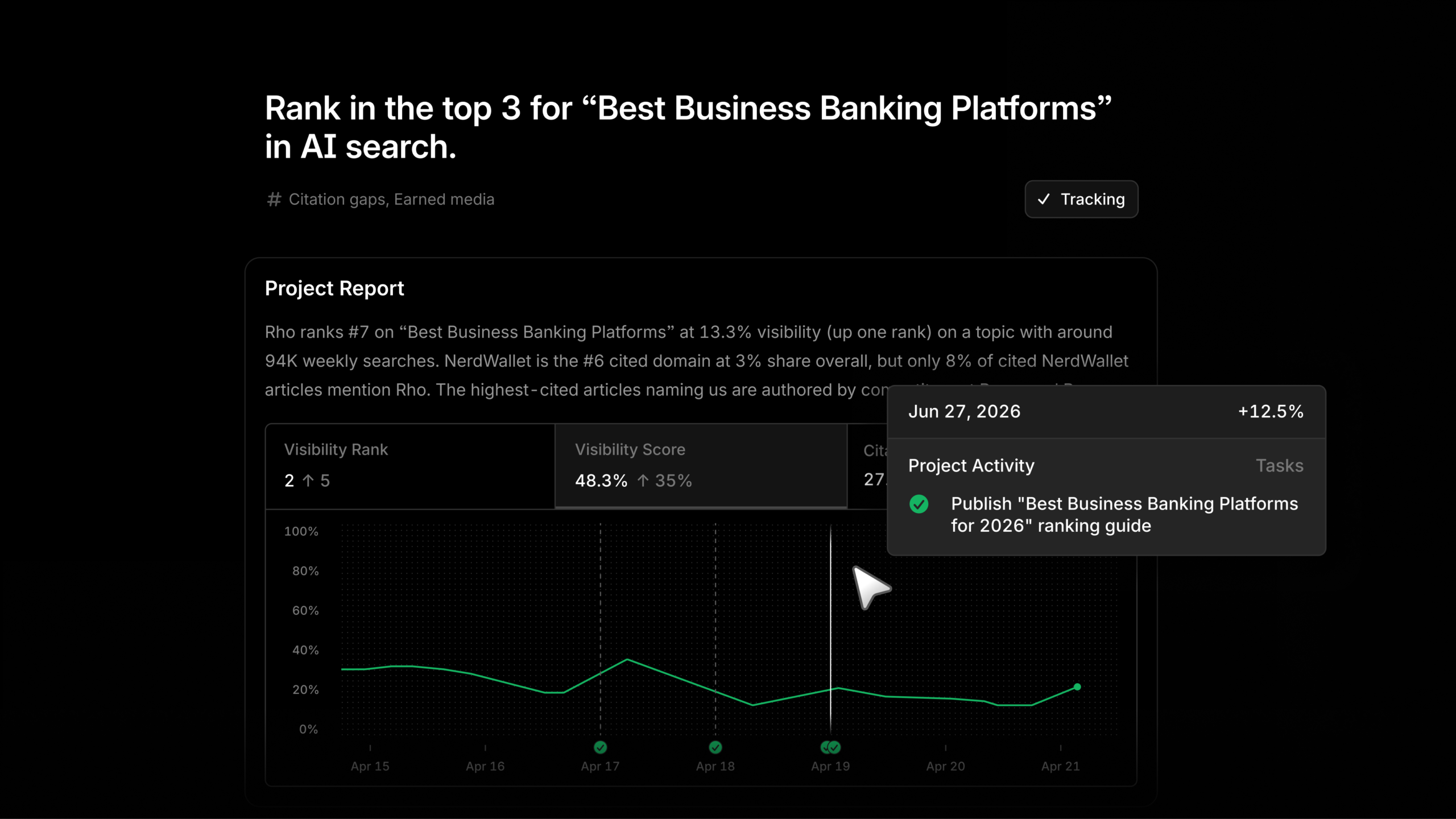
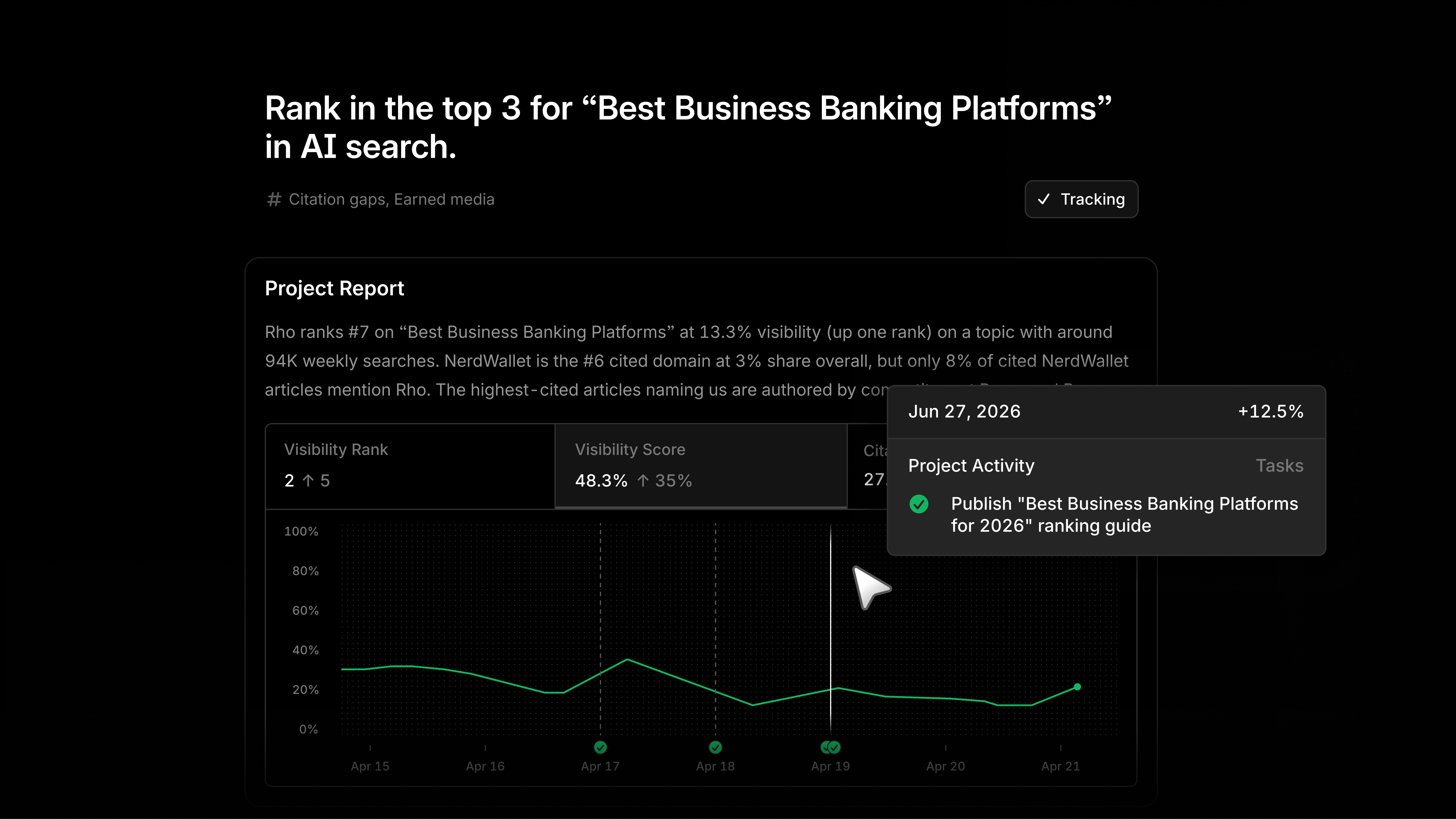
With Projects in Profound, I can turn my AEO data into a clear, ranked list of opportunities instead of another report I have to interpret from scratch.
Each opportunity is broken into practical tasks, with an agent ready to help do the work. That makes it easier for me to move from insight to execution without getting stuck in endless analysis.
For me, Projects is about spending less time deciding what to do next and more time acting on the opportunities that can improve visibility, performance, and momentum.
I’m excited to share that you and I can now easily sort our Agents and Sheets in Profound. The new feature allows us to organize them into folders, sub-folders, and even mark them as favorites for quick access.
Imagine the convenience of having all your important files just a click away, neatly categorized and prioritized as per your needs. This enhancement is designed to save us time and boost our productivity, making our workflow smoother and more efficient.
Your paid search account is probably not short of prompts to act. The harder problem is deciding which recommendation deserves budget, whether an automated result represents added business value, and how to preserve what your team learned after the interface changes.
You need more than a collection of campaign tools. You need an operating system that connects operator skill, controlled execution, and credible measurement. That system lets you move quickly without treating every platform suggestion as an instruction.
Key takeaways
Give every tool one clear job: build capability, execute a change, or verify its effect.
Record the hypothesis, baseline, spending limit, success metric, and rollback condition before applying a recommendation.
Treat platform-reported incremental lift as decision support. Compare it with the marginal cost and the business value of the added outcomes.
Turn Performance Max training into reusable launch and troubleshooting checklists instead of leaving the knowledge inside a course.
Manage additional Shopping images as structured feed data and test them against a defined commercial outcome.
Build your optimization stack around decisions, not features
A paid search tool earns its place when it helps you make a specific decision. A new dashboard, recommendation, feed field, or course is not automatically useful just because the platform makes it available.
Separate your stack into capability, execution, and evidence. The separation matters because no single platform surface should be expected to train the operator, make the change, and deliver the final commercial verdict.
Did the change create enough additional value to justify its cost?
This model exposes gaps that a tool inventory can hide. A credential can support operator development, but it cannot establish campaign profitability. A recommendation can identify an opportunity, but it cannot decide how much financial exposure your business will accept. A results view can estimate added conversions, but it cannot repair an incorrect conversion action or an inflated conversion value.
For each tool, write down its owner, required inputs, output, and resulting decision. If nobody can name the decision, the tool is adding interface activity rather than optimization capacity. If the same platform proposes a change, applies it, and scores it, add an independent business guardrail such as allowable acquisition cost, margin, qualified-lead rate, or incremental return on ad spend.
Put every automated recommendation through an evidence gate
Automated recommendations are hypotheses generated from the platform’s view of the account. They may be useful hypotheses, but accepting one still changes real bids, targets, or budget. A projected improvement is not the same thing as measured incremental value.
Google Ads is testing a Results area that adds a useful verification layer. For an applied bid or budget recommendation, the system analyzes performance one week later and compares the outcome with a baseline estimate. Its reporting uses a seven-day rolling average measured over the 28 days after the recommendation, organizes results around Budget and Target changes, and focuses on the campaign’s primary bidding objective: clicks, conversions, or conversion value.
Availability should not be assumed because the Results area is an early pilot. The operating principle still applies in accounts without it: define the expected effect before the change, preserve the starting state, and return after a declared observation window.
Before you apply a recommendation, add this record to your campaign log:
Recommendation: The exact budget, bid, or target change and every campaign it affects.
Hypothesis: The outcome expected to increase and the mechanism that should produce it.
Baseline: Current spend, the primary bidding objective, and the business metric used to judge quality.
Exposure limit: The maximum additional spend or efficiency deterioration you have approved.
Observation window: When you will evaluate the change and why that period is suitable for the available reporting.
Rollback condition: The result that will cause you to reverse or revise the change.
Confounders: Promotions, tracking changes, feed edits, landing-page releases, or other campaign changes that could affect the comparison.
The exposure limit is not paperwork. Raising a budget can spend more money without producing proportionate business value. Set the limit before approval so a promising platform forecast cannot become open-ended authority to spend.
When results arrive, separate volume from efficiency. Additional conversions can be valuable even if average campaign efficiency changes, but only when their marginal economics work. Calculate incremental cost per acquisition as additional cost divided by additional conversions. Calculate incremental return on ad spend as additional conversion value divided by additional cost. If clicks are the bidding objective, do not treat extra clicks as revenue; follow them through to the business outcome that justified buying the traffic.
The baseline in the Results area is an estimate, not direct observation of what the same campaign would have done without the change. Seasonality, promotions, competitor activity, measurement changes, and delayed conversions can still complicate interpretation. Use the reported lift as evidence, then ask whether the direction appears in your business data and whether any concurrent change offers a better explanation.
Turn Performance Max training into campaign infrastructure
Performance Max optimization often becomes account folklore: one person knows how the setup was built, another remembers why a target changed, and nobody has a stable troubleshooting sequence. Training is most valuable when it removes that dependence on memory.
Microsoft Advertising’s applied learning path provides a useful progression: foundations, guided hands-on setup, and advanced scenario-based implementation and optimization. The advanced course includes checklists, videos, reusable reference material, and contextual support through Help me understand during an assessment. Completion can also lead to a shareable Performance Max badge through Credly.
Use that progression to create internal operating assets:
From foundations, create a shared glossary. Define each objective, target, status, input, and output in the language your team uses when approving spend.
From setup training, create a launch checklist. Require the campaign objective, conversion action, budget authority, target, product or asset inputs, owner, and first review point to be documented before launch.
From advanced scenarios, create a troubleshooting tree. Start with the observed symptom, list the measurement and input checks that could explain it, and identify the smallest reversible action for each branch.
From reference material, create account notes. Link each live setting to the reason it was chosen so the next operator does not have to infer strategy from configuration alone.
Do not measure training only by course completion. Ask the operator to review a live configuration, identify one defensible change, explain the evidence required to keep it, and state the rollback condition. That exercise connects knowledge to account control without pretending that a credential proves commercial performance.
Reusable artifacts also make optimization safer when ownership changes. The campaign retains its operating history, and a new manager can distinguish a deliberate constraint from an overlooked default.
Treat multi-image Shopping ads as a feed experiment
Shopping creative is partly a feed-management problem. If you treat additional images as an informal upload task, you lose control over image purpose, product coverage, and measurement.
The existence of 10 available image slots does not mean every product needs 10 images. Each image should resolve a meaningful pre-click uncertainty. An alternate angle can clarify shape. A detail view can reveal construction or a feature. A variation image can help a shopper understand an option that the primary image cannot show clearly. Repetitive images consume feed space without adding equivalent information.
Use this rollout sequence:
Select a coherent product group. Start with items for which extra views communicate material information, not an arbitrary mix of the catalog.
Assign every image a role. Record whether it shows an alternate angle, close detail, style, color, or another useful distinction.
Validate the feed. Check that image links resolve, remain attached to the correct product, follow the intended order, and agree with the corresponding landing page.
Declare the commercial outcome. Choose the metric that would justify expansion, such as qualified click-through, purchase rate, conversion value, or revenue per click.
Protect the comparison. Avoid changing the same products’ bids, titles, prices, landing pages, and image sets at once. If your account structure permits it, compare a defined rollout group with a similar unchanged group.
Expand only after the whole path improves. A higher click-through rate is not sufficient when the added visits convert poorly or produce weak value.
This turns a creative feature into a testable merchandising decision. It also gives your feed team a clear rule for future images: add visual information that helps a shopper decide, then keep it only when the downstream result supports the added complexity.
Use one repeatable loop for every campaign change
Your review process should remain stable even when platforms introduce new controls. A durable optimization loop looks like this:
Start with the business decision. State whether you are trying to acquire more acceptable customers, recover efficiency, improve lead quality, or increase valuable product sales.
Verify the measurement input. Confirm that the campaign’s primary objective represents the outcome you intend to optimize and that the business can interpret it consistently.
Select one intervention class. Choose a budget change, target change, campaign setup correction, or creative-feed change. Separating change types makes the result easier to interpret.
Write the hypothesis and guardrails. Define the expected movement, allowable spending exposure, observation window, and rollback condition.
Apply the change and preserve context. Save the previous setting, implementation date, affected scope, owner, and any concurrent activity. Where Google’s pilot reporting is available, account for its 28-day measurement design rather than forcing an earlier conclusion from incomplete reporting.
Evaluate platform lift and business economics separately. First determine whether the platform’s primary outcome moved. Then determine whether the additional cost produced acceptable downstream value.
Turn the result into a reusable rule. Keep, revise, or reverse the change, and record what future operators should do when the same conditions appear again.
A compact decision record needs only the campaign, owner, date, starting state, changed setting, hypothesis, spending limit, primary platform objective, business metric, observation window, result, and next action. Keep that record outside any temporary recommendation card so it remains available after the interface or account ownership changes.
At your next account review, open the decision log before the recommendations queue. Pick one constrained problem, choose the tool that fits its layer, and define the evidence required to close the decision. That is how optimization becomes cumulative learning instead of a sequence of disconnected clicks.
You have a technically sound page. It targets the right query, uses sensible schema markup, and has enough authority to compete. Yet its visibility stalls, or the traffic it earns does little for the business. Adding another keyword variation is unlikely to solve that problem.
The missing layer is often the experience after discovery: how quickly the visitor understands the answer, whether the evidence feels credible, whether the page supports the next decision, and whether the brand leaves a reason to return. You can improve that layer without pretending that one behavior metric is a direct ranking switch.
Treat human experience as a visibility system, not a ranking toggle
Asking whether user experience is a ranking factor produces an incomplete answer. It encourages you to hunt for a single measurable signal when the practical issue is a chain of outcomes.
Discovery: The search result makes a clear promise that matches the query.
Understanding: The landing page delivers that promise before asking the visitor to work through background, branding, or a sales pitch.
Trust: The visitor can see who is responsible for the information, what evidence supports it, and where its limits are.
Decision: The content helps the visitor compare options, avoid a mistake, or complete the next task.
Continuity: The rest of the site, product, and conversion journey remains consistent with what the search result promised.
Memory: The experience is distinct and useful enough for the visitor to recognize or seek out the brand later.
This does not mean that every analytics event is a confirmed algorithmic input. Bounce rate is an especially weak shortcut. A visitor can leave because the page failed, because the answer was immediately useful, or because the next step happened somewhere you do not measure. Time on page has the same ambiguity. A long session can reflect careful engagement or simple confusion.
Use behavior data as diagnostic evidence, not as a ranking-factor scorecard. The operational question is not whether you can force visitors to stay longer. It is whether the page lets the intended visitor complete the intended job with confidence.
Audit the whole path from search promise to next decision
A conventional SEO audit can confirm that a page is crawlable, relevant, internally linked, and eligible for enhanced search features. An experience audit starts where that work leaves off. It follows one real search need through the result, page, evidence, action, and downstream experience.
Do not begin with the homepage or an abstract sitewide persona. Choose a query cluster that already matters, identify the principal landing page, and write the visitor’s immediate job in one sentence. Use a concrete formulation such as: decide whether this approach fits my situation, fix this specific problem, compare these options, or understand what to do next.
Check the search promise. Compare the title, description, and visible result features with the page’s opening. If the result promises a direct answer but the page opens with company history, the experience is broken before the visitor evaluates your expertise.
Test answer latency. Find the earliest point where the visitor can extract a usable answer. Definitions and context should come before the answer only when they are necessary to use it safely or correctly.
Remove interpretation work. Replace broad advice with decision rules, constraints, examples, sequences, and consequences. The visitor should not have to translate a generic principle into the action your team already understands.
Inspect trust at the claim level. A general author biography cannot support every assertion. Put relevant experience, methodology, citations, limitations, or accountable ownership near the claims that need them.
Evaluate the next step. The call to action should follow from the job the visitor came to complete. A person seeking a definition may need a related explanation. A person choosing an implementation path may need requirements, tradeoffs, or a consultation. Sending both to the same generic conversion block creates friction.
Follow the handoff. Open the form, product page, documentation, email, or checkout that comes next. Confirm that its terminology, scope, and expectations match the landing page. Search visibility has limited value when the experience falls apart immediately after the click you wanted.
Record each break as a mismatch, not a vague quality complaint. Useful labels include promise mismatch, delayed answer, missing evidence, unclear boundary, inaccessible interaction, premature conversion request, and inconsistent handoff. A precise label gives the responsible team something it can fix.
Then prioritize by consequence. A decorative layout issue usually matters less than a missing answer. A missing answer matters less than a misleading claim that could send the visitor toward the wrong decision. Fix the point where trust or task completion first fails, because improvements farther down the path cannot compensate for a visitor who never reaches them.
Make first-hand experience change the answer
Well-structured summaries are easy to produce, especially with generative AI. Structure alone is therefore a weak differentiator. First-hand experience becomes valuable when it supplies information an aggregator would not know: the condition that changed the outcome, the step that created unexpected friction, the tradeoff that only appeared during implementation, or the boundary beyond which the recommendation stopped working.
Do not confuse signals of experience with experience itself. An author box, a headshot, a claim that something was tested, or a polished first-person voice may make a page look more credible. None of them proves that the underlying answer came from direct work.
Before drafting, build an evidence inventory for the question:
What has your team done, observed, built, measured, or decided directly?
Under what conditions did that experience occur?
Which artifacts can substantiate it, such as a process record, original analysis, worked example, or documented result?
What went differently from the initial expectation?
Which conclusion is judgement rather than established fact?
Where does the team’s direct knowledge end and external evidence begin?
Use that inventory to alter the substance of the page. If the experience does not change the recommendation, add a useful constraint, reveal a failure mode, clarify a sequence, or narrow the claim, it is probably decorative.
This is also where responsible AI-assisted publishing draws a hard line. AI can help organize material, expose gaps, or turn rough notes into a clearer structure. It cannot create first-hand evidence that the organization does not possess. Do not manufacture an anecdote, test, customer conversation, or implementation detail to make a draft sound human. If you only have synthesis, label and support it as synthesis. If the query requires direct experience you do not have, obtain that experience from an accountable subject-matter expert or choose a question you can answer honestly.
The same distinction applies to E-E-A-T. Bios and citations are useful interfaces, but experience, expertise, authority, and trust work as a continuing business pattern. Editorial standards, transparent claims, corrections, consistent positioning, and accountable ownership have to support what the page says. You cannot add them as a finishing component after the business and content make conflicting promises.
Give SEO, UX, and conversion teams one shared outcome
Human experience usually degrades at team boundaries. SEO owns the query and search result. Editorial owns the explanation. Design owns the interface. Conversion specialists own the call to action. Product or sales owns what happens after it. Each part can meet its local target while the visitor experiences a single, disjointed journey.
A shared page brief prevents that split. For every important landing page, define:
the audience situation, not just a keyword;
the task the visitor needs to complete;
the direct answer or decision the page must enable;
the first-hand and external evidence available;
the material uncertainty, exception, or limitation;
the appropriate next step for this intent;
the experience that follows that step; and
the person accountable for keeping the promise accurate.
This brief changes the review conversation. Instead of asking whether every department supplied its component, ask whether the visitor can move from query to decision without encountering a contradiction, an unexplained claim, or an unnecessary demand.
Measure the journey without inventing an HXO score
There is no need to collapse human experience into one proprietary-looking number. Keep the measures tied to the stage they diagnose:
Discovery: impressions, result clicks, query mix, and whether the page attracts the audience it was designed to help.
Comprehension: use of relevant page elements, completion of the intended task, internal searches, and repeated questions that the page should already answer.
Trust: return visits, branded demand, direct feedback, and engagement with evidence or authorship information where those elements matter.
Action: qualified conversions, progression to the appropriate next step, and abandonment at the handoff.
Downstream fit: whether the conversion, product, or support experience reveals that the page created the wrong expectation.
Interpret these measures by page type and intent. A concise reference page should not be judged against a detailed comparison page. A visitor who gets an immediate answer may generate a short session without having a poor experience. A long session is not a success if the person is searching repeatedly for a missing requirement.
Look for combinations of evidence. Healthy impressions with weak clicks may point to an unclear promise, weak brand recognition, or poor result presentation. Strong clicks followed by little task completion may indicate an intent mismatch, a delayed answer, or interaction friction. Sustained engagement without the appropriate next action can expose missing proof, an unsuitable call to action, or unresolved objections. These are hypotheses to verify with page inspection, user feedback, and journey data, not automatic diagnoses.
Improve one complete journey at a time
Sitewide experience programs become vague quickly. Start with one commercially or strategically important query cluster and its principal landing page. Gather the search data, page analytics, recurring audience questions, conversion path, and available first-hand evidence. Run the journey audit, identify the earliest consequential break, and make the smallest change that resolves it.
Compare performance over a complete, like-for-like reporting period. Keep query intent, page type, seasonality, and unrelated site changes in view before attributing movement to the edit. Document what changed, why it changed, what evidence supported the decision, and what the outcome taught you. Feed that learning into the next content brief so experience quality becomes an operating loop rather than a periodic redesign project.
Key takeaways
Human experience affects visibility through the full path from search promise to understanding, trust, action, and later brand recognition.
Do not optimize bounce rate or time on page in isolation. Use behavior data to investigate whether the intended visitor completed the intended job.
Audit a specific query-to-action journey and label each failure as a concrete mismatch that an owner can resolve.
First-hand experience is useful only when it changes the answer with original evidence, constraints, tradeoffs, observations, or limitations.
E-E-A-T depends on accountable business and editorial practices; a bio or citation cannot compensate for unsupported or inconsistent claims.
Give SEO, content, UX, conversion, and downstream teams one shared brief and measure each stage according to its purpose.
Choose one landing page that matters and follow it as a visitor would, beginning with the exact search promise and ending after the next action. Fix the first point where the experience stops being clear, credible, or consistent. That is the most practical place to turn human usefulness into durable search performance.
When a landing page attracts visits but not leads or sales, do not start by changing the button color. First locate the point where the visitor’s decision breaks: the traffic promise, the offer, the evidence, the action, or the measurement.
Traffic and conversion are separate outcomes. More visits can expose a weak page without making it more persuasive, which is why high traffic does not guarantee conversions. The audit below helps you diagnose the actual failure, make the smallest useful correction, and verify whether it improved the business result.
Fix the gap between the traffic promise and the page
Your landing page begins before the visitor reaches it. An ad, search result, email, social post, referring page, or AI-generated answer creates an expectation. The landing page must continue that expectation without forcing the visitor to reinterpret what you meant.
Message match is not a requirement to repeat the referring copy word for word. It means preserving the audience, problem, offer, and intended outcome. If an ad promises payroll software for small construction companies but the landing page opens with a generic statement about business efficiency, the visitor has to work out whether the page is still relevant. That interpretive work is avoidable friction.
Write a message-match brief
Audit each major traffic source against the page using a short brief:
Name the exact audience the source addresses.
Copy the promise or question that earns the click.
State what the visitor is likely to expect next.
Identify the words or ideas on the landing page that confirm the visitor is in the right place.
Write the action the page asks that visitor to take.
You have a message-match problem if the source and page disagree about the audience, outcome, offer, or next step. You also have one if the connection is technically present but buried below company history, a product overview, or several unrelated features.
Do not send meaningfully different promises to one generic page merely because maintaining one URL is convenient. If separate campaigns address separate use cases, either create purpose-built variants or build a page that lets each audience recognize its route immediately. The deciding question is not whether the products are related. It is whether the same opening argument honestly serves every visitor.
Answer the entry question before advancing the sale
A person arriving from an informational search may still be defining the problem. Someone clicking a retargeting ad may already understand the product and need pricing, proof, or implementation details. Giving both visitors the same argument can make the page feel either premature or repetitive.
For search and AI-discovery traffic, answer the query that earned the visit near the beginning of the page. Then connect that answer to the offer. For high-intent campaign traffic, confirm the advertised offer immediately and make its conditions visible. Do not hide the promised detail behind a form unless receiving that detail is explicitly what the visitor agreed to request.
If one source converts poorly while other sources perform acceptably on the same page, inspect its promise, targeting, and visitor intent before redesigning the entire landing page. A source-specific failure is evidence about the handoff, not automatically evidence that every part of the page is broken.
Make the offer understandable before making it persuasive
Clarity is not the same as minimal copy. A short page can still be vague, and a detailed page can still be easy to follow. The real test is whether a qualified visitor can understand the offer without assembling its meaning from scattered headings, screenshots, and buttons.
The opening portion of the page should answer these questions:
What is being offered?
Who is it for?
What useful outcome does it support?
What will the visitor receive or gain access to?
What commitment does the next step require?
What happens after the visitor acts?
If your team cannot answer those questions in plain language, polishing the layout will not solve the underlying problem. Rewrite the offer as a single sentence before touching the page. A workable internal template is: this is a specific offer for a defined audience that helps with a named problem, and the next step is a clear action. The published copy can be more natural, but its meaning should remain that precise.
Build a visible hierarchy instead of a wall of benefits
A practical opening sequence is a headline that identifies the relevant outcome, supporting copy that qualifies the audience or method, evidence that makes the claim credible, and a call to action that names the next step. This sequence gives each element one job.
Avoid opening with an unsupported superlative, a slogan that could describe any competitor, or a broad category label. Replace it with the most specific claim you can support. If you cannot substantiate a dramatic promise, narrow it. Accurate specificity is more useful than inflated certainty.
Organize the rest of the page around the decision, not your internal company structure. A visitor usually does not need a tour of every capability before learning whether the offer addresses the current problem. Present the core outcome, explain how it works, show relevant evidence, address the main objections, and make the next step clear. Place secondary detail where an interested visitor can reach it without making everyone process it first.
Make the call to action describe the real next step
Labels such as Submit, Continue, or Learn More hide the consequence of clicking. Use language that describes the action or deliverable, such as View plans, Request a demo, Start the assessment, or Get the checklist. The best wording depends on what the button actually does.
The destination must honor the label. A button that says View pricing should not unexpectedly open a sales-contact form. A button that says Start free should not conceal a required sales conversation. When the wording and destination disagree, the page creates mistrust at the exact moment the visitor is considering action.
A single primary action does not require a single button. You can repeat the same call to action as the argument develops. It means that the most prominent controls support the same decision. Keep a secondary action only when it serves a clear alternate state, such as letting a visitor inspect documentation before requesting a technical demo. Several equally prominent actions force the visitor to decide how to use the page before deciding whether to accept the offer.
Remove friction without removing the confidence to act
Reducing friction does not mean making every page short or every form tiny. It means removing effort that does not help the visitor make a sound decision or help your team complete the promised next step.
Require only information that has an immediate purpose
Review every form field with the same questions:
Why is this information needed before the next step?
Will the answer change eligibility, routing, preparation, or the immediate response?
Could the information be inferred from existing data or collected later?
Is the label clear about the expected format?
Does the error message explain how to correct the entry?
A demo request may legitimately need information that helps assign the right specialist. A simple resource delivery may not need the visitor’s phone number, company size, job level, budget, and purchasing timeline. Form length should follow the transaction, not a blanket preference for short or long forms.
Do not remove required privacy controls, consent choices, or disclosures merely to shorten the interaction. Those elements may carry legal or operational consequences. Simplify their language and presentation with qualified review, but preserve requirements that apply to the data and jurisdiction involved.
Treat uncertainty as friction
A page can be visually simple and still feel risky. Before acting, a visitor may need to know whether the offer fits the relevant use case, what happens after submission, how personal or business information will be used, what commitment is involved, and whether the claims can be verified.
Place each answer near the moment the doubt arises. Put important conditions near the offer. Put a concise data-use explanation near the form. Put implementation evidence near implementation claims. Put relevant customer proof beside the outcome it supports. Do not make the visitor hunt through a footer, separate FAQ, or generic testimonials to resolve a predictable objection.
Evidence should be inspectable. A screenshot can clarify what the product looks like. A testimonial is more useful when its context makes clear who benefited and from what use case. A process description can reduce uncertainty about the next step. Logos, badges, counters, and quotations should never imply validation you cannot substantiate.
Test the complete path, not just the page appearance
Run a manual conversion check on the devices and input methods your visitors use. Complete the path as a new visitor rather than as someone who already knows how the interface works.
Open the actual campaign or search destination, including its query parameters.
Check that the page loads and remains usable on a phone-sized screen.
Navigate interactive elements with a keyboard and confirm that labels remain understandable without placeholder text.
Submit the form empty, with invalid entries, and with valid entries.
Confirm that errors identify the affected fields and preserve information already entered.
Try repeated clicks and verify that they do not create duplicate submissions or charges.
Confirm that the success state appears only after a real completion.
Check the promised follow-up, such as an email, download, booking, account state, or sales notification.
A page-level change cannot fix a broken confirmation email, an unavailable booking calendar, a validation loop, or a form that silently fails. If primary CTA clicks rise while completed actions remain flat, investigate what happens after the click before revising the headline again.
Measure the decision path before running an A/B test
Conversion optimization becomes guesswork when the success event is ambiguous. Define the completed business action first, then instrument the steps that help you locate failure.
For a lead page, a useful event path may include the landing-page view, primary CTA click, form start, validation error, successful submission, and confirmed thank-you state. For a purchase or account flow, the events will differ, but the distinction remains: intermediate interactions diagnose behavior; the completed action measures conversion.
Do not call a button click a lead when a valid submission is the actual objective. Do not call a form submission a purchase when payment confirmation is the objective. Naming an early event as the conversion can make a broken downstream path appear successful.
Before comparing versions, verify that the conversion event fires once, fires only after genuine success, carries the correct campaign context, and excludes or identifies internal quality-assurance activity. Keep the denominator consistent. A rate based on landing-page sessions cannot be compared directly with one based on users, ad clicks, or all site visits without explaining the difference.
Segment enough to find the problem, but not enough to invent one
Start with segments that can change your diagnosis: traffic source or campaign, device class, offer, landing-page variant, and new versus returning visitors when that distinction matters. Add geography, query group, or audience segment only when the page or offer meaningfully differs for those visitors.
Look for a coherent break in the path. Low CTA engagement can indicate weak relevance, poor offer clarity, or insufficient evidence. Strong CTA engagement followed by low form completion points toward the form, its expectations, or a technical failure. High form completion followed by low-quality leads points toward targeting, qualification, or an offer that attracts the wrong action.
Pair the landing-page conversion with a downstream measure when the business cares about lead or customer quality. Qualified leads, attended meetings, completed purchases, successful activations, or another relevant outcome can reveal whether an apparently improved page merely created more low-fit submissions. The correct downstream measure depends on the actual job of the page.
Turn observations into testable hypotheses
An A/B test should answer a decision, not provide movement for a dashboard. Write the hypothesis before building the variant:
Describe the observed break in the conversion path.
Name the most plausible mechanism behind it.
Choose the smallest meaningful change that addresses that mechanism.
Select the primary outcome and any guardrail, such as lead quality or completed purchases.
Decide in advance how you will judge the result, and do not stop merely because one version takes an early lead.
Record the traffic sources and audience segments included so the result is not applied beyond the visitors actually tested.
For example, a large drop between form start and completion supports a form-friction hypothesis more directly than a headline hypothesis. You might clarify why a sensitive field is required, repair confusing validation, or remove a field that does not affect the next step. A random button-color test would not address the observed break.
Keep variants interpretable. If you change the headline, offer, proof, layout, form, and CTA together, a different result will not tell you which mechanism mattered. A broader rebuild can still be appropriate when the baseline is fundamentally incoherent, but treat it as a page-level replacement rather than evidence that every individual change was beneficial.
When traffic volume cannot support a credible comparison, do not pretend that a handful of conversions settles the question. Use message reviews, session-level diagnostics, form-error data, support or sales questions, and manual path testing to identify obvious defects. Make corrections with a clear rationale, then keep monitoring the business outcome.
Key takeaways
Audit the promise that earns the visit before changing the design that receives it.
Make the audience, offer, outcome, commitment, and next step understandable near the beginning of the page.
Use calls to action that describe what will really happen after the click.
Remove form fields and page elements that do not support the decision or immediate follow-up, while preserving required controls.
Place proof and risk-reducing information beside the claims or actions they support.
Track the completed business action separately from diagnostic events such as clicks and form starts.
Prioritize the point where the conversion path visibly breaks, then test a change tied to a plausible mechanism.
Check lead or customer quality so a higher page conversion rate does not conceal a worse business result.
Choose one commercially important landing page and write down its traffic promise, intended visitor, offer, primary action, and confirmed success event. Walk the full path once, then inspect the data for the first meaningful break. That break is your next change. Put it in a test or change log with the reason, expected effect, and business measure before you ship it.
When someone asks a voice assistant a question, there may be room for only one spoken response. Your page can be relevant and still lose that response because the useful sentence is buried, the business details conflict, or the answer needs too much context to make sense aloud.
Treat voice search optimization as an answer-delivery problem. Your job is to make the right response easy to find, extract, verify, and speak while preserving the depth a person needs when they visit the page.
Key takeaways
Start with a complete spoken question and its intent, not an isolated keyword.
Place a direct, self-contained answer immediately below the heading that asks the question.
Use FAQ or HowTo schema to describe visible content accurately; markup cannot compensate for a weak answer.
Treat local voice optimization as an entity-data task before treating it as a copywriting task.
Measure whether assistants select your answer. Rankings and engagement metrics are supporting evidence, not direct proof.
Start with the spoken question, not a short keyword
A typed query might be a compressed phrase such as clean coffee maker. A spoken query is more likely to express the whole need: How do I clean a coffee maker? Voice searches are often longer, conversational, and framed as questions. That difference affects the answer format as much as the keyword choice.
Build your initial query set from language people already use. Customer-support messages, sales questions, site-search terms, product reviews, and conversations recorded by customer-facing teams are useful starting points. AnswerThePublic and Semrush can expand that set with question-based variations, but a tool-generated phrase still needs an identifiable intent before it deserves a page.
For every candidate query, record five things:
The spoken question: Write the complete sentence a person might say, including relevant qualifiers such as product type, problem, or location.
The immediate intent: Decide whether the person wants a fact, instructions, a comparison, a nearby business, or an action.
The answer format: Choose a short explanation, ordered procedure, criteria list, local result, or another format that matches the need.
The best destination: Assign the query to an existing page when that page already satisfies the intent. Do not create separate pages for minor wording variations.
The basis for the answer: Identify the facts, process knowledge, business data, or other evidence that lets you answer credibly.
Prioritize questions you can answer clearly and substantiate. A broad query such as What is the best marketing platform? hides the criteria needed to make the answer useful. A narrower question that identifies the user, task, or constraint gives you a better chance of producing a defensible response.
Do not force every conversational variation into the copy. Select a natural primary question, answer it, and cover meaningful follow-up needs in the surrounding section. Repeating near-identical questions makes a page harder to read without making its central answer clearer.
Build an answer unit that can stand on its own
A voice assistant may extract only a small part of your page. That part must remain accurate when separated from the paragraphs around it. We call this an answer unit: a descriptive heading, an immediate response, and just enough structure to preserve the meaning.
Use an answer-first order
Ask the real question in the heading. Use the wording a reader would recognize, but keep it natural rather than mechanically copying every keyword variation.
Answer in the opening sentence. Name the subject directly. Avoid an opening such as It depends or This is the best approach when the extracted sentence would leave the listener wondering what it or this means.
Match the structure to the task. Use ordered steps for a procedure, bullets for criteria, and prose when the explanation depends on cause and effect.
Add constraints immediately after the answer. State the conditions that could change the recommendation before moving into background material.
Provide depth below the extractable response. Examples, evidence, alternatives, troubleshooting, and related questions belong here.
Definition: Begin with [Term] is…, then explain what distinguishes it from nearby concepts.
How-to: State the outcome and any essential prerequisite, then present the actions in the order they must happen.
Comparison: Name the deciding criterion first, explain which option fits each situation, and support the distinction below.
Local service: Identify the business, service, and location plainly before giving directions, contact details, or the next booking action.
Read the opening answer aloud without the heading. If its subject becomes unclear, rewrite it. Then read the heading and answer together. If they sound repetitive or robotic, keep the meaning but loosen the phrasing. Voice-friendly content should sound natural when spoken; it should not look like a transcript padded with keywords.
Use schema to clarify content, not manufacture it
Structured data gives machines explicit labels for content that already exists on the page. FAQ schema fits a genuine set of visible questions and answers. HowTo schema fits a real process with an ordered sequence. Neither type turns vague copy into a reliable response, and neither guarantees that an assistant will select it.
Before publishing JSON-LD, check that:
The marked-up question and answer match what visitors can read on the page.
The schema type describes the content accurately rather than the result you hope to obtain.
A HowTo sequence follows the same order in the markup and the visible instructions.
Required qualifications and warnings appear in both the answer and its structured representation.
Content and markup are updated together when a fact, step, product, or business detail changes.
The markup still validates after a theme, template, CMS, or plugin change.
Schema is only one part of the retrieval path. Alexa can draw responses from Amazon’s knowledge graph, third-party skills, and indexed web content. A correctly marked-up web page therefore remains dependent on crawlability, relevance, authority, and the platform’s own answer-selection process.
Keep the technical objective narrow: help the system identify the question, the answer, and any ordered steps without creating a conflict between the markup and the visible page. If the two versions disagree, fix the publishing workflow rather than deciding which version a machine should trust.
Make local facts and authority easy to verify
A request such as Find a coffee shop near me is not solved by adding the phrase near me throughout a page. The assistant has to connect a service or business category with a location and a trustworthy entity. Conflicting records can undermine an otherwise well-written local page.
Audit the business data that supports that connection:
Keep the Google Business Profile complete and current.
Check the business’s presence in Amazon’s relevant local services where applicable.
Use a consistent name, address, and phone number across the website and important listings.
Verify opening hours, service areas, contact routes, and location details whenever operations change.
Include city and service-area language where it helps a visitor understand coverage.
Make each location page useful on its own instead of swapping place names into otherwise identical copy.
Write for local intent, not for the literal phrase. A clear statement such as We provide emergency plumbing services across [city and service area] communicates the entity, service, and geography. An awkward claim such as best emergency plumber near me does not tell the assistant where the business operates or why the claim should be believed.
Authority also develops across related pages. Create a central resource for the broad subject, publish supporting answers for the recurring subtopics, and link them according to the reader’s next question. High-quality backlinks, accurate citations, and positive reviews provide additional trust signals. The aim is not sheer publishing volume. It is a connected body of content that answers the main question and the follow-up questions consistently.
Measure answer selection before building an Alexa skill
Keep a repeatable voice-search log
Ordinary analytics cannot tell you reliably that a person heard your content from a smart speaker. A spoken answer can satisfy the request without producing a visit. Measure the selection event separately, then use rankings and on-site behavior to interpret what happens around it.
Freeze a manageable set of important spoken questions.
Test Alexa, Siri, and Google Assistant separately. Do not assume that selection on one platform transfers to another.
Record the exact wording, platform, date, response, and any cited or named destination. Include location or account context when it materially affects the result.
Classify each outcome: your answer was selected, another answer was selected, the assistant requested clarification, or no useful answer was returned.
Compare the selected wording with your answer unit and identify the missing fact, structural difference, or authority signal.
Change a single meaningful element, such as the opening answer or procedural structure, and repeat the check under comparable conditions.
Featured-snippet visibility can be a useful supporting measure because featured snippets often correlate with voice answers. Ahrefs and similar SEO platforms can help track those positions. Time on page, bounce rate, and related engagement metrics can show whether visitors find the expanded page useful, but they do not prove that an assistant selected its answer. Keep those measurements in separate columns so a traffic gain is not mistaken for voice attribution.
A/B testing can help you compare answer formats when the page receives enough comparable traffic or when your testing process can hold other factors steady. Test a meaningful difference, such as prose versus ordered steps, rather than changing the heading, answer, markup, and page layout simultaneously.
Use an Alexa skill for a repeatable task, not as a ranking shortcut
An Alexa skill gives a brand a controlled environment for responses. A fitness business, for example, could provide a requested morning workout through a dedicated skill. This can reduce dependence on web crawling within that skill experience, but it does not cause ordinary web pages to rank for generic voice searches.
A skill is worth evaluating when users have a repeatable task, the interaction is useful without a screen, the response depends on a maintained workflow or data set, and the business can support the experience after launch. If the only goal is to make an informational page more visible, improve the page, structured data, authority, and entity consistency first.
For a live skill, Amazon’s Alexa Developer Console can provide usage information that web analytics cannot. Review which requests succeed, where people stop, and which utterances fail to reach the intended response. That evidence should guide the skill’s language model and interaction flow separately from your web AEO work.
Start with the questions already reaching your support, sales, and site-search channels. Choose a manageable group, assign each one to the right page, rewrite the answer units, align the schema, and verify every relevant business field. Then establish the measurement log before making further changes. A repeatable record of what assistants actually select will give you a more useful roadmap than another round of speculative keyword expansion.